15 Living Room Layout Ideas for Every Room Shape (Long, Square, Awkward)
Every living room has a shape problem. Some are long narrow bowling alleys. Some are dead-square boxes with the TV on one wall and the door on another. Some are open-plan spaces that connect to the kitchen with no clear break. Every shape has a right layout and several wrong ones—and the right one usually isn’t the one that came with the room.
The mistake most people make is arranging furniture along the walls. Walls are where furniture goes when you don’t know what else to do with it. Real living rooms have furniture floated toward the center, arranged in conversation groups, and organized around focal points rather than square footage.
These fifteen layout ideas cover the most common problem shapes: narrow long, square, open-plan, small square, awkward corners, and rooms with too many doors or windows. Find the shape closest to yours and adapt the layout from there.
1. For long narrow rooms, split into two zones
A long living room (16 feet or more) works best when arranged as two conversation zones rather than one long strip. Put a sofa and two chairs facing each other in one half of the room, and a reading nook or desk in the other half.
Use a large area rug to define each zone. The sofa zone rug and the reading zone rug can be different sizes and patterns, as long as they share a color palette. The gap between the two rugs signals the visual transition.
A slim console table between the two zones (perpendicular to the room’s length) serves as a partial divider. Style with a small lamp, a plant, and a small stack of books. The console suggests separation without physically blocking anything.
2. For square rooms, float the sofa toward the center
A dead-square living room works best when the sofa is pulled away from the wall and floated toward the middle of the room. This creates a walkway behind the sofa and centers the conversation area around a focal point (fireplace, TV, window).
Add a slim console table behind the floated sofa to fill the negative space. The console holds a lamp, a plant, and a small stack of books. Two low armchairs face the sofa across a coffee table or ottoman.
The trick to floating the sofa in a square room is committing—pull it fully 3-4 feet from the wall, not just 12 inches. Half-floated sofas look like they belong against the wall but got bumped forward. Fully floated sofas look intentional.
3. For open-plan spaces, anchor with a rug
In open-plan homes where the living room, dining, and kitchen share one space, the living room needs a clear anchor. A large area rug (8×10 or 9×12) placed under the sofa and chairs creates the visual boundary that no wall provides.
The rug should extend at least 6 inches past the front legs of the sofa on all sides. Front legs of chairs should also sit on the rug. This makes the whole group read as one connected zone.
Repeat the rug’s color palette in the sofa pillows, art, and accessories throughout the living zone. Coordinated palette in the living room + different palette in the adjacent kitchen visually separates the two spaces.
4. For rooms with multiple doors, face the sofa away from the busiest door
Living rooms with three or four doors (entry, hallway, dining, closet) have limited wall space for sofa placement. Face the sofa away from the busiest doorway so that people entering see the back of the sofa rather than walking into a face-to-face conversation.
This slight positioning shift makes the living room feel calmer and more private. Add a console behind the sofa (facing the entry) to soften the sofa back visually and give arrivers a landing spot for keys.
For rooms with a door directly behind the sofa, add a folding screen or tall bookshelf as a partial divider. This physical break makes both the sofa area and the doorway feel more intentional.
5. For rooms with a fireplace, arrange around it as the focal point
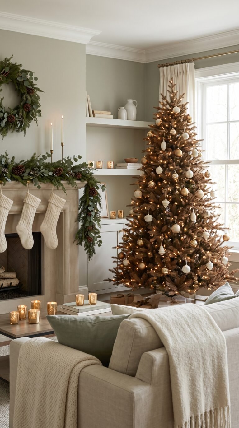
A fireplace is nature’s built-in focal point—the whole room should orient toward it. The main sofa faces the fireplace directly; two chairs sit perpendicular on either side; the coffee table centers the whole triangle.
Skip the temptation to face furniture toward the TV instead of the fireplace. In rooms with both, position the TV above the fireplace (or on a wall visible from the sofa) so both focal points work together.
Style the mantel simply—one large art piece leaning against the wall, two small candlesticks flanking, one small object at each end. Overly styled mantels compete with the fire for attention.
6. For small rooms, use one sectional instead of sofa + chairs
In living rooms under 200 square feet, a small L-shaped sectional often works better than a sofa and two chairs. The sectional maximizes seating in minimum floor footprint and creates an implied conversation area.
Choose an apartment-scale sectional (85-95 inches wide, 60-70 inches deep) rather than a big-house sectional. Article, Interior Define, and West Elm all sell compact sectionals for small rooms.
Add one small side chair or a slim armless chair to complete the group. The chair provides flexibility—move it to the dining table when needed, or use as a plant stand when not.
7. For rooms with an awkward corner, add a floor plant
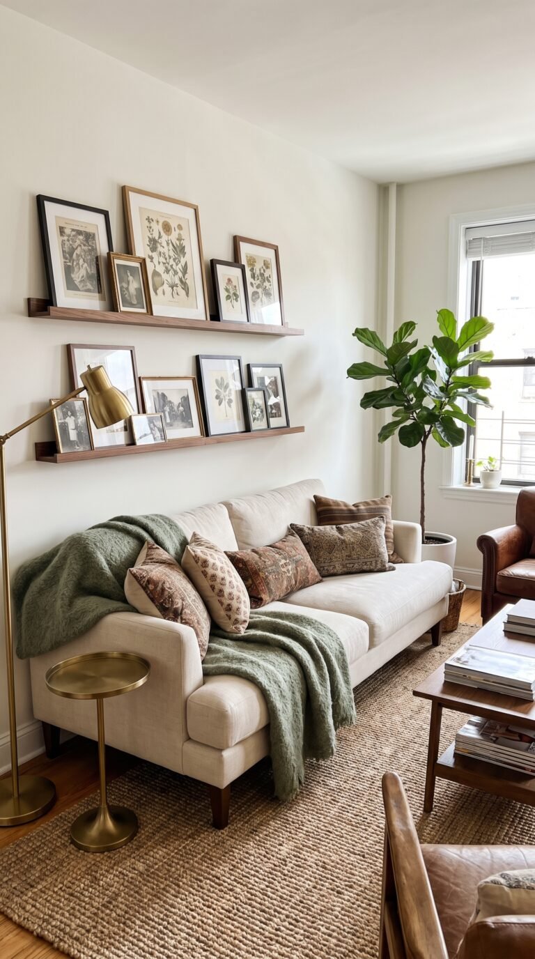
Every living room has one corner that just doesn’t fit anything—too small for a chair, too visible to leave empty. A 5-6 foot floor plant in a warm-toned basket fills that corner beautifully and adds vertical organic interest.
Fiddle-leaf fig, monstera, bird of paradise, or a tall snake plant all work. Choose based on the corner’s light—fiddle-leaf figs need bright indirect light, snake plants tolerate darker corners.
The plant serves the same function as a floor lamp or a slim console but with more organic texture. Rooms with one big plant read as cared for and personal; rooms with no plants read as sterile.
8. For rectangular rooms, position sofa along the long wall
In rectangular rooms where the sofa has an obvious wall to sit against, position it along the long wall (rather than short wall) even if the short wall seems more visually balanced. Long-wall placement leaves more usable floor in front for coffee table and chairs.
The two side walls (short walls) then hold shorter furniture: a small console with a mirror, an accent chair, or a floor lamp. This creates visual balance without cramming.
The room’s traffic flow works better with sofa on the long wall—people walk parallel to the sofa rather than perpendicular past its front, which reads as intrusive.
9. For rooms with too many windows, use minimal wall furniture
Living rooms with multiple windows (especially wraparound or picture windows) have less usable wall space for anchored furniture. Keep wall pieces minimal—one console under the biggest window, maybe two floor lamps, and floated furniture in the center.
The furniture that would normally go on walls (bookcase, tall dresser, big art) needs to be repositioned or replaced. Consider a low bookcase between two windows, art propped rather than hung, and a floor mirror leaning against the shortest wall.
Let the windows be the focal point. Curtains should be simple and consistent across all windows. Sheer or lightweight curtains preserve the light-and-view advantage that windowed rooms have.
10. For rooms with a low ceiling, use low-profile furniture
Rooms with 7-8 foot ceilings feel taller when furniture is low-profile. Choose low sofas (25-28 inches back height), low coffee tables (14-16 inches), and low shelving units (5 feet or shorter). Tall furniture reinforces the low-ceiling feel.
Skip tall bookcases in low-ceiling rooms. If storage is needed, use horizontal credenzas or long low console cabinets that stretch along a wall. Long low pieces make the room feel more spacious than tall pieces do.
Hang art at seated eye level (about 5 feet from floor to center of art), not at higher standing eye level. Lower art placement keeps visual weight low and makes the ceiling feel higher.
11. For rooms with a high ceiling, use tall statement pieces
Rooms with 10+ foot ceilings feel best when at least one piece of furniture or one design element reaches upward. A tall bookcase running floor-to-ceiling, a very tall floor plant, or oversized statement art all fill the vertical volume.
Small furniture in a tall-ceiling room looks stranded. Everything needs to be scaled up—bigger sofa, bigger art, bigger rugs, taller lamps. Otherwise the high ceiling reads as unfinished space.
Hang art higher in tall rooms—6-7 feet from floor to center of art works better than the standard 5 feet. High art keeps the visual weight distributed vertically through the tall volume.
12. For rooms with a TV as focal point, arrange conversation-first
Rooms where the TV is the obvious focal point work best when arranged for conversation FIRST and TV viewing second. Sofa facing TV directly; two chairs perpendicular facing each other (with TV visible in peripheral vision).
This layout works for both TV watching and hosting. Guests can chat facing each other; family can watch the TV comfortably from the sofa. Straight-line TV-only arrangements feel like waiting rooms.
Add a small side table between the two chairs, styled with a small lamp and a small stack of books. This gives the conversation zone its own anchor and doesn’t force everyone to stare at the coffee table.
13. For rooms with unequal walls, add architecture with molding
Rooms where one wall is significantly shorter or taller than the others feel unbalanced. Add architectural interest to the shorter or shorter-feeling wall—picture-frame molding, board-and-batten, or a floor-to-ceiling drape treatment.
This creates visual weight on the weaker wall and balances the room’s proportions. For rentals, use removable peel-and-stick molding or a large piece of art that anchors the wall.
Repeat the molding treatment in one other spot in the room (below a chair rail on another wall, for example) so the architecture reads as intentional rather than one-off.
14. For studios sharing living and bedroom, use a bookshelf divider
In studio-style living spaces where the sofa and bed share the same room, a tall open bookshelf perpendicular to the wall creates visual separation without blocking light. The shelf reads as intentional architecture.
Position the shelf 3-4 feet from the corner, creating a small alcove behind it for the bed. The living area stays on the other side, connected through the open shelves.
Style the shelf from both sides—it’s visible from two angles. Alternate books, plants, small baskets, and small art propped rather than hung.
15. For rooms with kids, choose forgiving fabrics and layouts
Family living rooms need to survive daily use. Choose stain-resistant performance fabrics for the sofa (Crypton, Sunbrella, or performance velvet), and washable slipcovers over expensive upholstery.
Layout matters too—leave clear floor space in the center for kids to play, use a soft ottoman instead of a hard coffee table (no sharp corners), and choose rugs with patterns that hide crumbs.
Store toys in matched woven baskets tucked under the coffee table or into a cabinet. Visible toy chaos ages a living room visually more than any other single factor.
The right living room layout depends more on your room’s shape than on any trend. A long narrow room needs two zones. A square room needs a floated sofa. An open-plan space needs a big rug to anchor. Kids-heavy rooms need forgiving fabric. Get the shape right, then style within it.
Test any layout before you commit—use painter’s tape on the floor to mark furniture footprints and live with them for a day. Rearrange one week and see if the room works better. Great living rooms are almost never right on the first attempt; they’re iterated toward over months. Start with the layout that fits your room’s shape, then refine from there.