
25 Modern Terracotta Home Decor Ideas That Warm Any Room
Terracotta is the color interior designers reach for when a room feels cold, correct, or quietly lifeless. It is the warm pigment of sunbaked clay — the shade of a Mediterranean rooftop at six in the evening, of an unglazed pot catching late light, of the earth itself after rain. In a decor landscape dominated by cool greys, stark whites, and over-corrected minimalism, terracotta is the human note that returns a home to warmth without surrendering any sophistication.
What makes terracotta exceptional is its range. It is not one color but a whole family — pale blush that reads almost nude, mid-tone rust that nods to Tuscany, deep sienna that approaches cocoa, and smoky brick that leans toward black. That spectrum means terracotta works in almost any palette if you choose the right shade and pair it carefully. The old mistake is treating terracotta as a single orange and loading a room with matching pots and curtains — the modern approach is layering shades, mixing finishes, and letting the color read as a tone rather than a theme.
The 25 ideas below are the modern terracotta decor moves that work in real homes — small apartments, rentals, families with pets, people with budgets. Each one is drawn from how editorial stylists, interior designers, and the best Instagram decor accounts actually bring the color into living rooms, bedrooms, kitchens, and bathrooms without the Southwestern-restaurant feeling that killed terracotta’s reputation twenty years ago. Pick two or three. The color will do the rest.
1. Start With a Single Hand-Thrown Terracotta Vessel

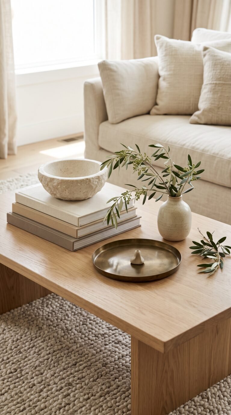
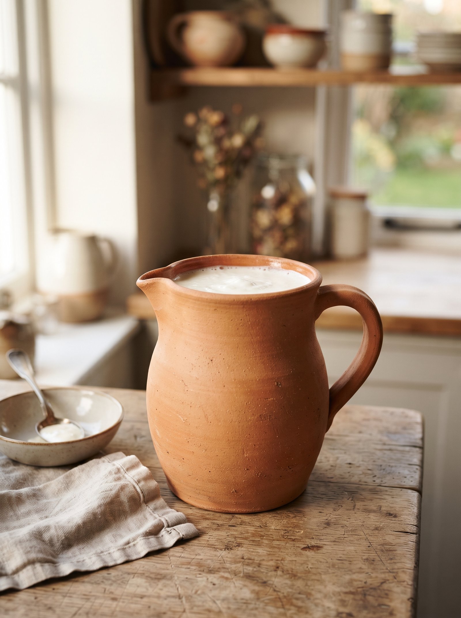
Before you commit to a wall color or a sofa reupholstery, prove the color works in your room with one object. A hand-thrown ceramic vessel in matte terracotta on the mantel, coffee table, or an open shelf gives you a reversible test — one you can live with for a week, move around, and judge against your existing furniture and light.
What you learn from that one piece tells you everything. If the terracotta glows warmer in the afternoon light and sits comfortably against your sofa, the color belongs. If it fights your current palette or looks like it was dropped in from another room, you’ve saved yourself from a bigger commitment.
Choose matte or lightly glazed finishes over glossy ones. The irregularity of a hand-thrown surface — the thumb-prints, the slight unevenness in the walls, the subtle variation in the glaze — is what gives terracotta its warmth. Mass-produced glossy ceramics flatten the color into something that reads cheap, like plastic trying to pass as clay. Prices for small hand-thrown pieces have come down enormously thanks to Etsy and small-shop ceramicists on Instagram; a $35 vessel from a working potter outperforms a $100 chain-store piece every time.
Place the vessel where it catches natural light at least once a day. Terracotta is a color that behaves differently in morning cool light versus afternoon warm light — a quality that is literally what makes it alive — and watching how it shifts tells you where in the room it belongs permanently.
2. Layer Three Shades of Terracotta in One Vignette
Terracotta is at its most sophisticated as a gradient, not a solid. A monochrome vignette layering three shades of the color — pale peach-blush, a middle burnt sienna, and a deep rust approaching cocoa — reads richer and more considered than any single-tone grouping. The eye registers the gradient as intentional, and the room feels designed by someone who understands tonal depth.
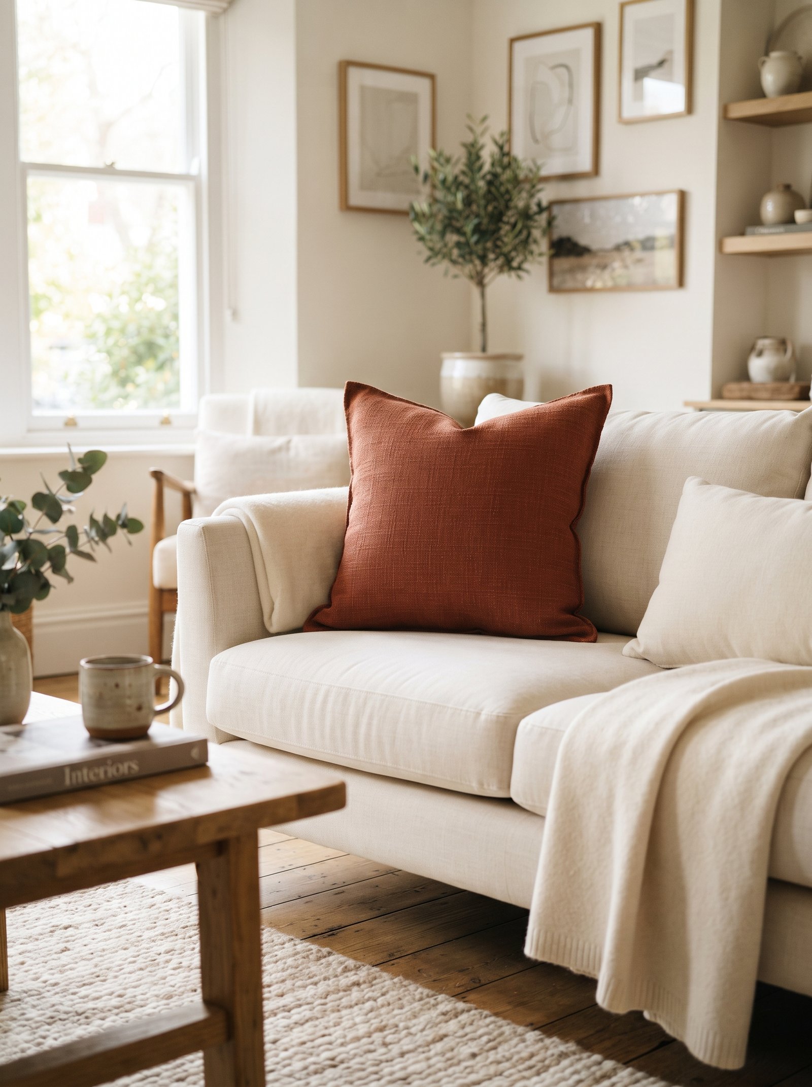
Build the layered look across different objects: a pale pink linen pillow on the sofa, a mid-tone throw folded at the foot of the bed, a deep sienna vase on the shelf above. The three shades tie the room together without any of them demanding full attention. This is the move that interior editors use on magazine spreads and that most home-styling guides skip entirely.
Apply the same gradient logic to a single vignette too — three ceramics in three terracotta shades on a tray, grouped in a triangle for visual rhythm. The pale piece belongs at the back as a soft wash of color, the deepest piece anchors the foreground, and the middle shade bridges them. The composition reads curated rather than collected.
Avoid matching sets. Three identical terracotta vases in different sizes read as a store display; three different terracotta pieces that share a tonal family read as personality.
3. Pair Terracotta With Warm Cream, Never Stark White
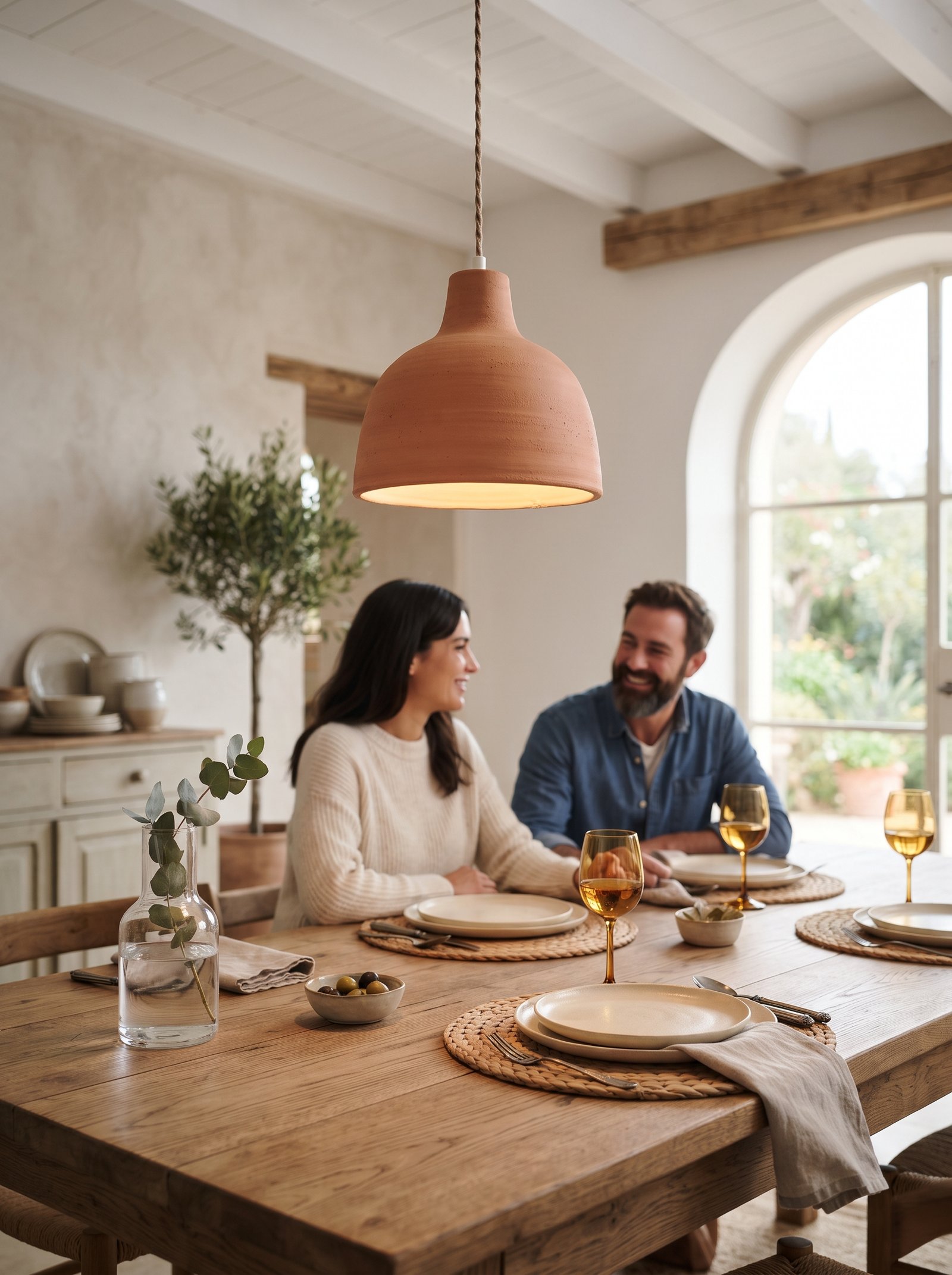
The single biggest reason terracotta looks dated in a home is pairing it with pure white. Stark white sharpens the orange, pushes it toward the Southwest-restaurant palette of the 1990s, and strips the warmth that makes terracotta worth using in the first place. Swap every pure white near your terracotta pieces for cream, bone, oatmeal, warm off-white, or putty — and the whole color story shifts into something sophisticated and current.
The same rule applies at every scale. Terracotta sofa pillow? Put it on a cream, not white, sofa. Terracotta vase? Set it against a warm oatmeal wall, not a cool bright one. Terracotta rug? Pair it with cream curtains, not white. The temperature match is what makes the whole palette read as considered rather than contrasting.
If you live in a house with lots of white already — white trim, white ceilings, white cabinets — you don’t have to repaint. But the fabric and object choices you make around terracotta should lean cream. The eye adjusts to accept the architectural white as background and reads the warm fabric relationships as the room’s actual temperature.
Specific cream paints that pair beautifully with terracotta include Benjamin Moore White Dove, Farrow & Ball Pointing, and Clare Snow Day. Any of these next to a terracotta accent reads sophisticated and warm without competing.
4. Mix Terracotta With Deep Green for Instant Modernity
The color combination that reliably pulls terracotta out of its dated associations and into modern decor is deep green. Olive, sage, forest, hunter — any green with earthy depth cools the terracotta without fighting it, and the two colors share such strong natural pedigree (clay plus leaves, soil plus moss) that they always read as cohesive rather than contrasting.
The reason this combination works is temperature balance. Terracotta is a hot color — all warmth, all earth. Deep green cools it just enough to keep the room from feeling overheated, and the two together create a palette that feels like being inside a well-tended garden rather than a themed restaurant.
Apply the combination through accents: one olive velvet pillow next to a terracotta linen one on a cream sofa. One eucalyptus branch in a rust clay vase on the mantel. One sage throw folded on a terracotta bench at the foot of the bed. The pairings almost design themselves once you see how willingly these two colors sit beside each other.
At scale, consider painting a bookshelf in a deep olive and styling it with terracotta ceramics on the shelves. The dark backdrop makes the warm pots glow, and the whole piece reads as a $1,500 custom cabinet.
5. Introduce Terracotta Through Textiles First
If a paint commitment feels like too much, start terracotta through soft goods. A terracotta linen throw draped over the sofa, a block-printed cushion cover on an armchair, a flat-weave rug with rust tones underfoot, or terracotta curtains that pool slightly on the floor all introduce the color reversibly — if you decide you’ve gone too warm, you simply move the textile elsewhere or store it.
Textiles are also where terracotta reads warmest to the body. The color against natural linen, wool, boucle, or mohair has a tactile quality that paint alone can’t deliver — the surface absorbs light differently, the texture catches the eye, and the whole piece feels inhabited rather than installed.
Prioritize natural fibers over synthetics. Terracotta in polyester reads plastic; terracotta in flax, cotton, wool, or hemp reads expensive and timeless. The small premium is worth it, and the washability of most natural-fiber terracotta textiles is better than you’d expect.
One rust throw on a cream sofa changes a room immediately. Two throws (one on the sofa, one on the armchair) make the whole seating area feel pulled together. Three terracotta textile moments across one room begins to feel like a theme — stop at two and let the rest of the color story live in objects.
6. Group Terracotta Planters in Varying Sizes
A small cluster of terracotta planters — three to five pieces in different sizes — on a sunny windowsill, a plant shelf, a kitchen counter, or a corner of the floor adds instant architectural warmth. Mix smooth modern cylindrical shapes with rough traditional handled pots for texture variation, and leave at least one empty for sculptural interest; the empty pot reads as decor rather than a plant waiting to arrive.
Age brand-new pots by lightly rubbing their outsides with yogurt or buttermilk and leaving them outdoors for a week or two. The resulting bacterial patina — mossy, mottled, aged — reads as vintage without the vintage price. If you can’t wait, hunt estate sales and garden centers for already-weathered pots; they go for less than new ones and have decades of patina baked in.
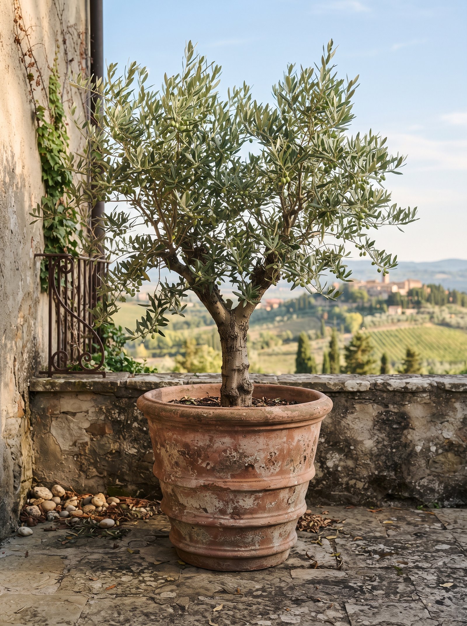
Scale matters more than number. A single very large terracotta pot (18-24 inches tall) with an olive tree, a fiddle leaf fig, or a rubber plant inside it anchors a whole room and reads as more intentional than ten small pots scattered. If you only buy one, make it big.
For small-space living, consider wall-mounted terracotta pots or hanging terracotta planters on a stair wall or beside a window. The vertical use of the color draws the eye up and makes small rooms feel taller.
7. Try Terracotta in a Powder Room for Maximum Impact
Powder rooms are the lowest-stakes rooms to go bold in. They’re small, guests see them briefly, and the drama you create reads as memorable rather than overwhelming. A terracotta wall color in a small bathroom — try Clare Atomic Orange, Farrow & Ball Red Earth, Benjamin Moore Audubon Russet, or Backdrop Fiero — makes the space feel moody, warm, and genuinely unforgettable.
Pair the terracotta walls with a cream vessel sink mounted on a floating oak counter, warm brass fixtures (an unlacquered brass tap, matching toilet paper holder and towel ring), a vintage round mirror, and a single pleated wall sconce casting warm light. The result is a powder room guests will mention weeks later.
Use eggshell or satin finish paint rather than matte. Matte paint in bathrooms picks up water marks and fingerprints; a slight sheen keeps the walls cleanable without reading as glossy. On the ceiling, consider painting it the same terracotta color for the enveloping room effect that makes small spaces feel luxurious rather than cramped.
Lighting matters more in a terracotta room than almost anywhere else. Install a dimmer, use warm 2700K bulbs, and avoid cool-white overhead fixtures entirely. Terracotta under cool light turns muddy and lifeless; under warm light it glows.
8. Use Terracotta as the Accent in a Mostly Neutral Room
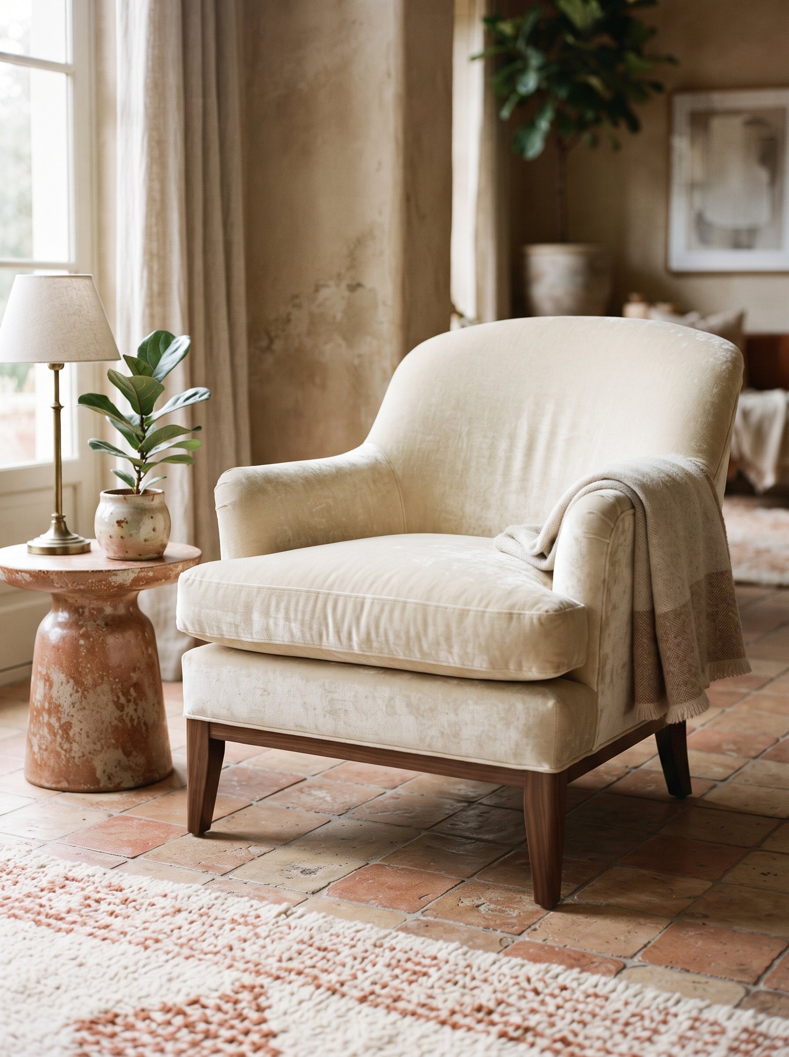
In a mostly cream, taupe, and oak room, one piece of terracotta becomes the entire personality of the space. A terracotta velvet armchair in the corner, a rust ceramic lamp beside the bed, a single terracotta leather pouf at the foot of the sofa — the surrounding neutrals make the terracotta sing without the room ever tipping into theme territory.
The restraint is what makes this work. Spread terracotta across multiple surfaces of a neutral room and you’ve built a theme by accident; keep it to one or two pieces and the terracotta becomes a deliberate point of view. Interior designers call this an “accent anchor” — the one piece that defines the room’s personality while everything else supports it quietly.
Choose your accent piece carefully. The armchair, ottoman, or large lamp works because its scale is substantial enough to feel like a decision rather than an afterthought. A tiny terracotta object in a neutral room reads as random; a mid-to-large terracotta piece reads as intentional.
Keep the accent in one zone of the room — the reading corner, beside the fireplace, the end of the sofa. Scatter terracotta across multiple zones and the single-accent effect dilutes immediately into a theme.
9. Add a Terracotta Tile Backsplash Moment
Zellige terracotta tiles — the hand-made Moroccan variety with uneven glaze, visible texture, and natural variation from piece to piece — deliver the color with built-in dimension and craft. Even a small 2×3-foot square of these tiles behind a stove, in a laundry room, on a bar wall, or around a bathroom mirror feels custom and quietly expensive.
The irregular surface of zellige is what makes the installation feel alive. The slightly uneven glazes catch light differently throughout the day, which gives the whole wall subtle movement that machine-made tiles simply cannot replicate. The small color variations across tiles read as handcrafted rather than defective.
If zellige is outside your budget, hand-made terracotta subway tiles or Spanish-made rustic terracotta tiles work similarly. Avoid machine-made imitations that try to replicate the variation with printed finishes; the fakeness shows in daylight.
Grout color matters enormously. Natural, oatmeal, or warm sand grout lets the terracotta tiles be the hero. Stark white grout fights them; dark grey or black grout creates a grid pattern that competes with the texture. Choose grout within one or two shades of the tile color for the seamless custom look.
10. Style With Dried Botanicals in Earth Tones
Dried pampas grass, wheat stems, poppy pods, amaranth, bunny tails, and bleached eucalyptus all echo terracotta’s earth palette and extend the color story without adding more objects. A tall cream vase holding dried pampas beside a terracotta chair reads as one composition rather than two separate pieces, and the organic texture of the dried stems softens the hard geometry of ceramic and upholstery.
Dried botanicals also last indefinitely, which means you can lean into the autumn-into-winter warmth of terracotta year-round without any maintenance. The slight dust that accumulates reads as patina rather than neglect; a quick shake outside every few months keeps them fresh.
Scale the dried arrangement to the room. A low floor vase with a huge spray of pampas grass works in a corner beside a sofa; a smaller trio of poppy pods in a terracotta bud vase works on a bookshelf. Vary the vase heights across your terracotta vignettes — tall-medium-short — for the same compositional rhythm that works in any styled scene.
Mix two or three types of dried stems in one vase for visual depth. Pampas plus wheat plus a few long branches of eucalyptus creates a layered arrangement that feels foraged rather than purchased.
11. Try a Pleated Terracotta Lampshade

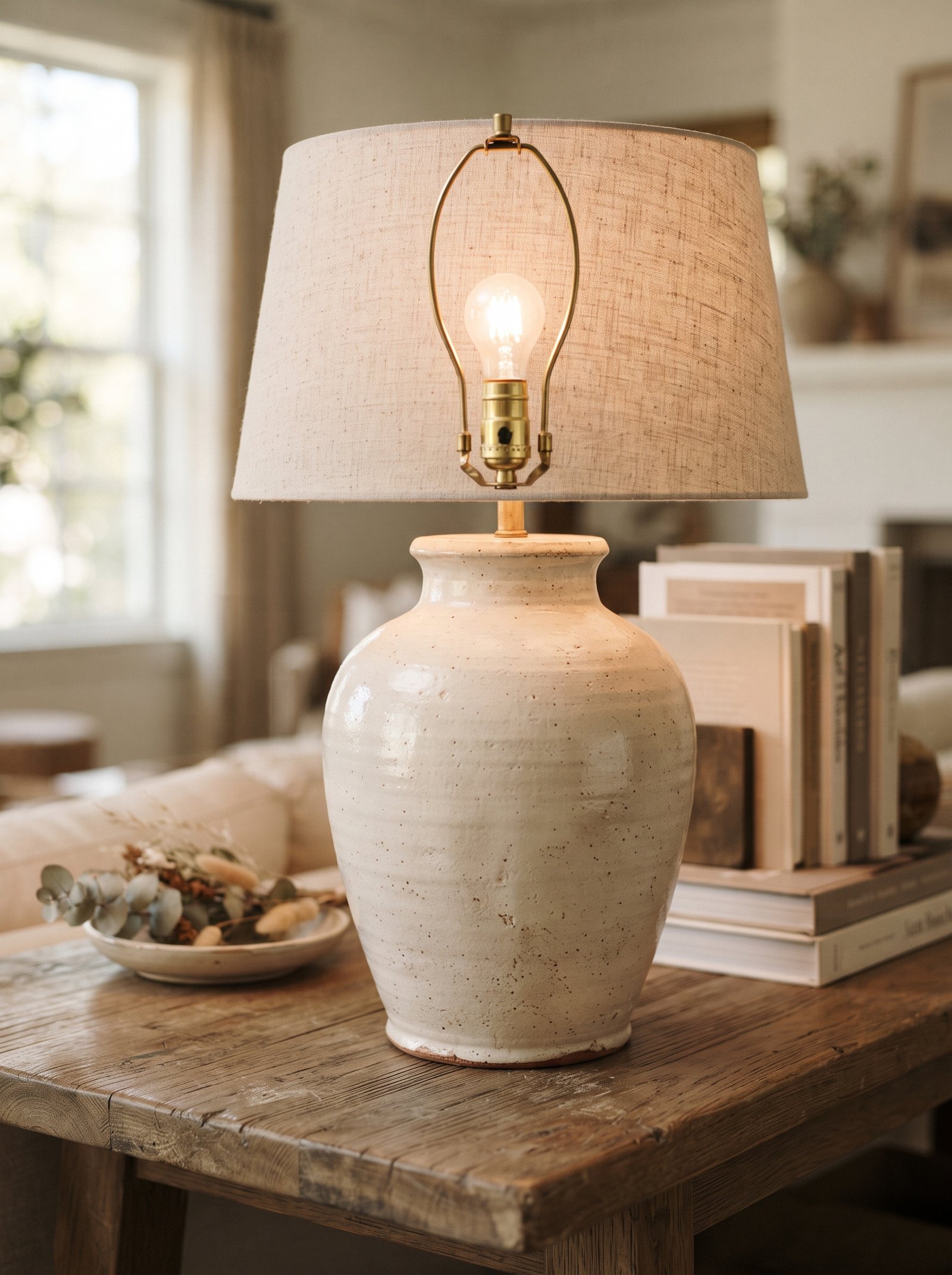
A pleated terracotta lampshade on a cream ceramic lamp base throws warm orange-tinted light into the room — the same light quality you get from a sunset reflecting off a stucco wall. It is one of the fastest and most impactful ways to shift a cool-leaning room toward warm, and the effect activates at the one time of day most of us actually use our rooms: evening.
Pair the terracotta shade with a 2700K bulb and the glow becomes rich and golden. Pair it with a cool-white bulb and the whole effect dies — the shade looks dulled, the light turns muddy, and the fixture ends up looking like a mistake. The lamp quality is 10% about the shade and 90% about the bulb inside it.
Pleated shades specifically are having a moment because the pleats catch light at different angles and create tiny shadow lines that give the whole shade dimension. Smooth drum shades in terracotta work too but read flatter.
Add a second terracotta lampshade elsewhere in the same room — a floor lamp in the corner, a smaller table lamp on the opposite side table — for the layered warm-light effect that designers use to make rooms photograph like editorial shots at any time of day.
12. Introduce Terracotta Through Framed Art
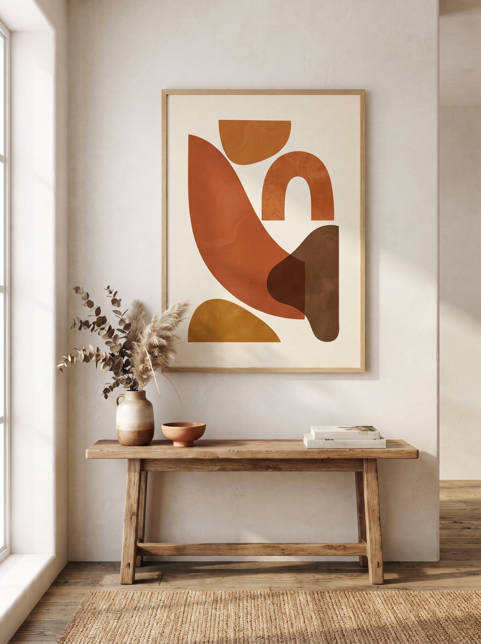
A piece of art with terracotta tones — a textured abstract in rust and cream, a desert landscape, a still life with clay vessels, a photograph of Moroccan architecture — ties the color into the room through a frame instead of asking the whole space to carry it. Art is also the lowest-commitment and most reversible way to test whether the palette belongs long-term.
Scale the art to the wall. A small framed print above a modest console reads intimate; a large statement piece above the sofa anchors the room. Both work; the sin is choosing art that’s too small for its placement — a tiny frame in a big empty wall reads as an afterthought.
Hang the piece at eye level with a lamp nearby so the terracotta glows in evening light. Picture lights above framed art are an under-used designer trick that doubles the piece’s impact. Even a small battery-powered picture light transforms a thrifted frame into a gallery moment.
For abstract terracotta art, Minted, Artfully Walls, Juniper Print Shop, and Etsy sellers like Nicola Williams and David Bromstad have extensive earth-tone collections. For original terracotta-palette art, hunt local artists at open studio events — a one-of-a-kind piece in the color you’re building a room around is worth the hunt.
13. Mix Terracotta With Natural Warm Wood Tones
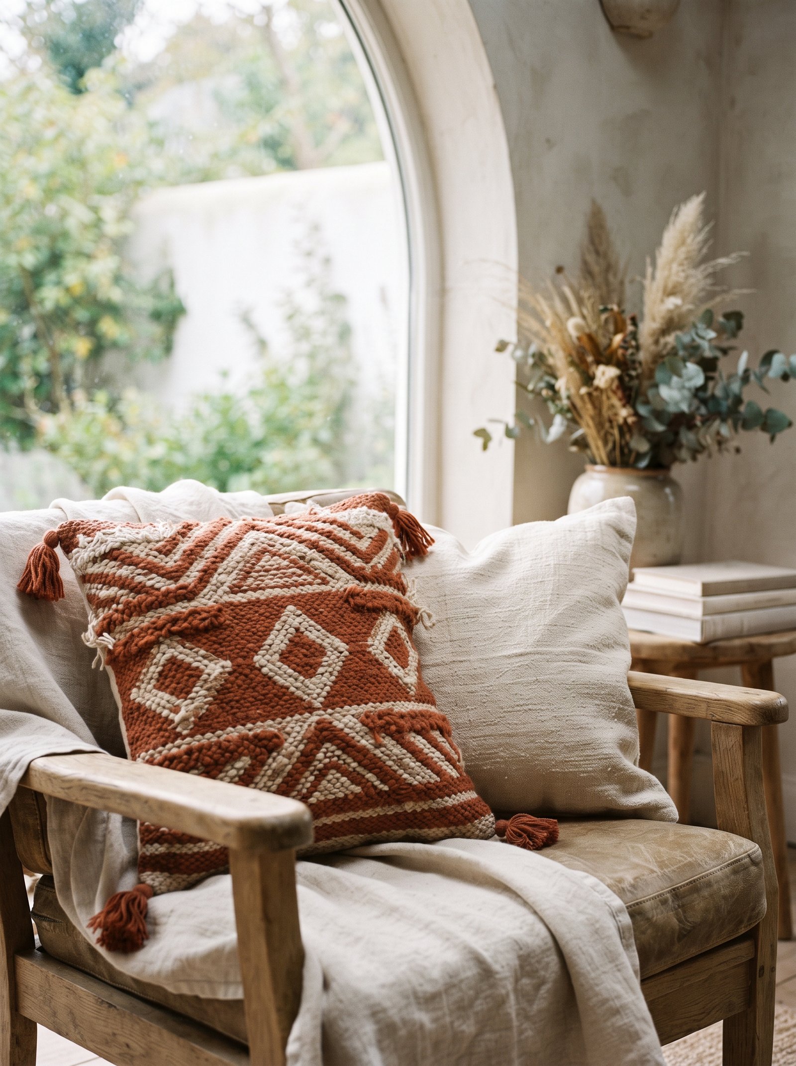
Terracotta and warm woods — oak, walnut, cherry, teak, acacia — are made for each other. The orange undertones in both materials rhyme chemically; both are earth colors that evolved under the same sun. Lean into a warm wood coffee table, oak flooring, or a walnut sideboard in a room with terracotta accents and the whole palette reads as pulled from one era, one landscape, one vision.
Avoid cool-toned woods with terracotta. Grey-washed oak, bleached pine, and whitewashed birch all have cool undertones that fight the terracotta’s warmth. The temperature mismatch flattens both the wood and the terracotta — the wood looks washed-out and the terracotta looks orange and loud.
If you’ve got cool wood floors already and you’re committed to adding terracotta, warm them up with a large natural wool rug in cream or oatmeal underfoot. The rug becomes the warm layer between the cool floor and the warm terracotta accents.
Oil-finished warm woods age even more beautifully next to terracotta than sealed or lacquered ones. The matte, slightly dry quality of oiled oak or walnut mirrors the matte quality of unglazed terracotta and the two surfaces feel kin.
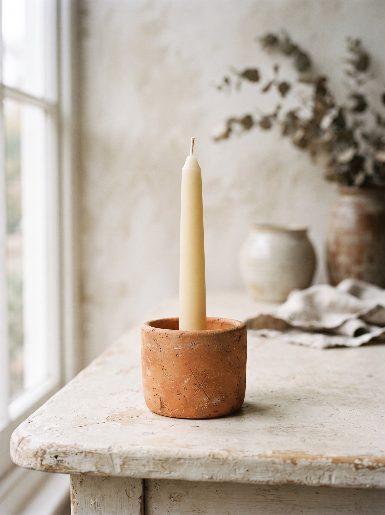
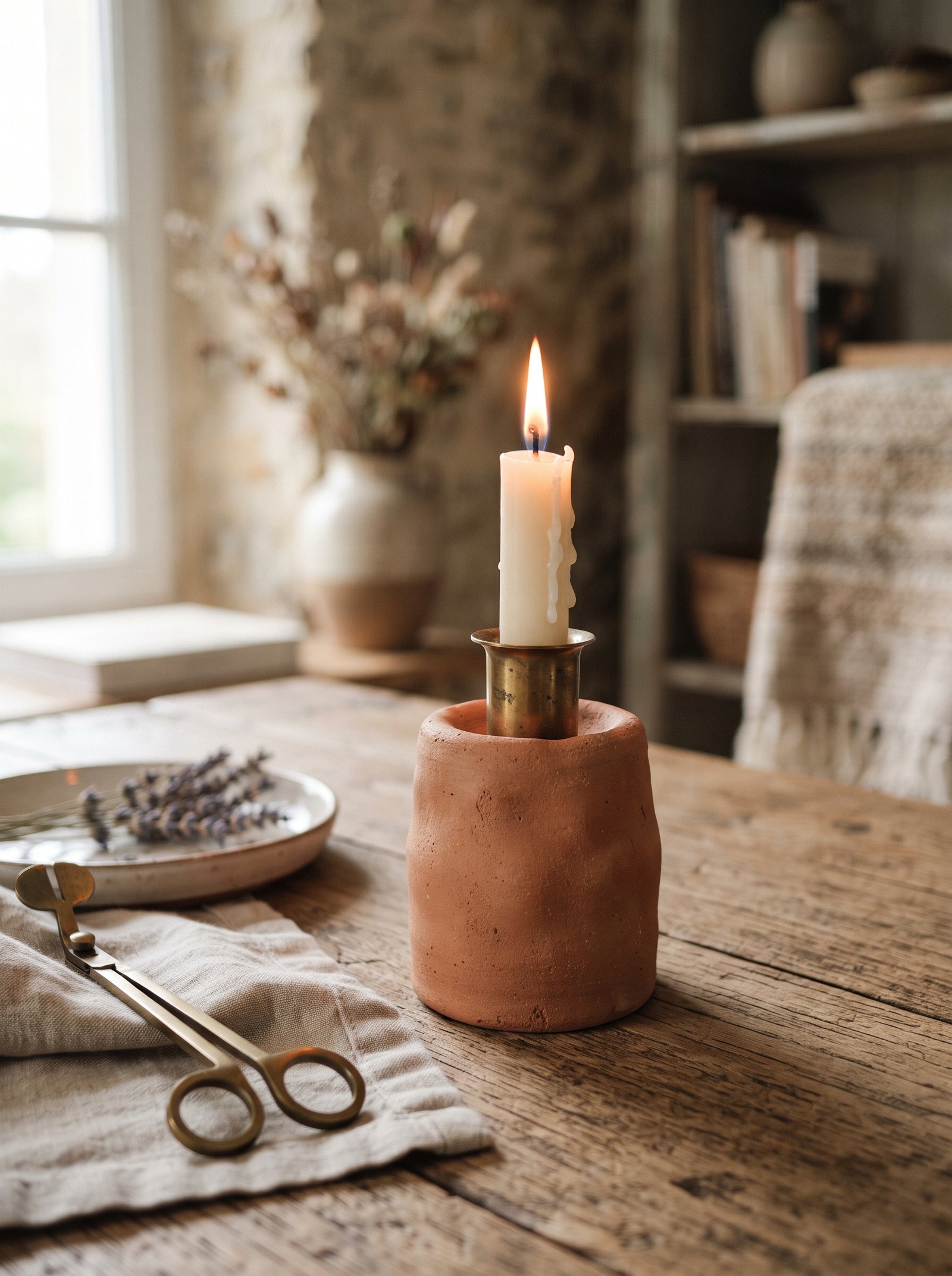
14. Add Grouped Terracotta Candles for Sculptural Warmth
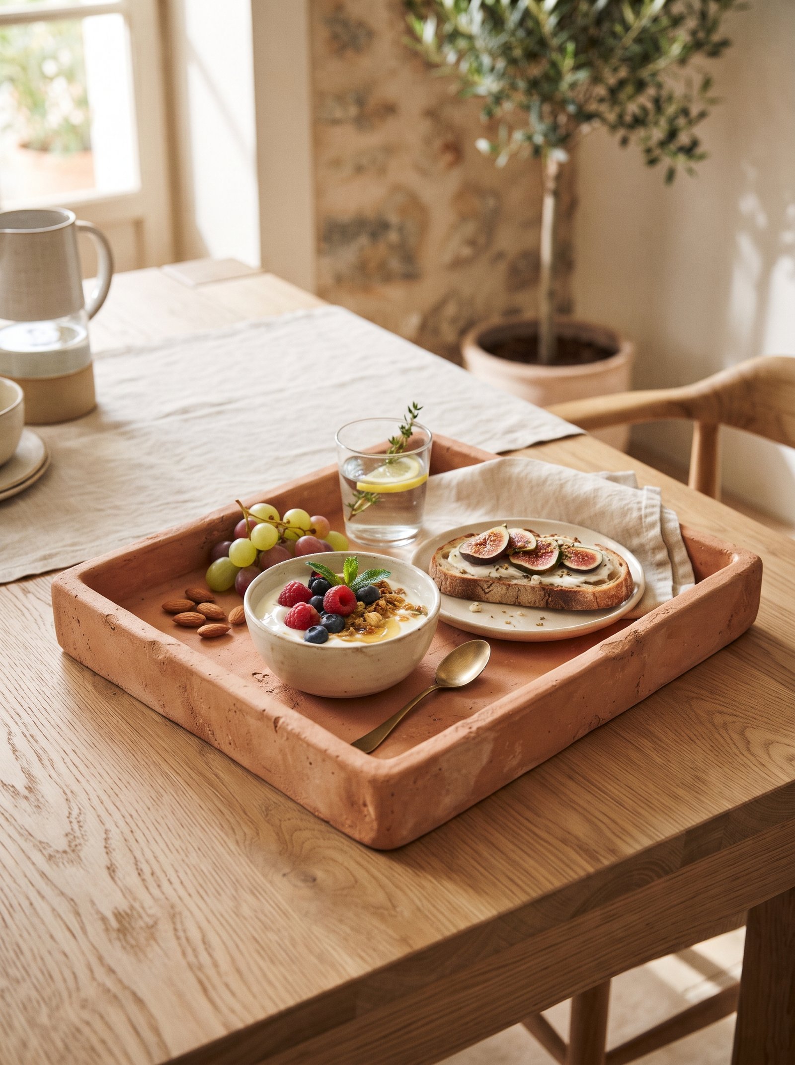
Pillar candles in muted terracotta tones, grouped in threes on a tray, mantel, or coffee table, add instant warmth without buying a single object you don’t already use regularly. Candle wax in rust, blush, and burnt orange reads as considered styling rather than seasonal decor, and the wax takes paint well so you can cast your own from solid pillars with a quick wash of acrylic.
Burn them so the tops become uneven and lived-in rather than pristine. A perfectly flat-topped candle reads as untouched and staged; a candle with a slightly carved-out well on top from being burned reads as part of someone’s actual life. The small signal of use is what separates styled from staged.
Vary the heights — one tall pillar, one medium, one short — grouped on a small tray or brass plate. The triangle composition is the same rule from coffee table styling and bookshelf styling: three objects in three heights read as curated.
Scent is optional. Unscented terracotta pillars read as sculpture; scented versions (sandalwood, fig, tobacco, leather) add a sensory layer. Avoid overly sweet or floral scents in combination with the earthy terracotta palette; they clash on the nose the way too-bright colors clash on the eye.
15. Add Terracotta Through Kitchen Linens and Soft Goods
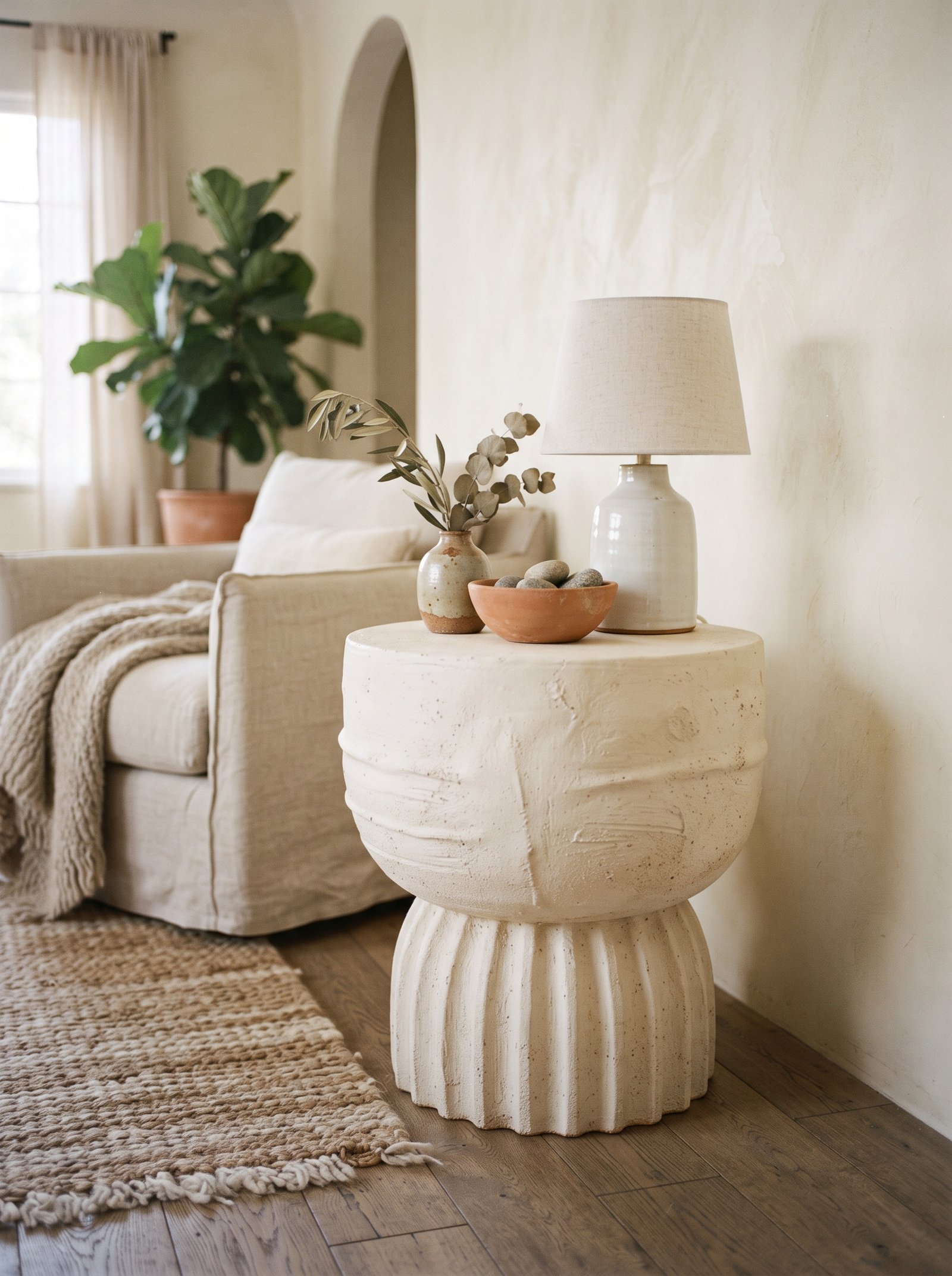
Tea towels, oven mitts, a short runner on the kitchen island, and a pair of terracotta linen aprons on hooks introduce the color into a room that’s usually dominated by stainless steel and stark white. The warmth makes the kitchen feel more like a room and less like a lab, and the fabric softens the hard surfaces of countertops and appliances in a way nothing else can.
Choose heavyweight natural linen in rust tones. It washes beautifully, softens with every laundry cycle, and the surface develops a quiet matte patina over months of use that reads as expensive. Thin polyester tea towels in terracotta look cheap after one washing and never recover.
Store the terracotta linens visibly rather than tucking them in drawers. A folded stack on an open shelf, a draped tea towel on an oven handle, a runner left on the island when not in use — the visibility is what makes the color read as decor rather than storage.
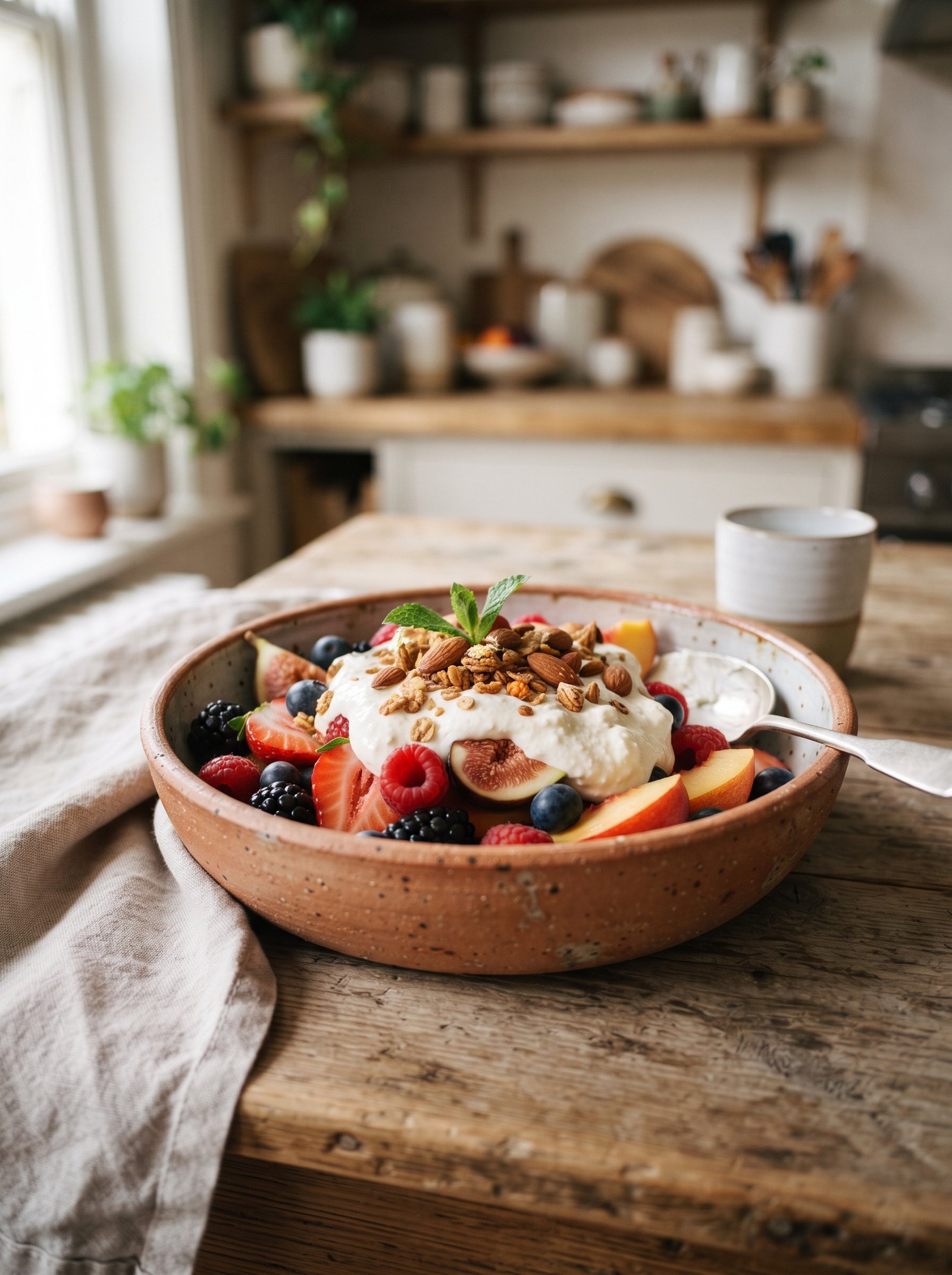
Add one terracotta ceramic piece to the same kitchen for color continuity — a bowl of fruit, a small vase of herbs, a hand-thrown vessel on a floating shelf. The textile plus ceramic combination roots the color in multiple textures and keeps it from reading as a theme.
16. Layer Terracotta With Checked or Striped Patterns
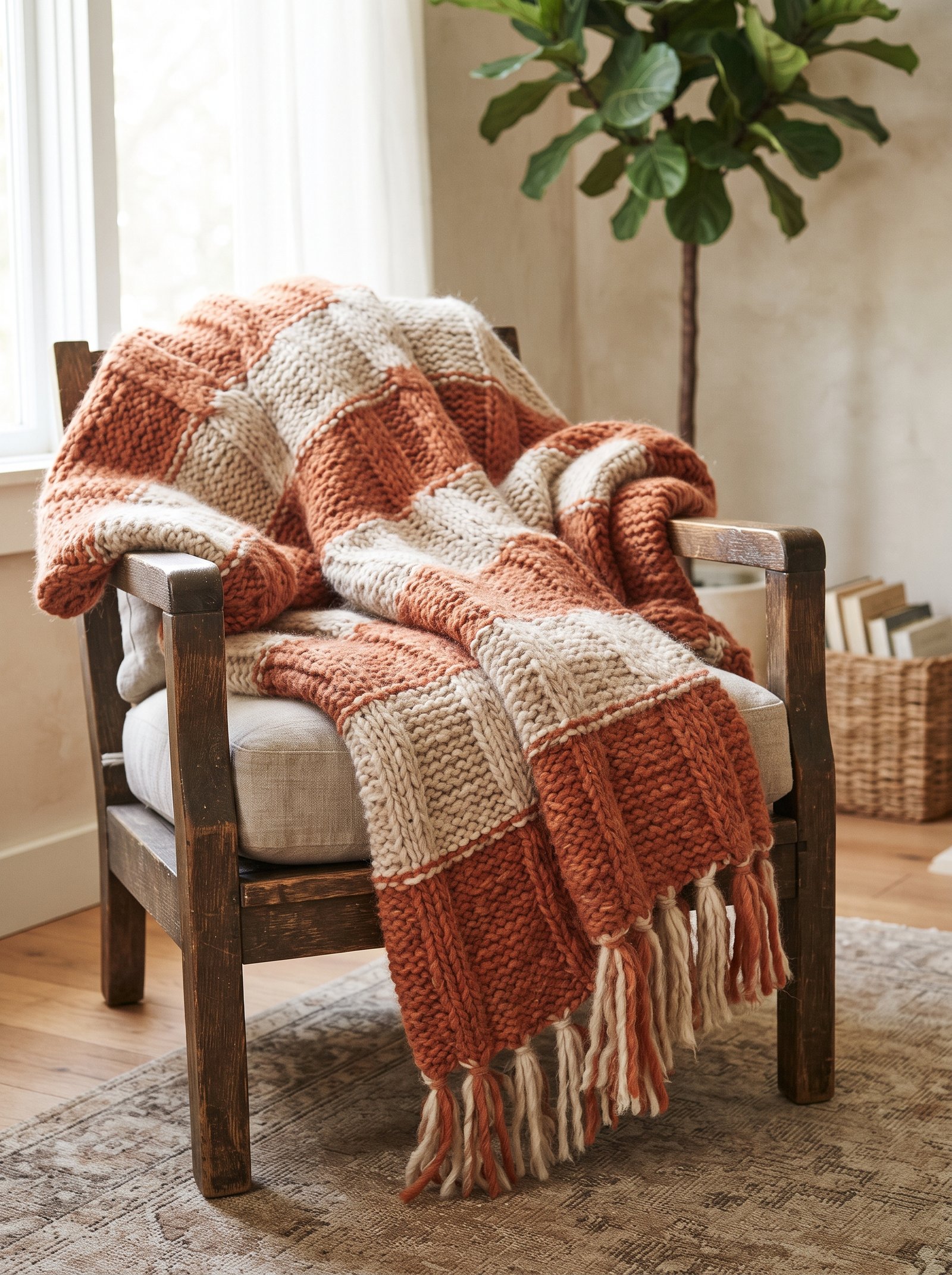
A small gingham pillow in terracotta, a muted plaid throw with rust tones, or a block-printed cushion with earthy pattern adds visual interest that solid terracotta alone rarely gets. The pattern creates micro-texture at the eye and keeps the terracotta accents from reading as flat blocks of color against the rest of the room.
Keep the pattern small-scale and the palette restrained. A tiny gingham with cream-and-rust check works beautifully; a large bold terracotta geometric pattern often fights the rest of the room. The best patterned terracotta pieces borrow from traditional block-printing, mudcloth, or Suzani embroidery — all techniques with historical craft weight that read sophisticated rather than trendy.
One patterned piece per room is almost always enough. Multiple terracotta patterns in the same space start to read like a maximalist choice that requires a lot of other confident decisions to work; one pattern among solids reads as the one point of visual interest that balances the quieter pieces.
Match the pattern’s secondary color to another color already in the room. A terracotta-and-olive gingham pillow works best in a room where olive already appears somewhere else; a terracotta-and-black geometric pillow works best in a room that already has black accents.
17. Use a Terracotta Rug as the Room’s Foundation

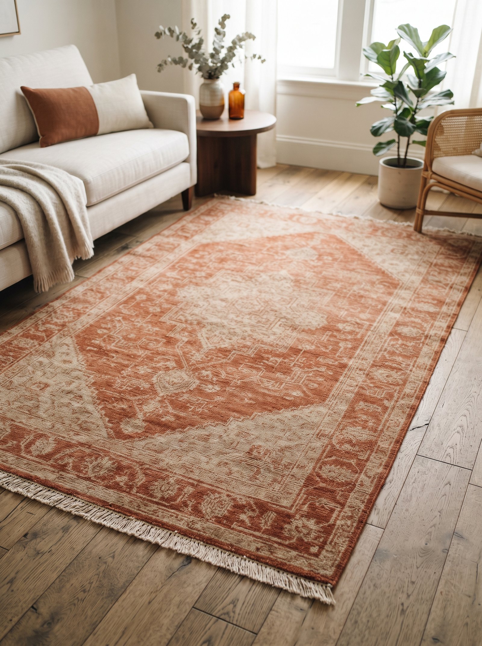
A large flat-weave rug with terracotta, cream, and olive tones under the main seating area roots the color in the room’s foundation. Everything else — pillows, art, ceramics — can then play off that palette with less commitment per piece, because the rug has already made the color decision and set the tone.
Vintage Beni Ourain, Boucherouite, and Turkish kilims often carry naturally occurring terracotta notes with the kind of irregular hand-woven character that mass-produced rugs can only imitate. Hunt estate sales, Chairish, Rejuvenation’s sister sites, and Facebook Marketplace for authentic vintage pieces in the right palette; a $400 vintage rug outperforms a $400 new one every time.
Scale is non-negotiable. A rug too small for its room creates visual islands that make the whole space feel disjointed; a rug that extends under the front legs of all major seating pieces unifies the room. Measure before you buy and err a size up.
The rug’s palette becomes your room’s palette. Pull the rug’s secondary and tertiary colors — cream, olive, charcoal, whatever appears — into the pillows, art, and accessories around it, and the room reads composed with surprisingly little additional effort.
18. Add Terracotta Dinnerware for Everyday Elevation
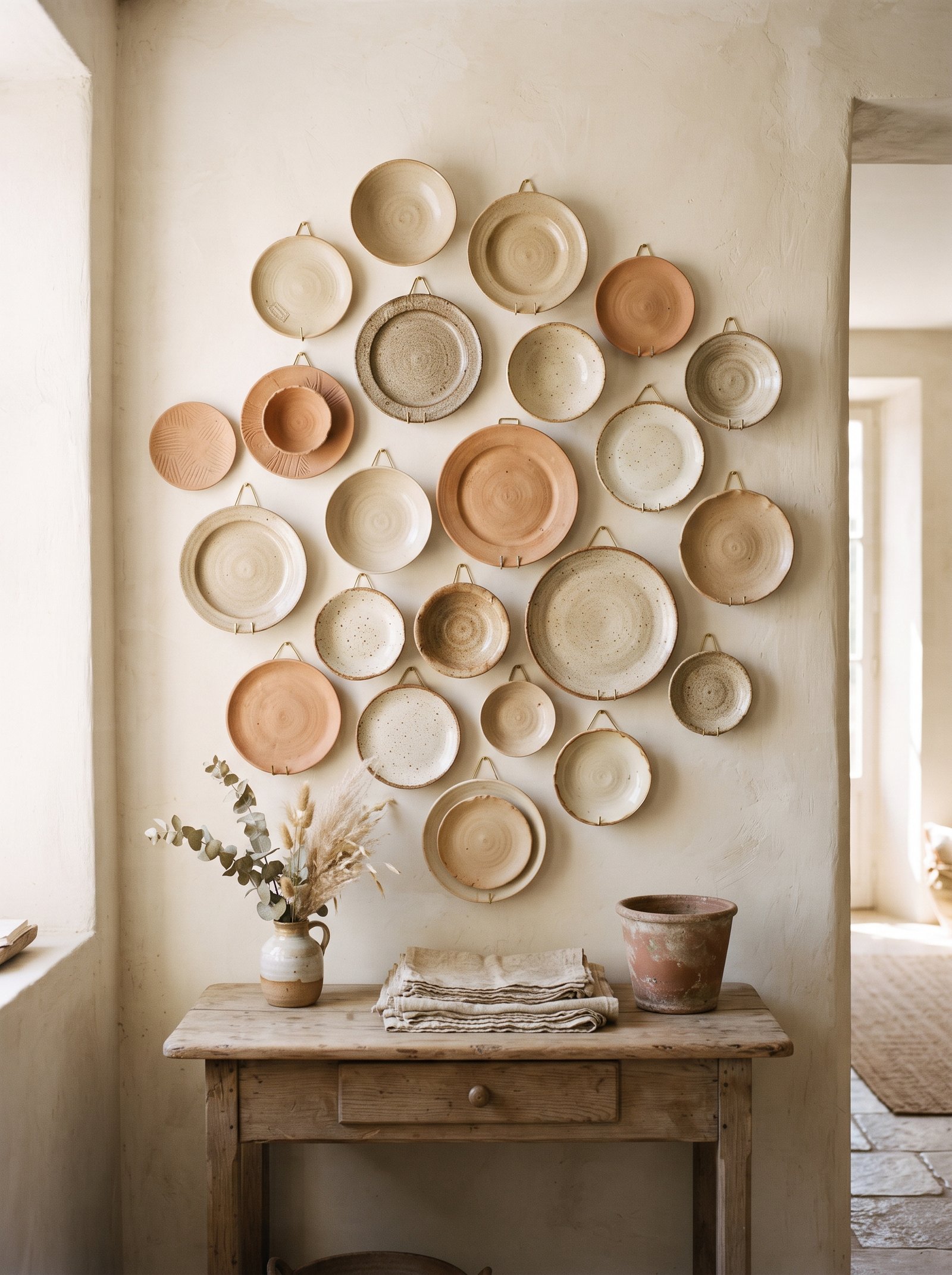
A set of terracotta or rust-glazed stoneware plates layered under cream linens on a dining table makes every meal feel composed. The color photographs beautifully for everyday dinners too — the kind of small detail that quietly elevates ordinary rituals and gives you a reason to actually set the table rather than eat off the kitchen counter.
Mix in cream and white pieces so the terracotta reads as a layer rather than a complete set. Alternating cream dinner plates with rust salad plates on top, or terracotta chargers under cream mains, creates visual depth and makes the dinnerware feel curated rather than catalog-ordered.
Hand-thrown stoneware ceramics in terracotta tones from East Fork, Jars Ceramics, Costa Nova, and small Etsy ceramicists age beautifully and resist chipping better than cheap mass-produced alternatives. The small premium per piece pays off across years of daily use.
Store the terracotta pieces visibly in an open hutch, on open shelving, or in a glass-door cabinet so they become part of the room’s styling even when they’re not on the table. A stack of beautiful rust plates on a kitchen shelf is a decor moment in itself.
19. Add a Terracotta Upholstered Headboard or Bench
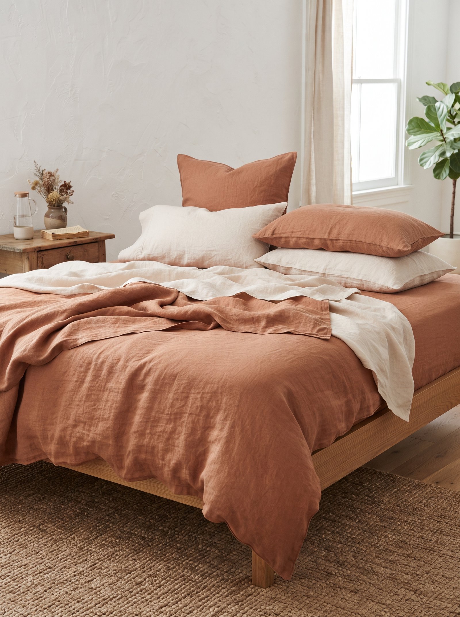
An upholstered headboard or small bedroom bench in terracotta velvet, boucle, or linen anchors a bedroom in the color without covering a whole wall. The terracotta becomes the architectural moment of the room against cream bedding and oak floors, and the single large piece reads as a decisive design choice rather than an accent accident.
Boucle in a rust tone photographs as a texture-first piece and reads modern despite the warm palette. Velvet in terracotta reads richer and more traditional. Linen reads most casual and family-friendly. Choose the fabric for the mood you want the room to carry; all three work with the color but set very different tones.
A terracotta bench at the foot of the bed is the lower-commitment version of this idea. It brings the color in at a smaller scale, doubles as functional seating or a landing zone for the throw blanket at night, and can be moved to another room if you ever change your mind.
Keep the bedding and curtains cream so the terracotta piece carries the color story alone. Adding more terracotta accents around a terracotta headboard quickly tips the room into theme territory.
20. Combine Terracotta With Black for Modern Edge

If a terracotta-heavy room starts to feel too soft or too warm, add black. Matte black hardware, black picture frames, a black floor lamp, a black-and-cream rug underfoot — black grounds terracotta and modernizes it in a way nothing else can touch. The combination of warm earth plus cool black is the exact palette that pulls terracotta into contemporary design.
Just one black element per room is usually enough. Too much black and the balance shifts cold; too little and the terracotta can read nostalgic. The sweet spot is a single substantial black piece — a floor lamp, a bookshelf painted black, a set of black-framed art, a black metal coffee table — serving as the counterpoint.
Matte black finishes work better than glossy with terracotta. The matte surface absorbs light the same way the matte terracotta ceramics do, which creates visual harmony across different materials. Glossy black introduces a sheen that fights the earthiness of the terracotta palette.
For hardware specifically, swap out any brass or chrome pulls on terracotta-painted furniture or in terracotta rooms for matte black. The hardware change is small, cheap, and transforms the whole piece immediately.
21. Paint One Door in a Terracotta Tone
Painting one interior door in a terracotta tone — a pantry door, a bathroom door, the back of a bedroom door, a closet door — delivers a shot of color with almost zero commitment. It’s reversible, inexpensive, uses less than a quart of paint, and tests the palette in a highly contained zone that you can live with for months before deciding whether to expand it.
Satin or matte finish, not glossy. Terracotta glossy reads cheap and dated — the kind of finish you’d see on a 1990s cabinet repaint. Matte reads custom and current. Eggshell is the sweet spot for most doors, offering durability close to satin without the sheen.
Pair the painted door with warm brass or matte black hardware. The hardware upgrade is often the detail that pushes the whole door from decent to custom. Even on a $12 can of paint, the right hardware adds the finish of a $600 artisan door.
Consider painting the inside of a closet door terracotta — a small moment that only you see every morning when you dress. It makes a mundane routine feel considered without requiring any public-facing commitment.
22. Add Terracotta Through Styled Books on Open Shelves

Hardcovers with rust and burnt-orange spines stacked on a coffee table or styled on a shelf introduce terracotta into the room through objects you already own. Browse your own bookshelves for the color before you buy anything new — most people own more rust-spined books than they realize, and surfacing them to the front of the shelf is a free styling move.
Pair with cream and black spines to create a small color story within the stack. A tight vignette of three books (one rust, one cream, one black) topped with a small terracotta ceramic reads as a $500 bookseller display built from your existing collection.
Dust jackets with saturated terracotta covers work especially well. If a book you love has a boring publisher dust jacket, remove the jacket and style the hardcover underneath — publishers often give the book itself a beautiful cloth-and-rust cover under a utilitarian dust jacket.
Second-hand bookshops and estate sales are the best source for terracotta-palette hardcovers. Vintage art monographs, mid-century cookbooks, and old travel books all tend toward earth-tone spines; a stack of $4 vintage hardcovers in rust tones outperforms a dozen new ones in matte finish.
23. Create a Terracotta Reading Nook

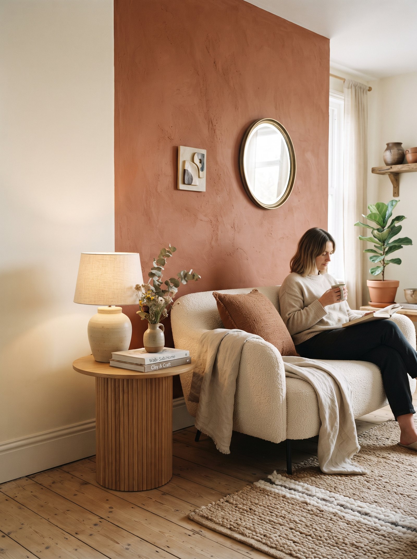
A small reading corner with a terracotta armchair, a cream throw folded over the back, a warm-toned oak or walnut side table, and a brass floor lamp arcing overhead becomes the room’s cozy anchor. Even in a cool-leaning space with grey walls and pale floors, a terracotta nook pulls the eye and the body into warmth whenever you walk by.
Add a terracotta ceramic lamp with a warm 2700K bulb on the side table and the nook becomes functional at any time of day. Morning coffee in that chair, afternoon reading, late-evening book-with-a-glass-of-wine — the lighting setup makes the corner usable across the full daily cycle.
Scale the nook to the room. A big armchair in a small living room overwhelms; a compact slipper chair in a large room reads as a lost accessory. The chair should fit the proportions of the space while still being generous enough to actually settle into.
The small styling details matter — a small stack of books on the side table, a candle, a woven basket beside the chair for a throw. A single empty terracotta chair in a corner reads as furniture; the same chair with a small styled vignette around it reads as the room’s most inviting zone.
24. Pair Terracotta With Boucle Textures for Modern Softness
Boucle fabric — the knobbly, loopy, cream wool look that defined the past five years of upholstery — reads as modern and expensive, and it loves terracotta accents in a way no other upholstery fabric does. A cream boucle sofa with two terracotta linen pillows and a knit throw is the exact modern-warm formula interior designers return to again and again on project after project.
Keep the sofa cream and let the terracotta live in the accents. Terracotta boucle is possible but much harder to style — the texture and the color together often read heavy, and the boucle’s natural visual weight gets amplified by the warm tone until the whole piece feels oversized.
The texture contrast is what makes this combination sing. The nubbly cream boucle against the smooth matte terracotta linen gives both fabrics a role in the composition — the boucle brings tactile texture, the linen brings color and sleekness, and together they feel like two intentional notes rather than one single statement.
Add one more texture to complete the vignette: a woven jute rug underfoot, a knit cream throw across the back of the sofa, or a leather ottoman as an accent. Four textures (boucle, linen, jute, leather) in a cream-plus-terracotta palette is the formula for a sofa composition that photographs beautifully and feels intentional in real life.
25. Finish With Living Plants in Classic Unglazed Terracotta Pots

The oldest trick on the list and still the best one: a cluster of indoor plants in classic unglazed terracotta pots in a sunny corner. Olive trees, rubber plants, fiddle leaf figs, pothos, and succulents all look better in terracotta than in plastic or ceramic alternatives, and the color story resolves itself without any additional effort.
The color is literally the ancient one for plant pots because terracotta clay breathes with the roots — moisture passes through the walls, air circulates, and plants in terracotta pots are generally healthier than plants in sealed modern alternatives. Function and style align perfectly, which almost never happens in decor decisions.
Scale the pots to the plants. A large olive tree needs a 16-20 inch pot to look proportional; a small succulent lives happily in a 4-6 inch pot. The wrong-sized pot — too big for a small plant, too small for a large one — fights the room’s visual balance even when the color is right.
Group three to five pots in varying sizes together in a sunny corner, on a plant stand, or along a windowsill. The grouping reads as a styled moment; one lonely pot in the middle of a room reads as unfinished. Let the pots become a corner of the room on their own, and the whole space benefits from the collective warmth.
Pulling the Modern Terracotta Palette Together
Modern terracotta works best as an accent rather than a theme. One wall, one chair, one carefully styled grouping of ceramics — paired with cream, olive, oak, and black — gives the color room to breathe and the space room to feel current rather than dated. The warmth terracotta brings to a cool-leaning home is almost impossible to replicate with any other color, and the historical weight of the color (clay, earth, sun, Mediterranean architecture) means it never reads as a trend chasing itself.
Start small. One hand-thrown vessel on the mantel, one rust linen throw on the sofa, one terracotta candle grouping on the coffee table. Live with those choices for a few weeks. Watch how the color behaves in your light, with your furniture, against your existing walls. The decisions about where to go bigger — a painted door, a reupholstered armchair, a tile backsplash, an entire powder-room wall color — will become obvious once you’ve seen the color at work in small doses.
The pairings that keep terracotta modern are the ones that counter its warmth with something restrained: cream not white, olive not teal, oak not grey-washed, matte black not glossy. Those small corrections are the difference between a terracotta room that reads as sophisticated 2026 decor and one that reads as a 1998 Mediterranean restaurant. The color itself is the same; the context is everything.
For more earth-tone, neutral, and warm-palette styling that holds up across years rather than seasons, see our guides on warm neutral living room ideas, sage green bedroom ideas, cozy fall living rooms that are not all orange, master bedroom boutique hotel decor, and IKEA hacks that look custom. Terracotta plays beautifully with every one of those palettes and style directions, and the layered references across these guides will help you build a whole-home palette rather than one isolated room.
Take our 2-minute Decor Style Quiz
Answer 10 quick questions and discover whether you’re Modern Boho, Scandinavian Minimalist, Modern Farmhouse, Mediterranean, Japandi, or Classic Traditional — plus your color palette and 3 articles made for you.
Start the Quiz →Modern Terracotta Decor FAQs
What colors go with terracotta walls?
Terracotta pairs best with warm cream (not stark white), deep olive green, warm wood tones like oak and walnut, matte black for modern edge, and soft brass. Avoid cool blues and stark whites which make terracotta look dated.
Is terracotta still in style in 2026?
Yes. Modern terracotta is one of the most sophisticated accent colors in current interior design, used extensively in Mediterranean, Japandi, and modern-boho interiors. The trend is matte finishes and hand-thrown ceramics rather than glossy 1990s terracotta tile.
How do I use terracotta without making my home look dated?
Keep terracotta as an accent, not a theme. One wall, one armchair, or one grouping of ceramics is enough. Pair with warm cream rather than stark white, and avoid Southwestern decor accessories that trigger the dated 1990s association.
What is the best terracotta paint color?
Clare Atomic Orange, Farrow & Ball Red Earth, Benjamin Moore Audubon Russet, and Backdrop Fiero are the modern terracotta paints that read sophisticated. Choose satin or matte finish rather than glossy.
Our interactive tools can help
Take the style quiz, generate a beige wall color palette, or calculate the perfect pillow stack for your bed — all free, all in under 2 minutes.
Explore Tools →