25 Coffee Table Styling Ideas Straight From Designers
A well-styled coffee table does what a thoughtful host does — it anchors the room, invites you to sit, and gives the eye a reason to linger. Styled badly, the same surface becomes a dumping ground for remotes, half-read mail, and whatever landed there this morning. The difference between a coffee table that reads editorial and one that reads tolerated is not the table, the budget, or the taste of the owner. It is a short, repeatable set of styling rules — the ones every editorial stylist, interior designer, and small-shop decor pro uses on project after project.
Those rules are consistent because they come from how human perception actually works. The eye reads composition — proportion, height, texture, negative space, the triangle of three — long before it reads price. A $20 ceramic from Goodwill styled with the rules on this list outperforms a $400 designer vase placed carelessly, every time. The budget doesn’t matter nearly as much as the application does.
The 25 coffee table styling ideas below pull from the stylists who shoot shelter magazine spreads, the small-shop interior pros who style client homes week after week, and the stagers whose work sells six-figure listings. Each idea is small enough to try tonight with pieces you already own, and sturdy enough to still look right when guests arrive on Saturday. Pick two or three. The table will transform in an afternoon.
1. Start With a Tray as Your Anchor
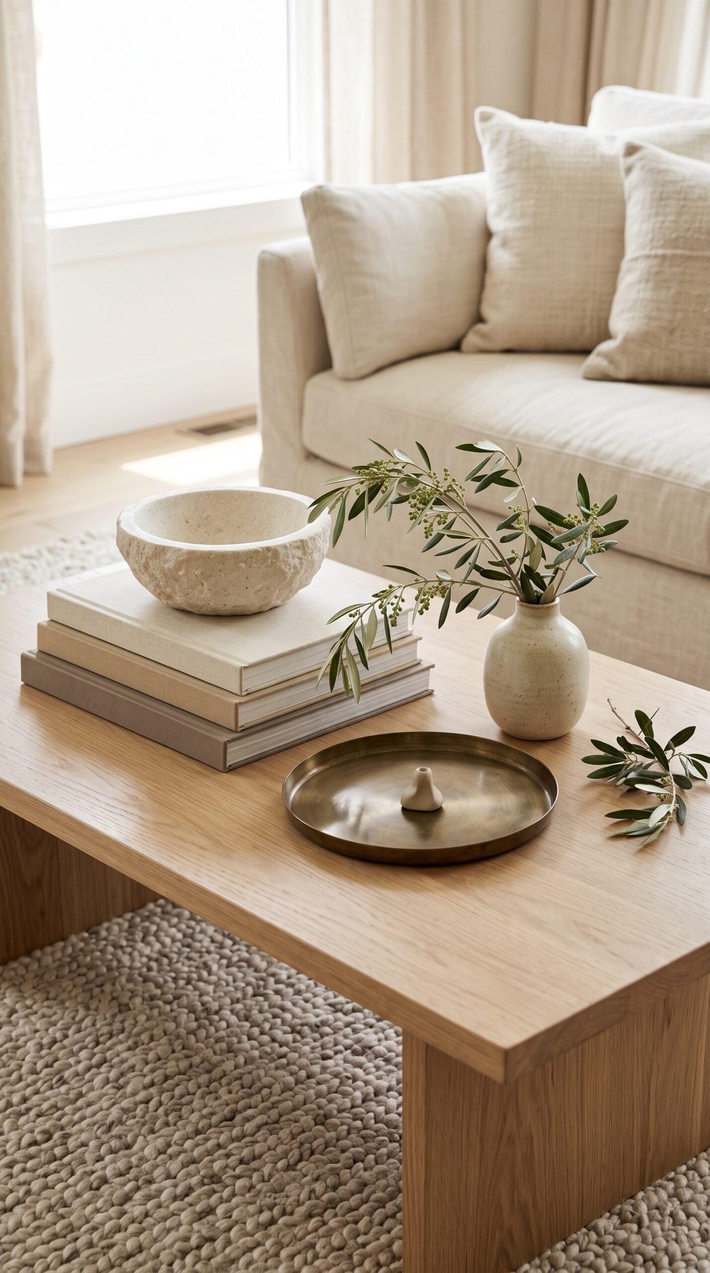
Every well-styled coffee table starts the same way: a tray. The tray draws an invisible frame around your styling, which stops the arrangement from looking like a random collection of unrelated objects. Round trays soften square tables, square trays sharpen round tables — pick the shape that opposes your tabletop and the contrast does the heavy lifting for you. The move is quiet, nearly invisible to anyone who doesn’t study interior design, and absolutely transformative in impact.
Size matters more than material. The tray should cover roughly a third of the tabletop, no more. Leave two-thirds of the surface open so there is still a usable landing zone for a coffee cup, a book, or your phone. If every square inch is styled, nothing on the table feels usable, and the whole room reads as a showroom instead of a home. Function and style are not opposites; they are partners.
Rattan, brass, marble, lacquered wood, and leather are the five tray materials that reliably photograph well and age beautifully across decades of use. Rattan reads warm and tactile; brass reads elegant and reflective; marble reads substantial and architectural; wood reads classic and quiet; leather reads soft and tailored. Any of these outperforms the kind of cheap plastic trays sold alongside dollar-store housewares, which tend to look exactly as inexpensive as they are and ruin the whole vignette underneath.
If your table has a strong material of its own (walnut, oak, marble, travertine), consider contrasting the tray with it. A brass tray on a walnut table, a rattan tray on a marble top, a leather tray on glass — the material contrast prevents monotony and gives the eye another layer to register as thoughtful.
2. Build Height in Threes
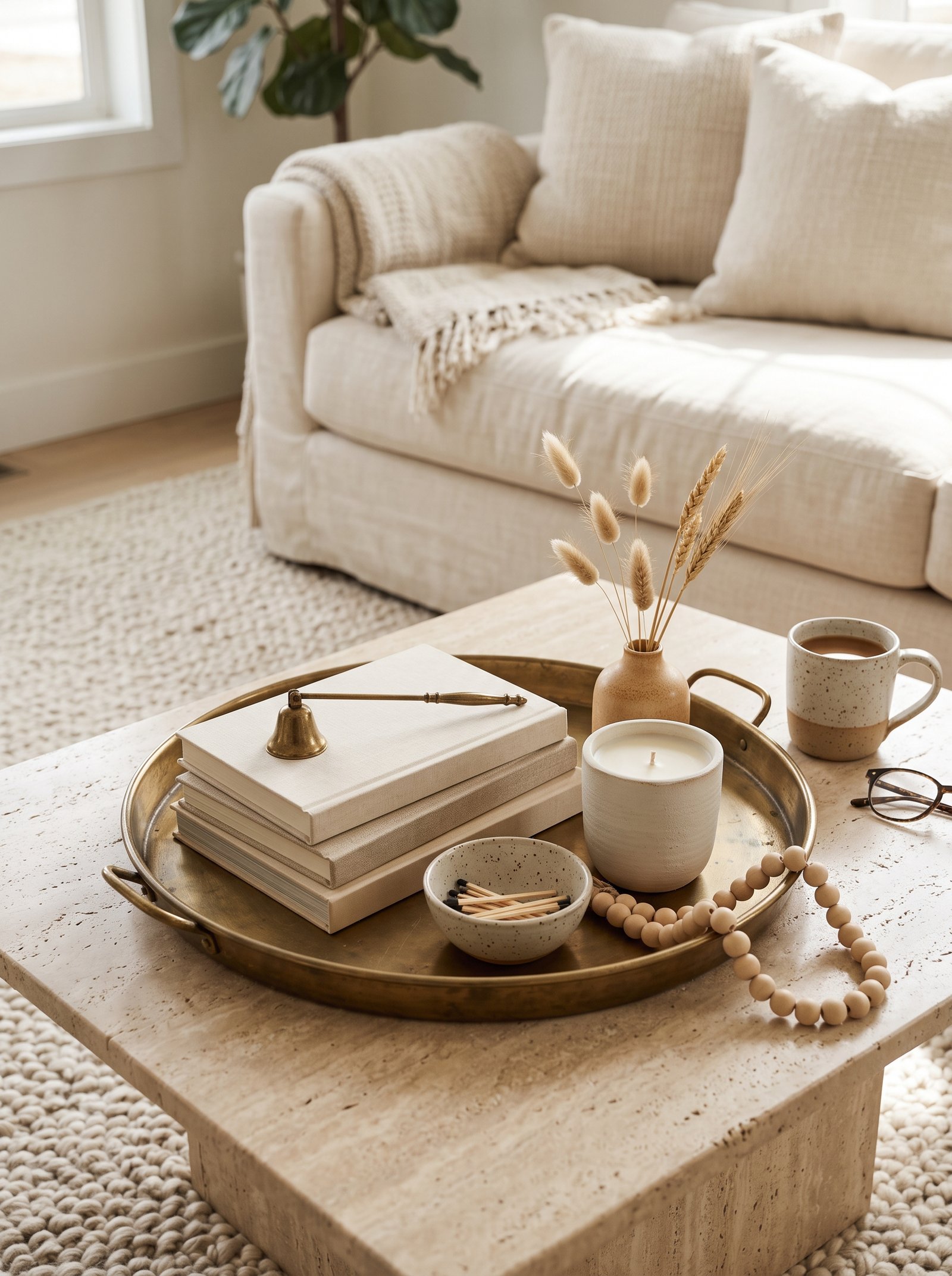
The oldest rule in interior styling still holds: three objects at three different heights. One tall piece (a vase with branches, a slim lamp, a sculptural ceramic), one medium piece (a stack of books, a modest ceramic, a small sculpture), one short piece (a bowl, a candle, a coaster set). The arrangement reads composed and considered because the eye reads it as a triangle — the most stable, most visually satisfying shape in all of composition theory.
The quick test: stand up and look down at the table from above. If the three items form a triangle instead of a straight line, you are done. A straight-line arrangement reads like a shelf at a hardware store; a triangle arrangement reads like someone with taste walked in and set things down. The difference is thirty seconds of rearranging and the entire visual quality of the table shifts.
The height differences matter more than the specific pieces. Three objects of similar height — three ceramic vases of the same size, three identical candlesticks — read flat and museum-like. Three objects at distinctly different heights — a 14-inch vase, a 6-inch sculptural piece, a 2-inch bowl — read dynamic and alive. Measure if you have to; the proportions carry the composition.
Add a fourth or fifth object only if you have room and only if they fit the triangle rather than disrupting it. Most tables look best with the clear three-object vignette; the urge to add more is the enemy of a composition that already works.
3. Stack Books, But Only the Right Ones

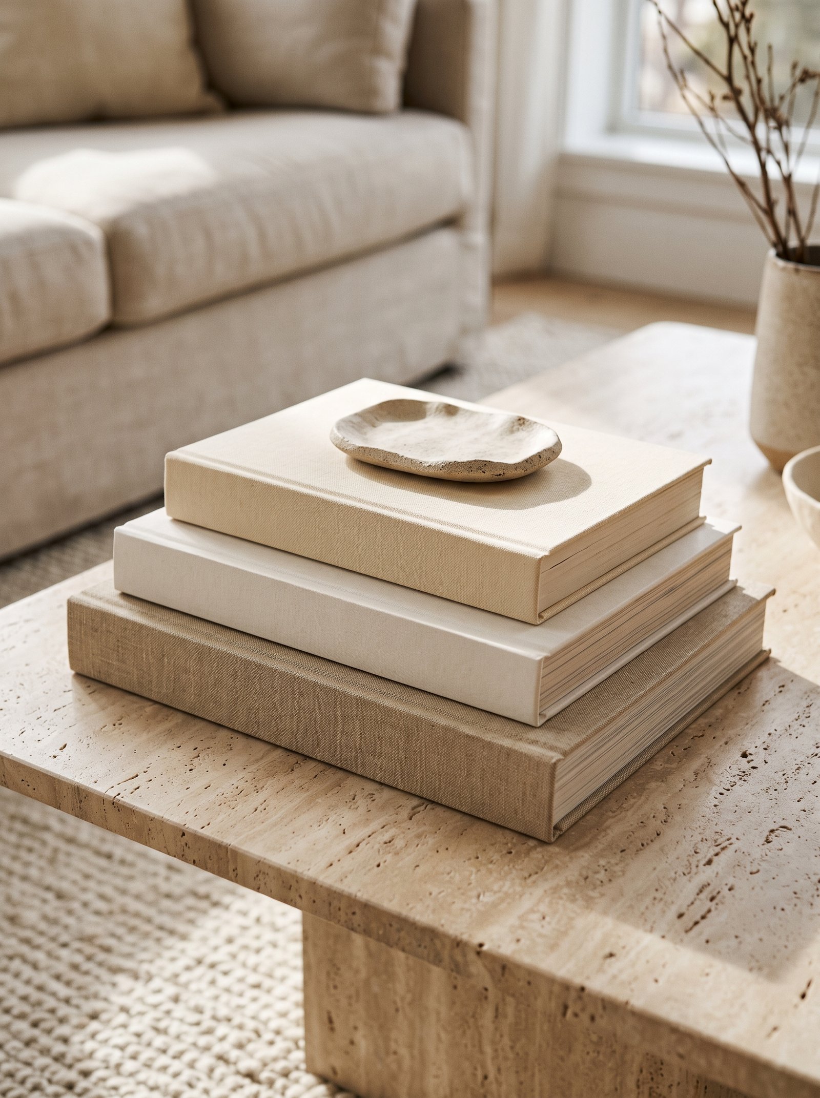
A stack of books is a styling cheat code — it adds instant height, color, personality, and the suggestion that someone intellectually curious lives here. But not every book works. Reach for large-format hardcovers with cloth or linen spines, muted or earth-toned covers, and titles that mean something to you (a travel book from a trip, a cookbook you actually use, an art monograph you flip through, a design book you reference). The books tell a story about the owner without any explicit effort.
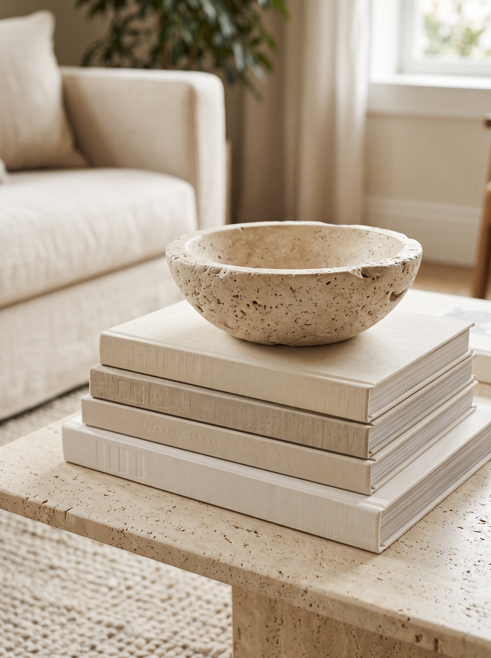
Stack three or four at most, biggest on the bottom, and crown the stack with something small — a brass object, a hand-thrown ceramic piece, a smooth stone from a beach you remember. The topping object is what elevates the stack from storage into decor. Without the topping piece the stack reads as unread books; with it, the stack reads as deliberate composition.
Avoid shiny mass-market dust jackets — they bounce light awkwardly, date the room instantly, and photograph as cheap. Either remove the dust jacket (publishers often give the hardcover beneath a beautiful cloth-and-foil treatment that looks far better than the jacket) or restrict yourself to books whose jackets are matte, textured, or muted in color.
Thrift stores, used bookshops, and estate sales are the best source for beautiful coffee-table-ready books in bulk. Vintage art monographs, Taschen editions, and classic photography books from the 1970s-1990s all have the heft, color palette, and visual weight that style a table beautifully.
4. Add One Living Thing
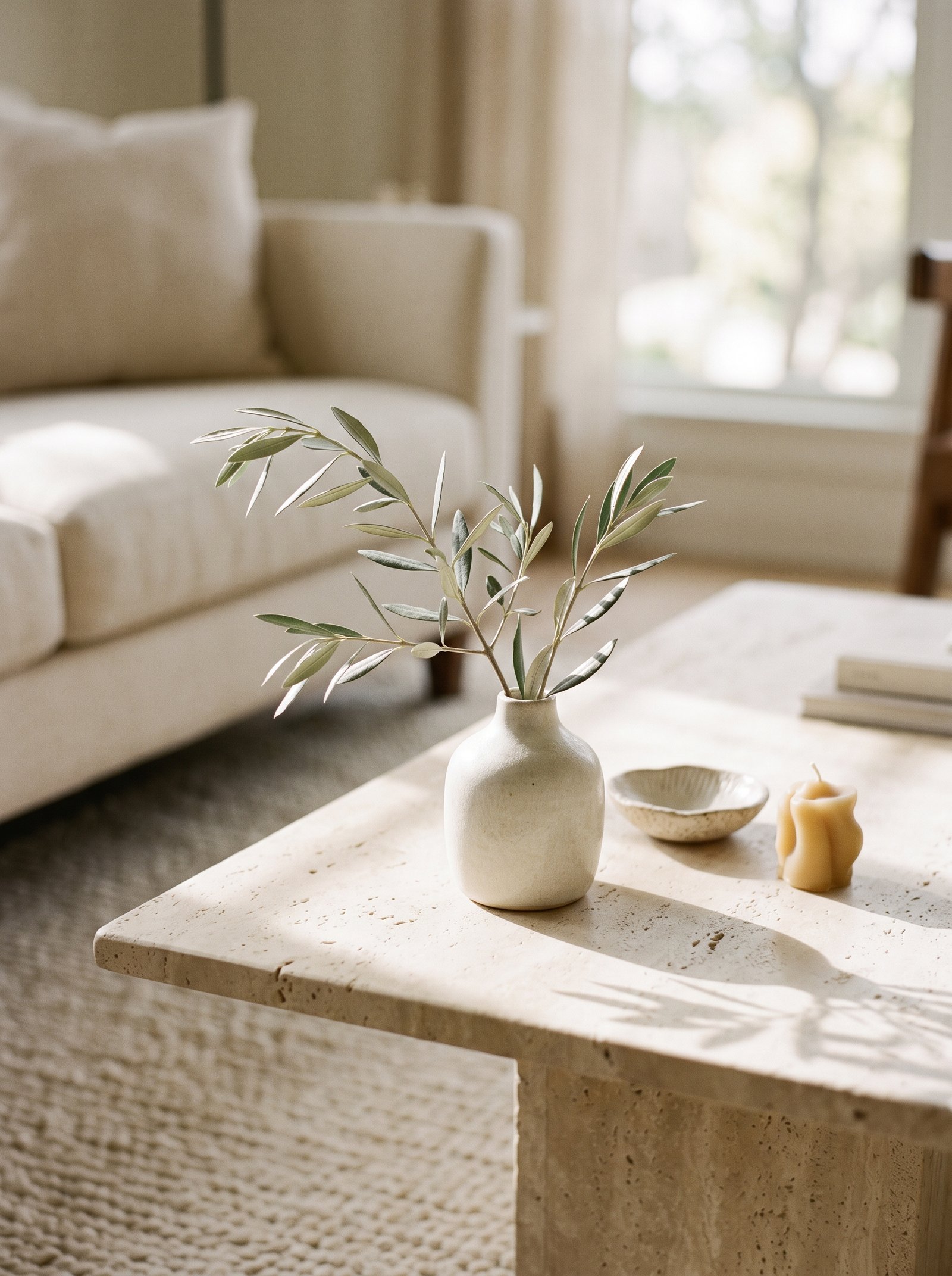
Every well-styled coffee table has something alive on it — fresh branches, a trailing plant, a bowl of fruit, even a sprig of herbs clipped from the kitchen windowsill that morning. Living elements add movement, a tiny bit of unpredictability, and a scale shift that no ornament can mimic. They are also the one element that changes with the seasons without any effort from you.
Branches are the most forgiving choice for coffee tables because they last for weeks or months without water. Eucalyptus lasts weeks; olive branches last months when dry; magnolia leaves hold their shape all winter; dried pampas and bleached palm fronds last indefinitely. Keep stems tall enough to break the horizon line of your sofa back; that is what gives the table its sense of height from across the room.
Fresh flowers work beautifully but require commitment. Change the water every three days, trim the stems, and remove any that have passed their peak. Styled rotting flowers destroy the vignette instantly. If you cannot commit to fresh florals, dried branches outperform fake flowers nine times out of ten.
The living element also serves a secondary purpose — it brings organic texture that contrasts with the hard geometries of ceramics, glass, and metal usually dominating a styled table. The contrast reads as the room being lived in rather than staged for a magazine shoot.
5. Group Candles in Odd Numbers
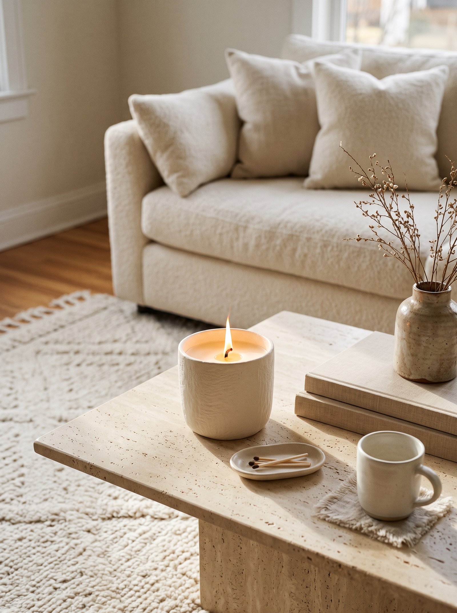
Candles are a coffee-table staple because they do two things at once — they sit as sculpture during the day and become mood lighting at night. Group them in threes or fives, in varying heights, and in muted tones (cream, taupe, charcoal, warm beige, terracotta). Skip pure white if your room is warm; white reads cold and clinical next to warm wood and earthy ceramics.
Vary the heights to the same ratio you use for the overall table composition — one tall, one medium, one short. Three pillar candles at the same height read as a store display; three pillars at different heights read as styled. Candlestick holders with tapered candles work the same way; mix heights and the composition reads intentional.
If you do not actually burn the candles, consider the wick tops. Trim them, smudge the tips with a touch of ash, so they look lived-in rather than brand-new. A perfectly unused candle with a stark white wick reads as staged; a slightly burned candle reads as part of your actual life.
Beeswax candles have the warmest glow; soy candles burn cleaner; paraffin lasts longest. Any of these outperforms the cheap scented pillars from drug stores, which tend to have artificial fragrance that reads too strong in a styled living room.
6. Use Negative Space Like a Pro

The biggest mistake amateur stylists make is filling every surface. Designers do the opposite — they style a corner, leave the rest empty, and let the wood or stone of the tabletop become part of the composition. Empty space reads as calm, intention, and expense. The showing of the surface itself is what signals that the table was chosen as furniture, not merely as a platform for things.
A good target: style roughly one-third of the tabletop and leave two-thirds open. That open zone is what makes the table functional — a landing spot for a drink, a book, a magazine, the dog’s ball that lands there on a Sunday afternoon. It is also what signals “this room is designed” rather than “this room is decorated with everything the owner could find.”
The negative space works harder when the surface beneath is interesting. A beautiful walnut grain, a book-matched marble pattern, a leather-wrapped top — any of these benefits from being seen rather than covered. If your table surface is boring (a plain white laminate, a basic black MDF), consider refinishing or reupholstering the top to give the negative space something worth looking at.
Resist the urge to fill the open space with “just one more thing.” That instinct is the single biggest obstacle between a merely acceptable table and a genuinely beautiful one. Trust the empty space.
7. Repeat a Color From the Room

Pull one color from somewhere else in the room — the throw on your sofa, the rug underneath, the artwork on the wall — and repeat it on the coffee table. One rust vase that echoes the rust in the throw. One navy book spine that echoes the navy in the rug. One cream bowl that echoes the cream walls. That deliberate repetition is what makes a room feel pulled together instead of randomly assembled from pieces that happen to coexist.
You only need the color to appear twice for the eye to register the connection. Three times is the sweet spot — enough to read as deliberate without reading as themed. More than three repetitions and the room starts to feel insecure, like it is trying too hard to prove it has a scheme.
The repeated color does not need to be exact. A rust pillow and a slightly orange ceramic vase register as “the same color” to the eye even if they are tonally different. The eye is forgiving about small variation; it is unforgiving about complete mismatch.
Hunt for the color repetition opportunity before you shop. Look at your room, pick the accent color that is already working, and buy one piece in that color for the coffee table. The thrift store find in exactly that shade is often the single piece that transforms the room.
8. Mix Textures, Not Just Colors

Color gets most of the attention in design advice, but texture is what separates a flat styled table from one that photographs beautifully and feels interesting in person. Combine something woven (a rattan tray, a jute coaster), something glossy (a ceramic vase, a glass vessel), something matte (a stone object, a linen-bound book), and something organic (branches, a dried pod, a piece of coral). Four textures is the floor for any serious coffee table composition.
The eye needs this variety to stay engaged. Without textural contrast, even a well-chosen palette of expensive objects reads flat in person and dead in photos. With it, inexpensive thrift finds read as considered and layered. Texture is the invisible fourth dimension of styling.
Natural fibers (jute, linen, wool, cotton) always outperform synthetic alternatives in a styled vignette. The organic unevenness of natural materials reads warm and alive; synthetic textures tend to read flat and artificial under the kind of close inspection a coffee table invites.
Match the textures to the room’s broader style. A boho living room benefits from more organic texture (rattan, jute, dried botanicals); a modern minimalist room benefits from fewer, more sculptural textures (polished stone, smooth ceramic, lacquered wood). The right texture mix amplifies the room’s identity.
9. Add a Small Scent Moment

Smell is the most overlooked styling layer, and the one guests notice first before they consciously process anything visual. A small reed diffuser, a wax-fill candle, or a ceramic incense holder on the coffee table adds a sensory dimension nothing else can touch. Keep the scent low-key — fig, sandalwood, tobacco, cedarwood, a soft musk, a quiet jasmine — nothing that announces itself from across the room.
Place the scent object near the edge of the tray so the scent travels when someone sits down nearby, and so you can lift it off without disturbing the rest of the arrangement when you are actually using the table. The styled vignette and the functional scent diffusion are not mutually exclusive if you plan the placement thoughtfully.
Avoid stacking multiple scents. One scent per living space is enough; multiple competing scents create olfactory chaos even if each is beautiful individually. If you have a candle on the mantel and a diffuser elsewhere, pick one for the coffee table and ensure the scents complement rather than compete.
Change the scent seasonally. Fresh citrus and green scents work in spring and summer; warmer notes (fig, sandalwood, amber, wood) work in fall and winter. The seasonal rotation adds another layer to the room’s sense of being lived in and attended to.
10. Keep a Decorative Bowl as a Catch-All
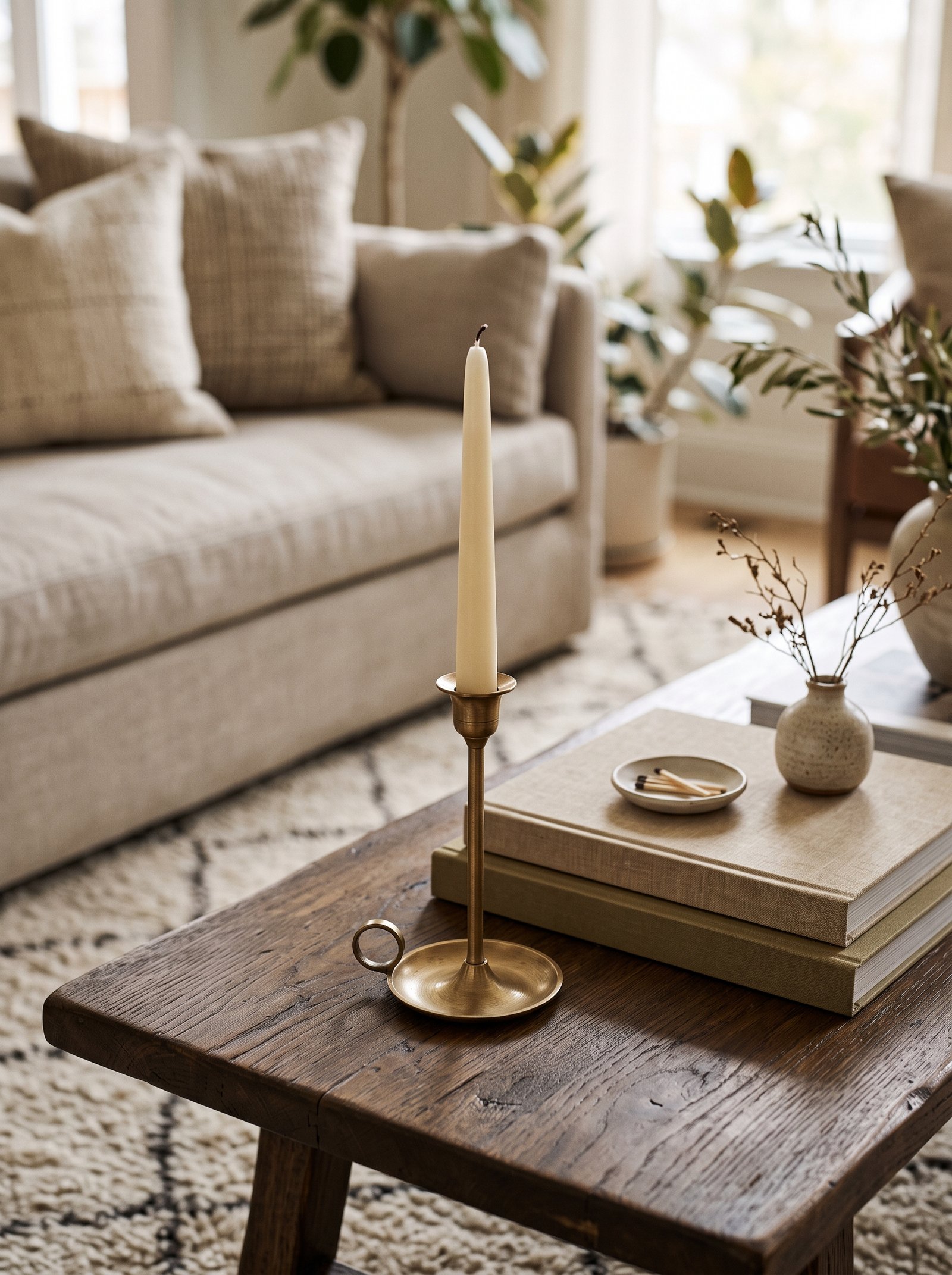
A shallow decorative bowl solves the problem every coffee table has: where do the keys, matches, a stray coaster, and the tv remote go when you want the table to look nice? One bowl, placed on the tray, becomes the sanctioned drop zone. Fill it with something quiet — smooth river stones, dried citrus peel, small vintage marbles, a cluster of coffee beans — so it looks styled even when it is doing its functional job.
Pick a bowl in a material that contrasts your tray: ceramic bowl on a wooden tray, wooden bowl on a stone tray, metal bowl on a woven tray. The contrast reads as deliberate even if nobody can articulate why. Monochrome tray-and-bowl combinations read dull; contrasting materials read considered.
The decorative content inside the bowl is more important than most people realize. Smooth river stones in cream and beige tones photograph beautifully and complement most color palettes. Vintage brass keys, antique marbles, or a stack of thin coasters all work. Avoid obviously utilitarian items (unopened mail, loose change) that break the illusion.
The bowl should be shallow enough that whatever lands in it does not disappear from view. A deep bowl reads as a hiding spot; a shallow one reads as a styled zone where incidental items happen to live.
11. Think in Heights, Not Just Footprint
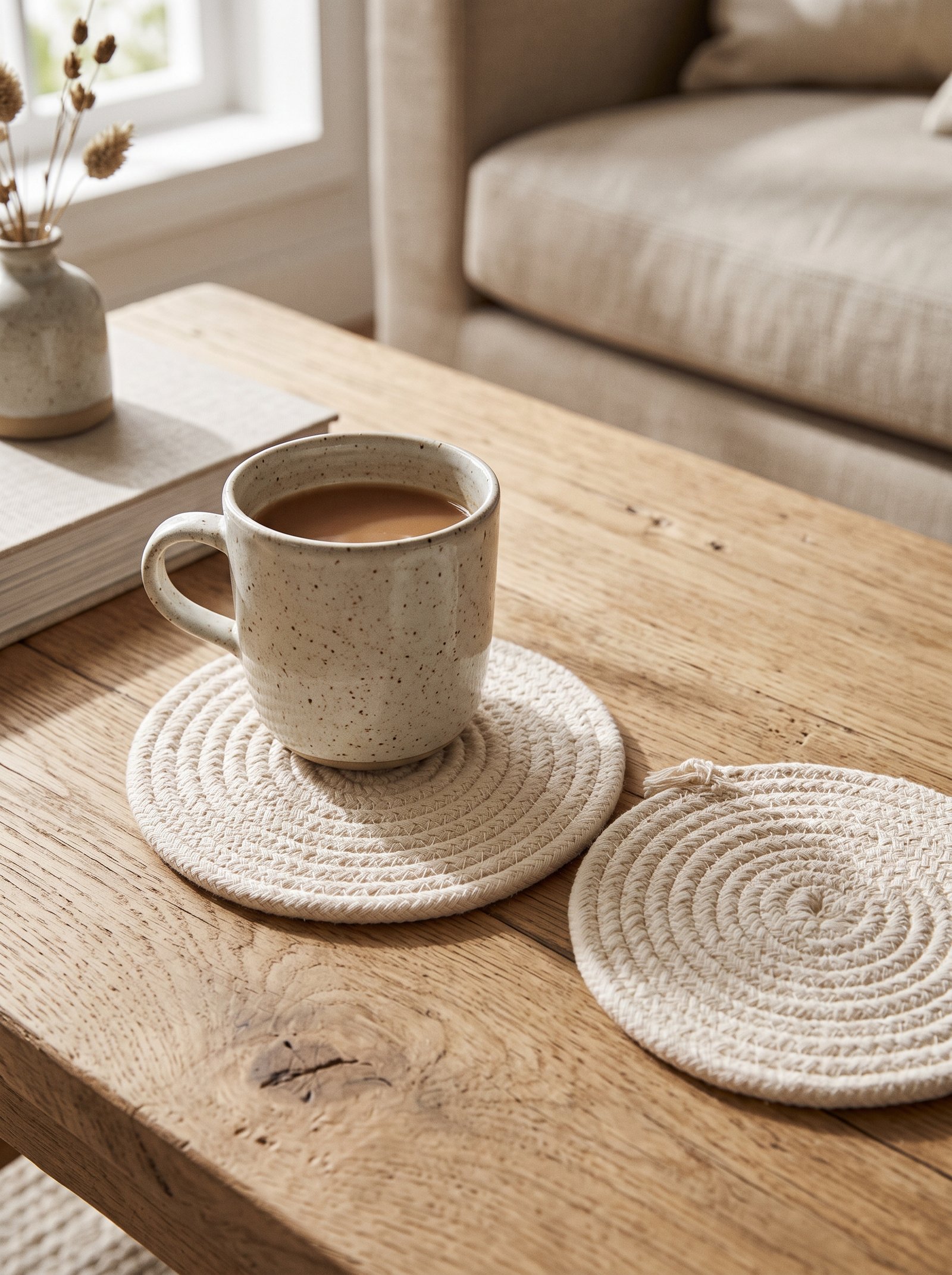
Lay a hand flat on your table and imagine your styling as a mountain range viewed from the side. The silhouette should rise and fall, not sit at one flat level. Tallest point in back or on one side, cascading down to shorter objects at the front. That silhouette is what gives a styled table its depth from across the room; without the stepped height variation, even careful arrangements read flat.
Flat styling — three objects of similar height in a row — is the signature of someone still learning. Varied heights, even by just a few inches, instantly reads as professional composition. Measure if you must; the proportions matter.
Photograph your table from the side after styling it. The side profile shows height variation that top-down views hide. If the silhouette reads interesting from the side, the composition is working; if it reads flat, rearrange until the heights step gracefully.
The tallest piece earns the back position relative to seating. If the sofa is on one side, the tallest object sits on the far side of the table from the sofa so it does not block the view across the table from the main seating area.
12. Use the Table to Tell a Story
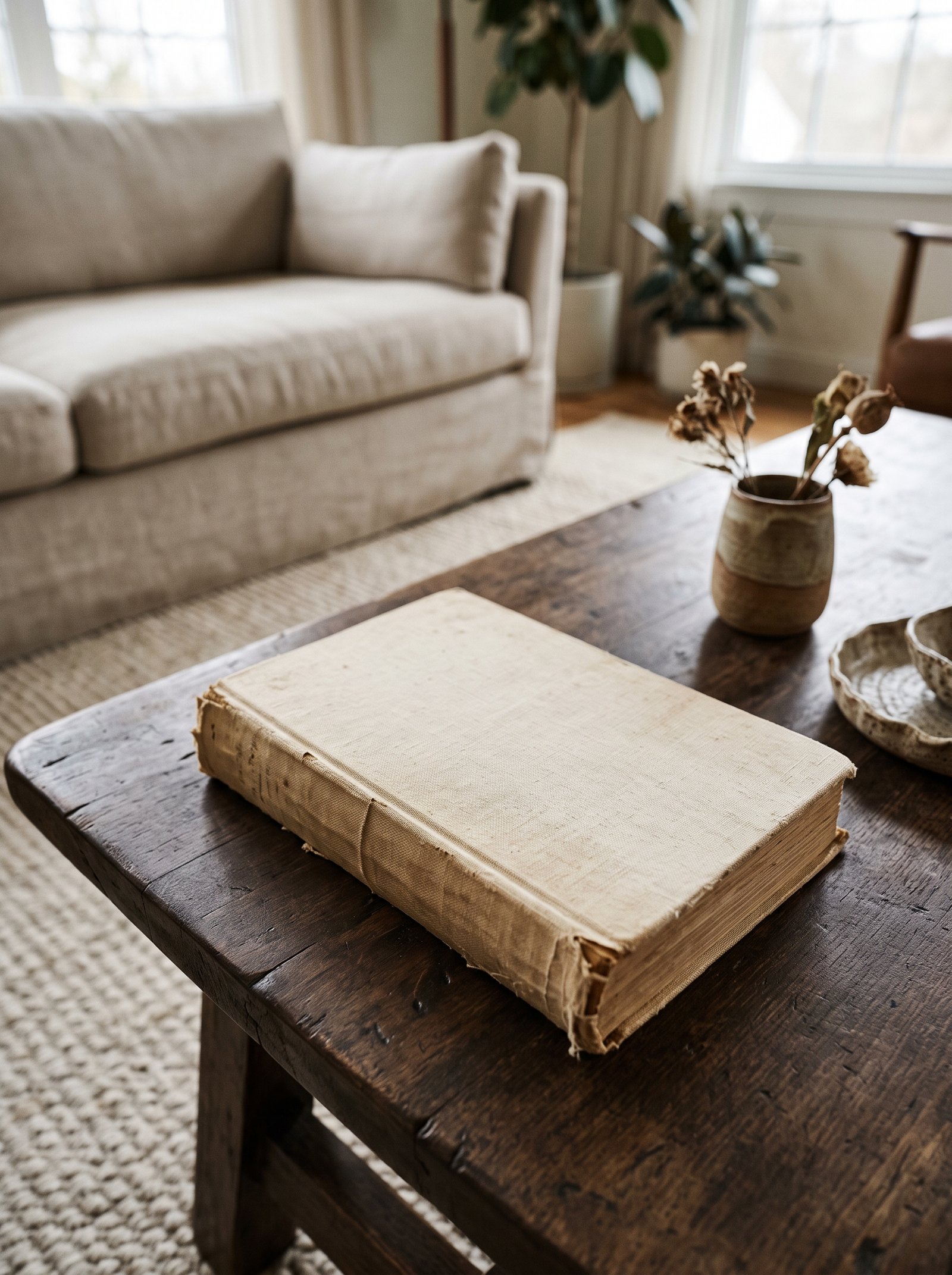
The best coffee tables feel personal, not stocked from a catalog. A small object from a trip, a book you have actually read, a ceramic you watched a friend throw on the wheel. One or two of these pieces turn a styled table into a styled table that belongs to a specific person with a specific history. Guests will pick them up and ask about them. The pick-up objects are the whole point of styling an inviting living room.
Avoid everything looking brand-new and purchased for the room. Mix in something with patina — a slightly chipped vintage bowl, a book whose spine has softened, a brass piece dulled from years of being handled, a stone that has been smooth-polished by the sea. The combination of new plus worn is the formula for lived-in luxury.
Each personal object should earn its place through meaning rather than aesthetic alone. The slightly imperfect bowl from your grandmother’s house carries weight that no store-bought piece can match, even if the store-bought piece is objectively more beautiful. Guests sense the difference even when they cannot name it.
Rotate the personal pieces seasonally or when you return from trips. A new object from a weekend away becomes the coffee table’s next focal piece; the previous focal piece migrates to a shelf or shelf elsewhere in the house. The rotation keeps the room feeling alive and tied to your actual life.
13. Match the Table Shape, Then Oppose It
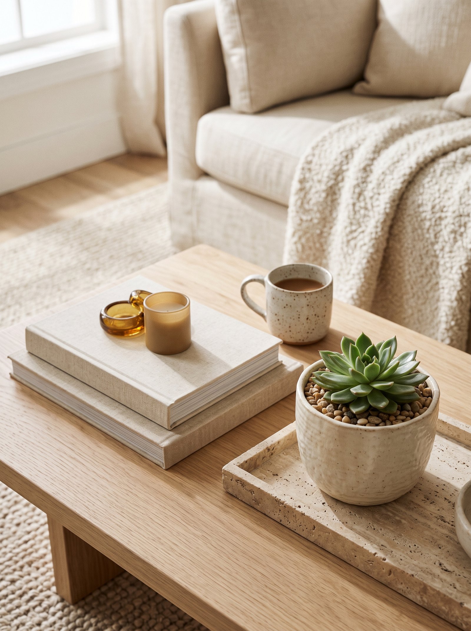
If your coffee table is round, add a square or rectangular tray and square-based objects on top. If it is square or rectangular, add round trays, bowls, and vessels. That shape contrast creates visual rhythm and keeps the composition from feeling single-note. The rule works at every scale, from the overall table to individual object groupings.
Apply the same rule to the arrangement itself: a mostly round grouping gets one angular piece as the deliberate exception; a mostly angular grouping gets one soft curve. The exception is what makes the rest of the grouping legible. Without a contrast element, a grouping of similar shapes reads as redundant.
The shape contrast also prevents the eye from getting bored. All-round compositions read soft but monotonous; all-angular compositions read sharp but cold. The mix of shapes creates the visual tension that keeps the whole arrangement interesting.
Scale the shape contrast appropriately. If the dominant shape is small, the contrasting shape can be small too. If the dominant shape is large and bold, the contrasting shape should be bold enough to actually counter it rather than disappearing into the background.
14. Treat Your Remote as Part of the Styling

The remote is going to be on your coffee table every single day. Pretending it will not is why most people’s coffee table styling collapses within a week of being set up. Keep a small lidded box, a shallow basket, or a leather catch tray on the table at all times — remotes, chargers, headphones, a notebook all live there when they are not in active use. The functional storage disappears into the styling as long as the container itself is beautiful.
Pick the storage piece in the same material family as the rest of your styling — woven if you are going organic, leather if you are going warm-neutral, ceramic if you are going sculptural. The storage reads as styling rather than as storage because it belongs visually to the other objects on the table.
Lidded containers hide more than open ones but require slightly more effort to use. For items you access multiple times per day (remotes, phones), open baskets or trays make more sense than lidded boxes. For items you access occasionally (notebooks, extra chargers, headphones), lidded boxes keep the surface cleaner.
The styling-plus-storage container should sit on the tray with the rest of the vignette rather than off to one side. Integrating it into the composition reads as deliberate; separating it reads as a compromise between function and form.
15. Keep Glassware Clean and Simple
A single clean-lined glass vase with one or two stems is more sophisticated than any arrangement of busy florals in an ornate container. The clarity of the glass adds light to the table, the simplicity of the stems reads as restraint, and the whole piece disappears when it needs to — which is often, because you will move the vase every time you use the table for other purposes.
Skip cut crystal and heavy etching; both date fast and photograph poorly. Clear, matte, or softly colored glass (olive, smoke, amber, pale blush) is the quietly expensive choice that keeps working as your taste evolves across years.
The shape of the glass matters almost as much as the material. Tall slim cylinders work for a single branch; wide-mouth vessels work for loose bouquets; narrow-neck bottles work for a small stem that gets room to breathe. Match the shape to the stem rather than forcing the stem into whatever glass is available.
Clean glass is non-negotiable. A smudged, water-stained, or dusty glass vessel ruins the whole table. Keep a microfiber cloth nearby and wipe the glass every time you change the stems.
16. Edit, Then Edit Again
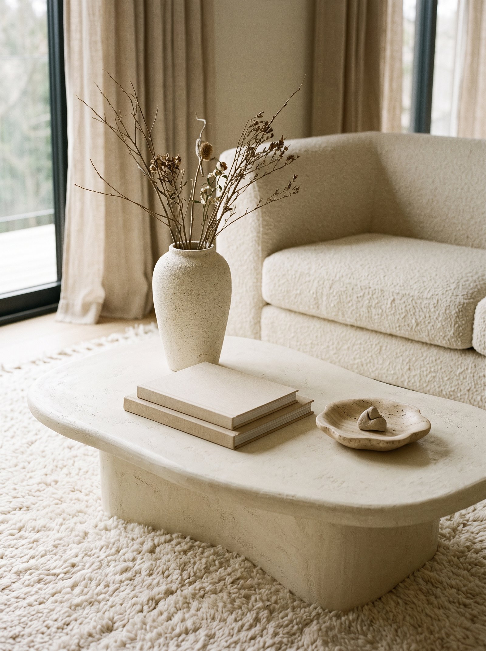
Finish styling your table, then take two things off. Live with it for a day. If you do not miss what you removed, leave them off permanently. Designers call this editing, and it is the step amateurs always skip. The urge to add one more thing is the single biggest enemy of a composition that already holds together.
When in doubt, remove rather than add. A table with three carefully chosen objects reads as expensive and considered. The same table with eight objects reads as cluttered no matter how expensive each individual object was. Density is the enemy of elegance in most coffee table contexts.
Store the removed objects somewhere accessible — a nearby cabinet, a styling box in another room. If you want them back, they are easy to retrieve. If you do not want them back after a week, consider donating or selling them; the fact that you did not miss them is useful data.
Editing is a continuous practice, not a one-time setup. Every few weeks, remove one object and see whether the table feels better without it. Over time, the natural tendency to accumulate objects on surfaces will erode even the best styling; proactive editing fights that drift.
17. Change the Styling Seasonally
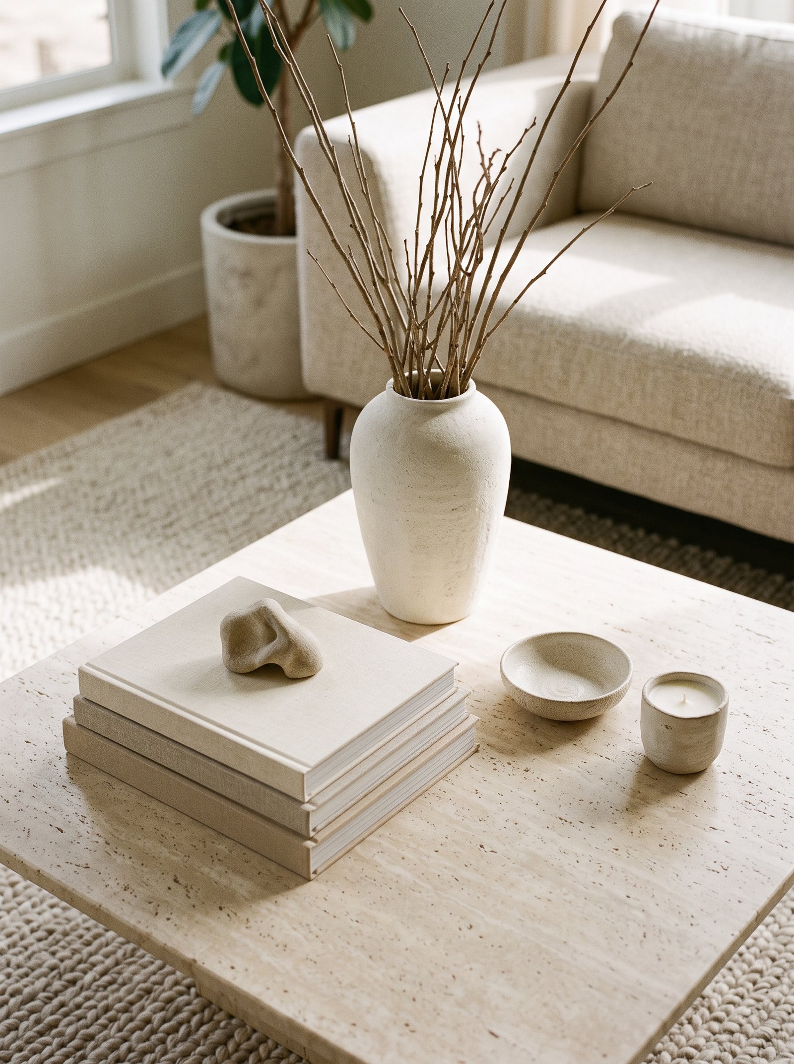
Swap out one or two objects every season — a sprig of eucalyptus becomes a branch of magnolia in fall, a cream candle becomes amber in winter, a bowl of lemons becomes a bowl of pine cones in December, a glass vase of tulips becomes dried pampas in autumn. Small shifts keep the table feeling alive and keep guests noticing it instead of walking past.
You do not need a holiday-specific display; a seasonal palette is enough. Warm tones for autumn and winter (rust, amber, cream, warm wood), cooler and greener tones for spring and summer (sage, moss, soft blue, bright white), kept inside your existing color story so the shifts feel organic rather than themed.
The seasonal rotation should be subtle. One or two objects change, the overall composition stays recognizable. A complete seasonal overhaul every few months reads as restless; small shifts within a stable base read as attentive design.
Keep the seasonal objects stored together in a small bin or basket when not in use. The organization makes the seasonal swap take ten minutes instead of an hour of hunting for the right piece.
18. Add a Textile Layer
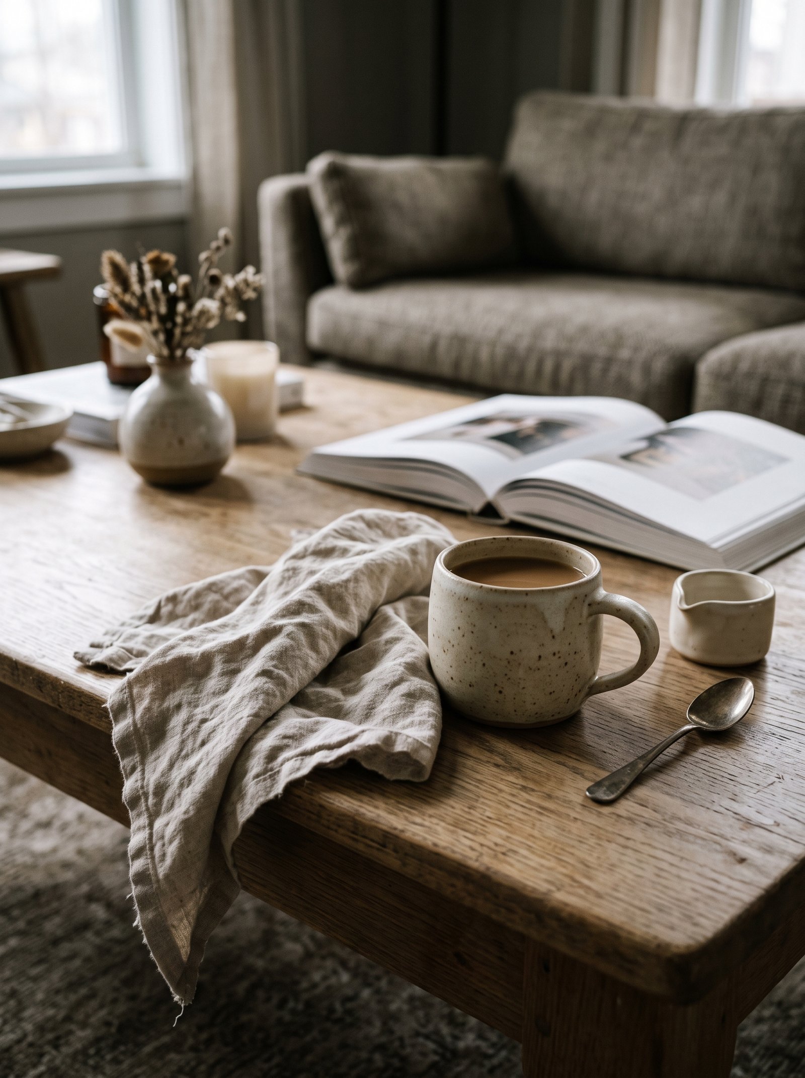
A small linen runner, a vintage block-printed napkin, or a scrap of handwoven textile placed under the tray adds softness and warmth that hard surfaces cannot give you. It also protects the table from water rings and scratches, which means you can finally stop stressing about using coasters for every drink.
Keep the textile neutral — oatmeal, flax, soft black, muted check — so it reads as texture rather than pattern. A loud textile competes with everything else on the table and wins, which is not what you want. The textile should be a quiet background layer that elevates the objects above it.
Natural fibers age most beautifully in this application. Vintage linen or handwoven cotton develops character over years of use; synthetic alternatives tend to look exactly the same at year five as they did at week one, which paradoxically makes them read cheaper over time.
Position the textile at an angle rather than squared with the table edges. The slight diagonal reads as styled and casual; a perfectly aligned textile reads as uptight. The deliberate casualness is a designer trick that photographs beautifully.
19. Try a Sculptural Object as the Focal Point

One beautiful sculptural piece — a hand-thrown ceramic, a carved wooden form, a soft plaster shape, a sculptural glass vessel — can carry the entire table if you let it. Place it slightly off-center on the tray, let it be the tallest or largest piece in the vignette, and build everything else around it as supporting cast. The sculptural piece becomes the room’s visual anchor and the conversation starter.
Hunt for these at estate sales, pottery studios, small-shop ceramicists on Instagram, and independent gallery sales. One $60 handmade piece outweighs a dozen big-box objects in impact, patina, and conversation value forever.
The sculptural object should have genuine presence. Scale matters — a small sculptural piece in a large space gets lost; a substantial piece commands the entire room. Choose scale based on the room and the table rather than the budget.
Rotate the sculptural piece occasionally with another one if you collect them. The rotation gives each piece time to be the hero and prevents the room from stagnating around any single focal object.
20. Mind the Scale Against the Room

Styling that works on an Instagram flat-lay often fails in a real room because the pieces are too small. If you have a big sofa, a big rug, and a big coffee table, your tallest styling object probably needs to be 12 to 18 inches tall. Tiny bud vases vanish in big rooms; branches in a 15-inch vessel command the space from across the room.
Walk across the room and look back at the table. If you cannot make out the three main shapes from across the space, scale up. Styling should read from the doorway, not just from the armchair two feet away. The ability to be seen from a distance is what separates sophisticated styling from fiddly tabletop clutter.
Small rooms benefit from smaller-scale styling. The same oversized vase that commands a loft would overwhelm a 10×12 living room. Scale the vignette to the room’s proportions and the whole composition reads balanced.
Scale is also about proportion. Even in a large room, every object should have thoughtful relationships to its neighbors. A huge vase next to a tiny bowl creates awkward tension; the same huge vase next to a medium bowl and a small bowl creates balanced tension that reads as intentional.
21. Use Trays as Organization, Not Decoration
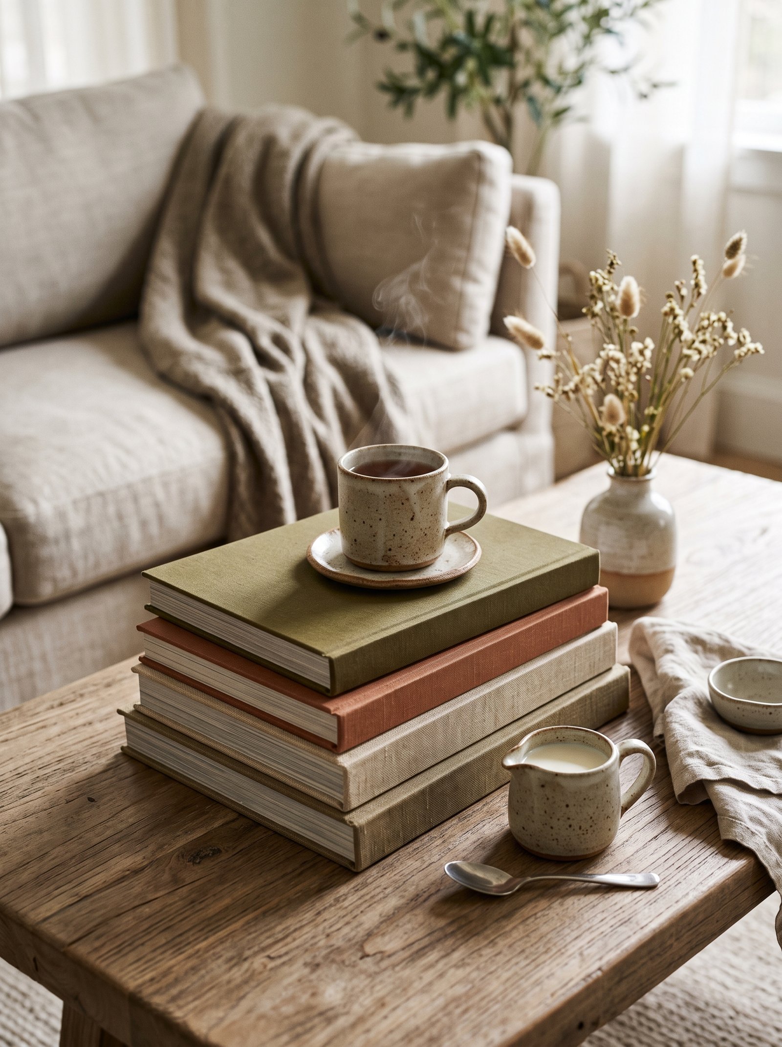
If your table is large enough, use two trays to zone it — one for scent (candle, matches, a small plant), one for function (coasters, a notebook, the remote in a small bowl). Zoning makes the table feel designed in the same way a well-planned kitchen island does, with distinct areas for distinct purposes.
Keep the two trays in the same material family (both wood, both woven, both metal) but in different shapes or finishes so they read as a pair rather than identical twins. The visual relationship signals that both trays belong together while the slight variation prevents the composition from feeling redundant.
Place the two trays with intentional distance between them. Close together they read as cluttered; too far apart they read as disconnected. The sweet spot is close enough that the eye reads them as related, far enough that each gets room to breathe.
The second tray approach works best on genuinely large coffee tables (minimum 48 inches long). Smaller tables look crowded with two trays; stick to one on anything smaller than that.
22. Lean Into a Single Material for Impact
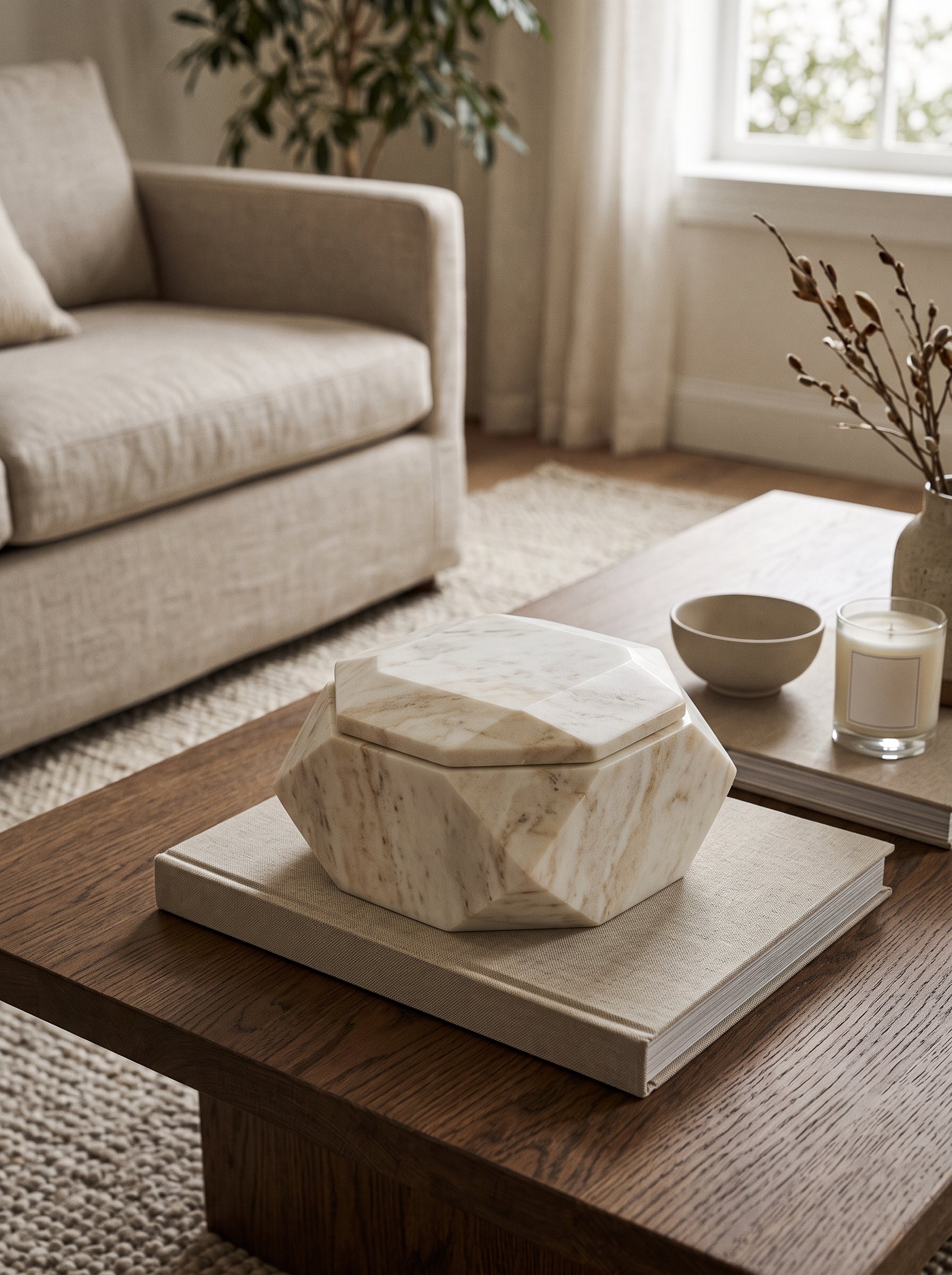
Instead of mixing every material, try the opposite: style the whole table around a single hero material. All wood tones. All ceramics in a shared glaze family. All brass and metal objects. The restraint reads as deliberate and gives the room a signature instead of a scheme that fights itself.
Add one small outlier — a single green stem, a single black object, a single contrasting element — to keep the arrangement from going completely flat. Monochrome styling needs a tiny punctuation mark the way a long paragraph needs an occasional comma; without the pause, the eye runs out of places to rest.
The single-material approach is especially effective on glass or marble coffee tables where the surface itself provides contrast with whatever single material you choose for the styling above it. A table of all brass on a marble top reads as a sculptural installation; the same brass on a warm wood table reads less distinctly.
Collect pieces slowly for this styling direction. The whole point of single-material styling is that the pieces look collected over time rather than purchased together, which is the one effect that a single shopping trip cannot replicate.
23. Light the Table From Above
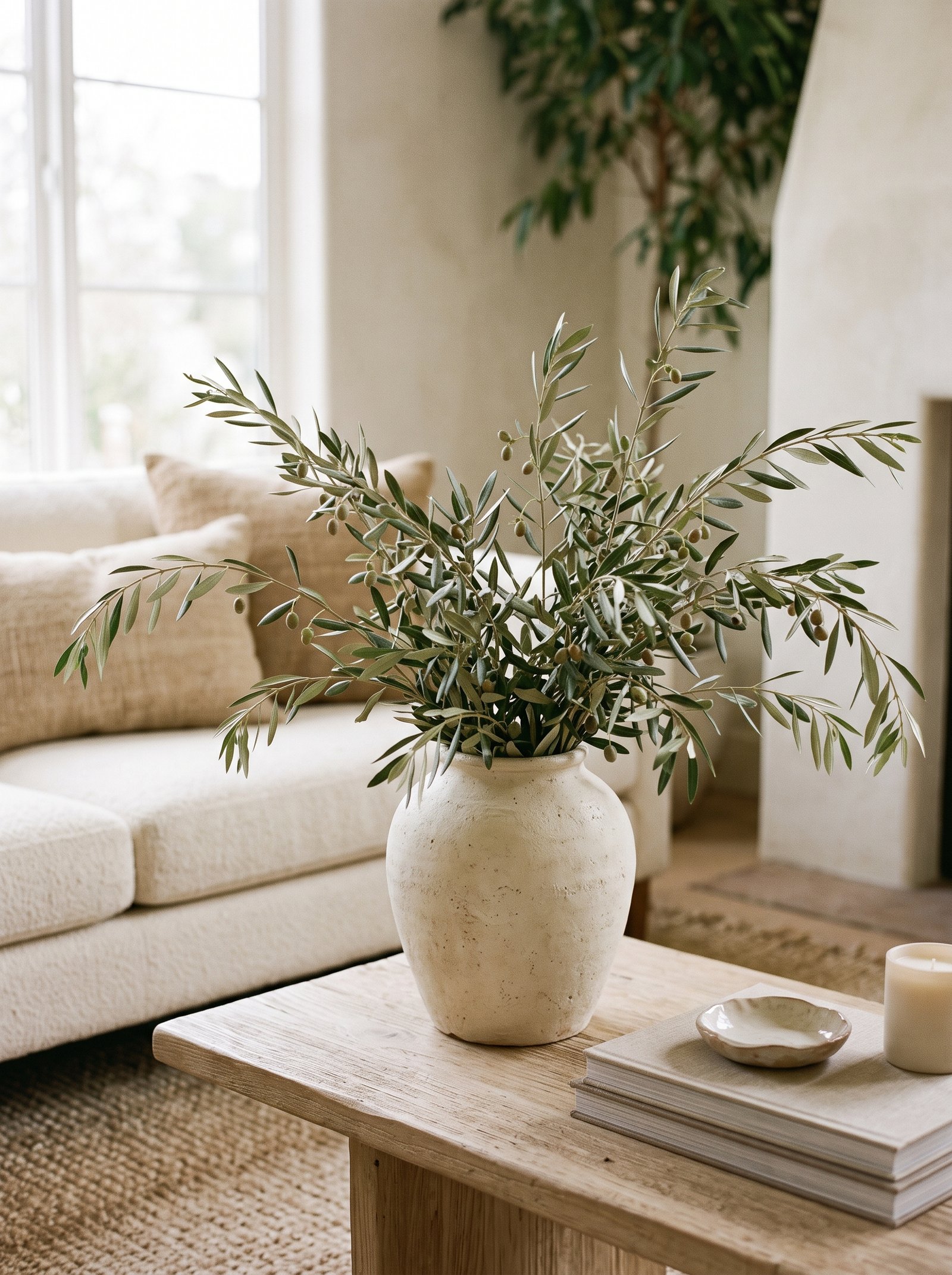
A pendant light low over the coffee table, a floor lamp arching over it, or a nearby table lamp casting warm light onto its surface changes everything about how the styled vignette reads. Light turns a styled table into a scene. Without light, even the most careful styling disappears after sunset, which is when most of us actually spend time in the living room.
Aim for 2700K bulbs — the warm, candle-adjacent tone — not cool white. Warm light flatters wood, ceramic, brass, and skin tones alike. Cool light makes everything in a living room look like a dentist’s office, which is especially unflattering to the earthy palettes that most styled tables rely on.
The light does not need to be dramatic. Even a low-wattage warm bulb in a nearby lamp transforms the table at night. Install a dimmer wherever possible so you can tune the mood from bright practical daytime to warm atmospheric evening without changing fixtures.
Picture lights, battery-powered puck lights, and small cordless lamps all work for specifically lighting a vignette without full room lighting. The spotlight effect reads boutique-hotel and photographs beautifully.
24. Add a Personal Collection, Not a Set

A small collection of related objects — three brass candleholders of different heights, two hand-thrown ceramic vessels, a trio of smooth river stones — reads as styled by someone with a point of view. A matching set reads as styled by a catalog. There is a difference, and the eye catches it even if the brain cannot articulate why.
Build the collection over time. Buy one piece, live with it, buy the next when you find it. The accidental coherence of pieces chosen slowly over months or years is impossible to fake in one shopping trip. The patience is the whole point.
The collection should share a theme (brass, ceramics, stones) but vary in detail (different sizes, different patinas, different shapes). The theme makes the grouping read as a collection; the variation makes it read as interesting rather than repetitive.
Edit the collection as it grows. Not every piece you acquire needs to live on the coffee table. Rotate pieces in and out based on seasons, mood, and how the current grouping is feeling. The restraint keeps the composition sharp.
25. Leave Room for Life
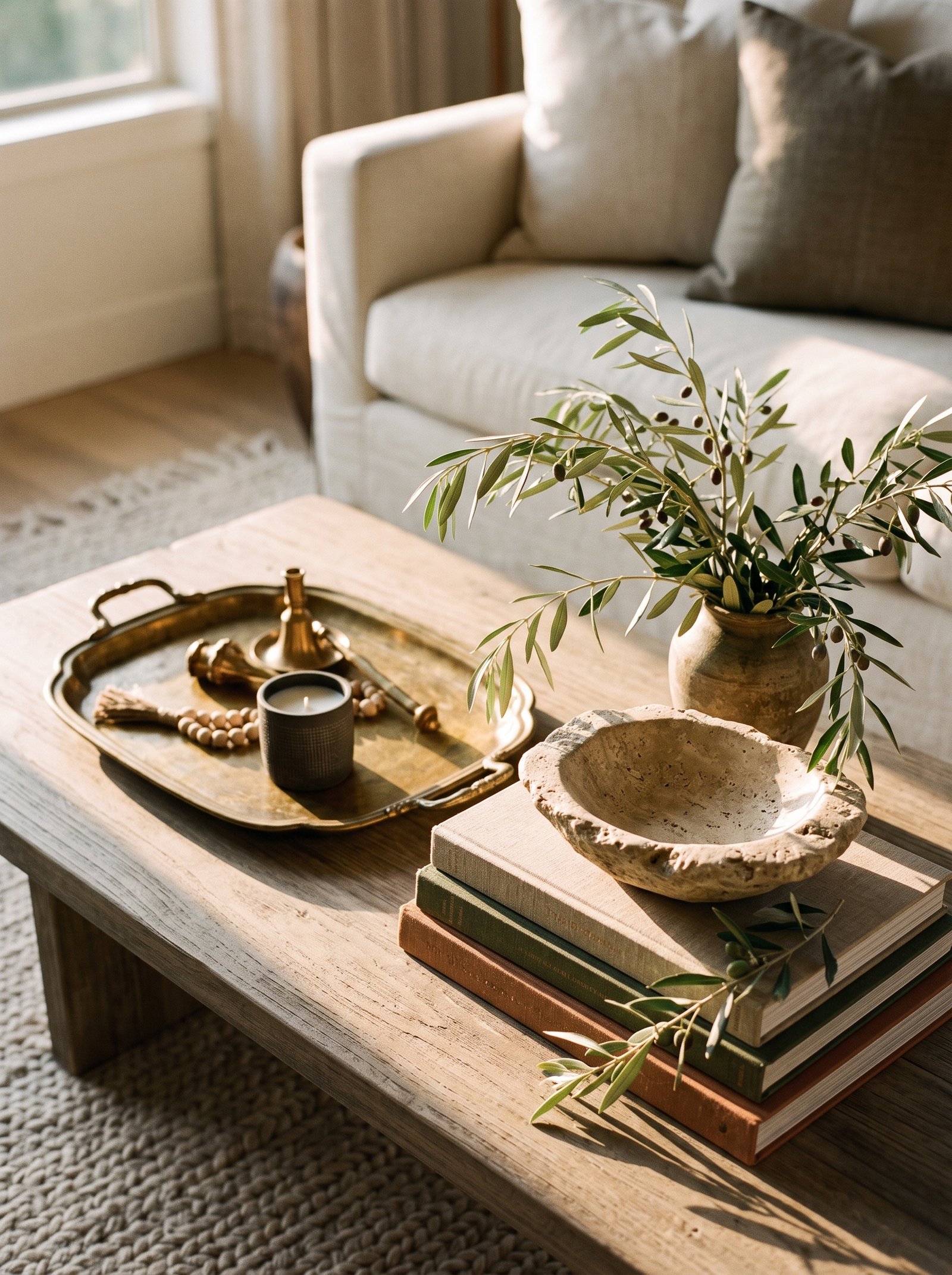
The last rule is the one every designer eventually comes back to: a coffee table is a coffee table, not a shrine. Leave real estate open for the cup of coffee, the open book, the dog’s ball that lands there on a Sunday afternoon, the magazine someone was reading before dinner. The styling should frame your life, not replace it.
If you cannot set a mug down without rearranging a vignette, you have over-styled. Pull one more piece off, breathe, and remember — the best rooms look like someone just stepped out of them, not like no one is allowed in.
The functional empty space is also what makes the styled portion look more considered by contrast. A table styled wall-to-wall reads as clutter; the same styling with generous negative space reads as intentional composition.
Guests notice the usability as much as the beauty. A table where you can actually set your drink down without ceremony reads as warm and welcoming; a table where every surface requires navigation reads as cold and performative. Warmth beats perfection every time in a living room.
Pulling the Coffee Table Styling Together
Coffee table styling does not require a new coffee table or a shopping trip. Most of the pieces you need are already in your house — a tray in the kitchen cabinet, three books from the shelf, a candle you forgot you had, a branch cut from the yard this morning. Start with the tray, build in threes, mix textures, leave room to breathe, and edit once more than feels comfortable. The improvement is immediate and the cost is zero.
The rules compound. Any one of the 25 ideas above helps a coffee table; combining five or six of them transforms the whole room’s visual quality. Pick the ones that match your existing pieces and your room’s style, apply them in an afternoon, and the table will look like it was styled by someone who gets paid to do it.
The underlying philosophy is simple: a styled coffee table should feel inviting rather than performative. Every rule above exists to make the table more useful and more beautiful at the same time, not to force those two goals into opposition.
Styled this way, the table does what a well-designed coffee table has always done: it anchors the room, invites you in, and quietly signals that someone thoughtful lives here. For more small-space and rental-friendly styling guidance, see our guides on cozy reading nook ideas, warm neutral living rooms, IKEA hacks that look custom, bookshelf styling with layered looks, and modern terracotta home decor.
Take our 2-minute Decor Style Quiz
Answer 10 quick questions and discover whether you’re Modern Boho, Scandinavian Minimalist, Modern Farmhouse, Mediterranean, Japandi, or Classic Traditional — plus your color palette and 3 articles made for you.
Start the Quiz →Coffee Table Styling FAQs
How do I style a coffee table like a designer?
Start with a tray as your base. Build three objects at three different heights (tall, medium, short) grouped on the tray. Add a stack of hardcover books. Include one living element like branches or a plant. Leave two-thirds of the tabletop open for functional space.
What goes on a coffee table?
A tray, a stack of 3-4 large hardcover books, one or two sculptural objects, a small bowl or vessel, a candle or two, a living element (branches or small plant), and a small lidded box or basket for remotes and chargers.
How many books should be on a coffee table?
Three to four hardcovers stacked, biggest on the bottom. Place a small decorative object on top of the stack to crown it. Avoid stacks taller than 4 books — they start to feel wobbly and look over-styled.
What is the rule of three in coffee table styling?
Group three objects at three different heights to form a visual triangle. Three is the number that reads composed to the human eye without feeling cluttered. The triangle arrangement reads intentional while a straight line reads like a store shelf.
Our interactive tools can help
Take the style quiz, generate a beige wall color palette, or calculate the perfect pillow stack for your bed — all free, all in under 2 minutes.
Explore Tools →