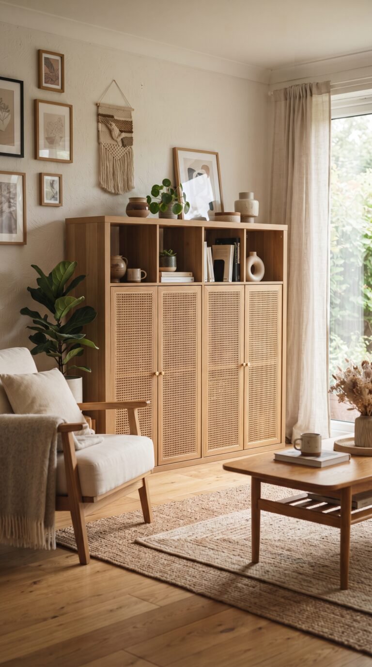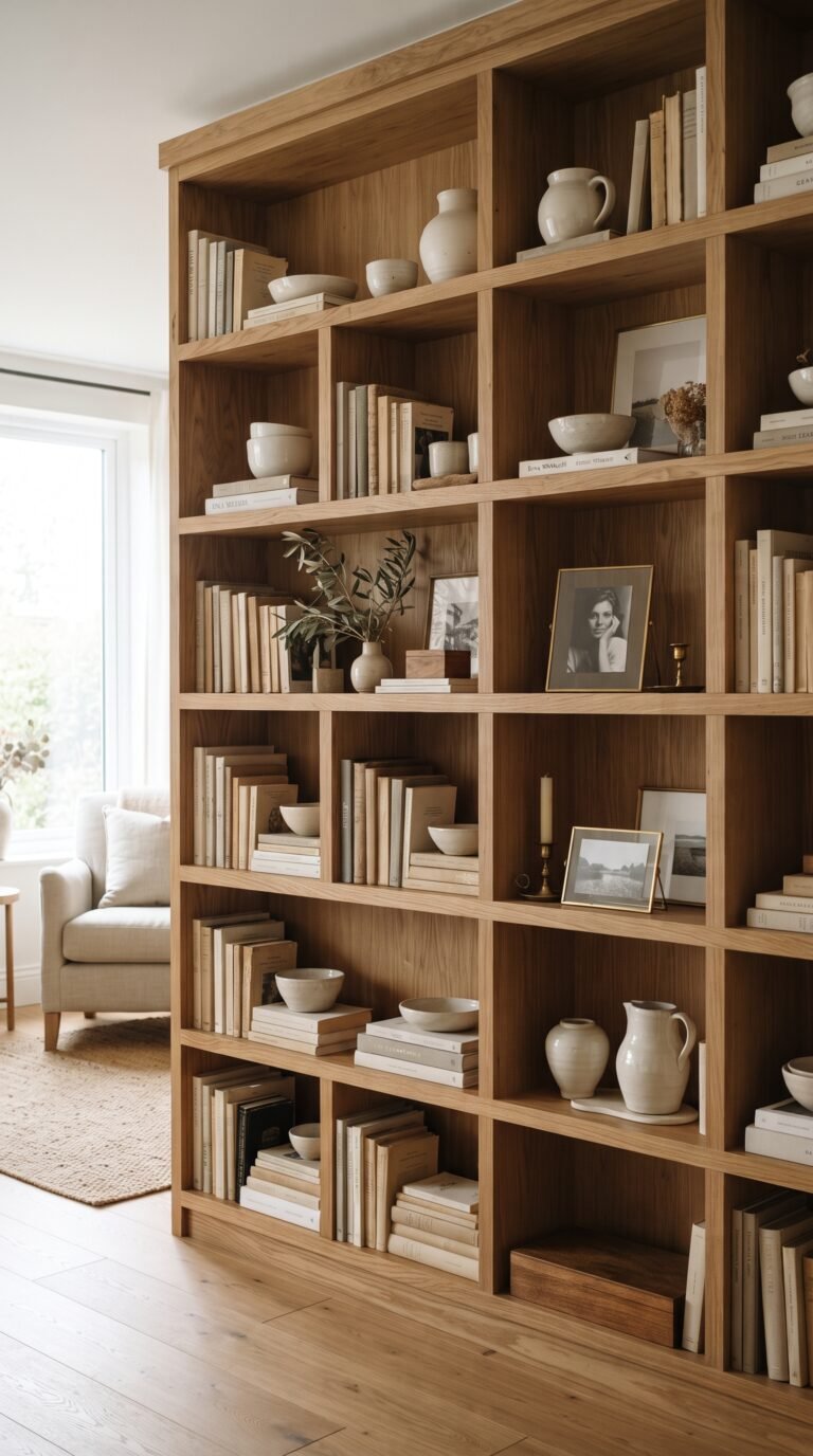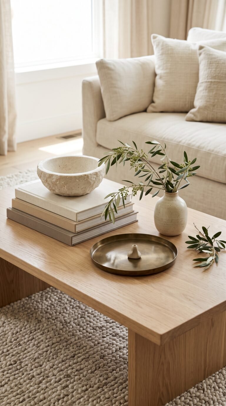
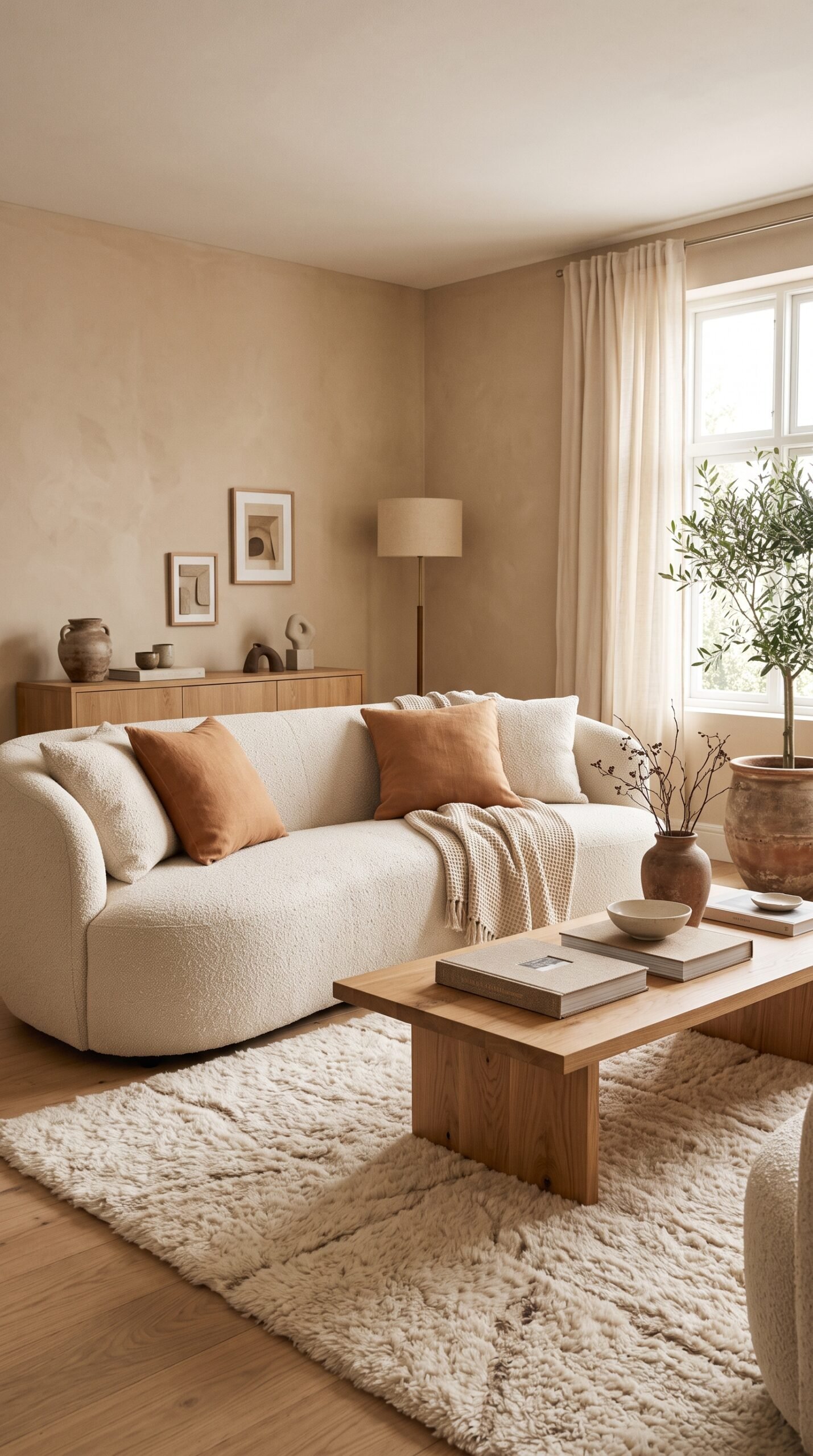
25 Colors That Go With Beige Walls in a Warm Modern Home
Beige walls get a bad reputation. People call them boring, dated, builder-grade — and for a certain generation of beige (the pink-peach undertones of the early 2000s), that criticism holds up. But modern beige, the warm neutral that reads as cream, oatmeal, mushroom, or soft stone, is one of the most sophisticated wall colors in current interior design. The problem is almost never the beige itself. The problem is the colors around the beige.
A beige wall paired with the wrong accents reads flat and dated. The same beige wall paired with the right colors — layered thoughtfully across furniture, textiles, art, and small accessories — reads like a warm cream backdrop in a Belgian country house, a Parisian apartment, or a boutique hotel in Marrakech. The wall color is identical in both cases. The surrounding palette is everything.
The 25 colors below are the ones that genuinely work with beige walls in modern homes. Each pairing explains how the color behaves against beige, what rooms it suits, how to introduce it (through paint, textiles, art, or furniture), and which other colors complete the palette. Pick one or two primary accent colors from the list and build your room around them — the beige walls will become an asset instead of something to apologize for.
1. Deep Olive Green
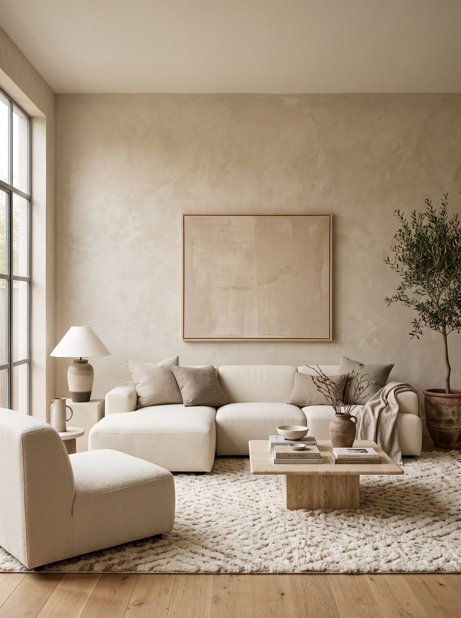
Deep olive green is the single most reliable accent color for beige walls. The green shares the warm earth undertones of modern beige, which is why the two colors read as inherently cohesive rather than contrasting. An olive sofa, olive curtains, or an olive painted accent cabinet against beige walls creates the exact sophisticated-neutral palette that defines modern European interiors.
Introduce the color through fabric first — a velvet olive pillow on a cream sofa, an olive linen throw folded over an armchair, olive curtain panels pooled on the floor. The fabric texture softens the color and makes it read warm rather than harsh.
Pair olive with cream, warm wood tones (oak, walnut), and small amounts of warm brass or matte black. The combination feels like it was pulled from a well-designed country house or a Belgian minimalist interior.
For a bolder commitment, paint a single piece of furniture — a bookshelf, a dresser, or a large accent cabinet — in a deep olive like Farrow & Ball Bancha, Clare Dirty Chai, or Backdrop Veloutine. The painted piece becomes the room’s anchor against the beige walls.
2. Warm Terracotta
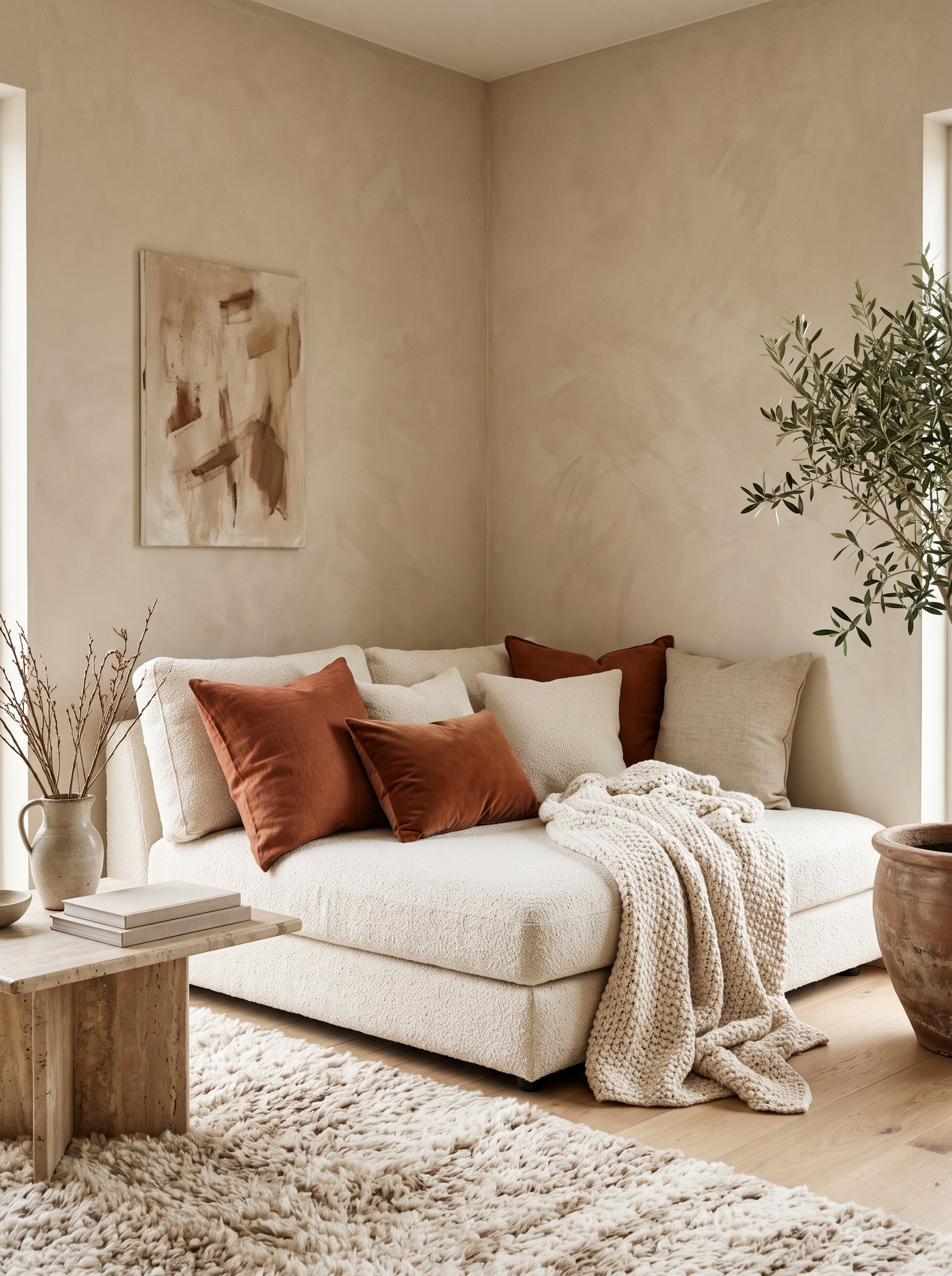
Terracotta against beige is a palette that borrows directly from Mediterranean architecture — sun-baked clay walls, warm stucco, late-afternoon light reflecting off natural materials. The two colors share orange undertones, which creates immediate harmony and a cohesive warmth that reads sophisticated rather than themed.
Start small — a terracotta linen pillow, a hand-thrown terracotta vase, a rust area rug. Even one well-placed terracotta object transforms a beige room from flat to layered. Build up only if the first few pieces work.
Pair terracotta with cream, olive green, warm wood, and matte black for the full modern palette. Avoid pairing terracotta with cool blues or stark whites against beige walls; the color temperatures clash and the room feels confused.
For a bold feature, consider terracotta tile accents in a kitchen backsplash or a bathroom wall. Hand-made zellige terracotta tiles against beige walls elsewhere in the home create color continuity throughout the whole space.
3. Soft Black
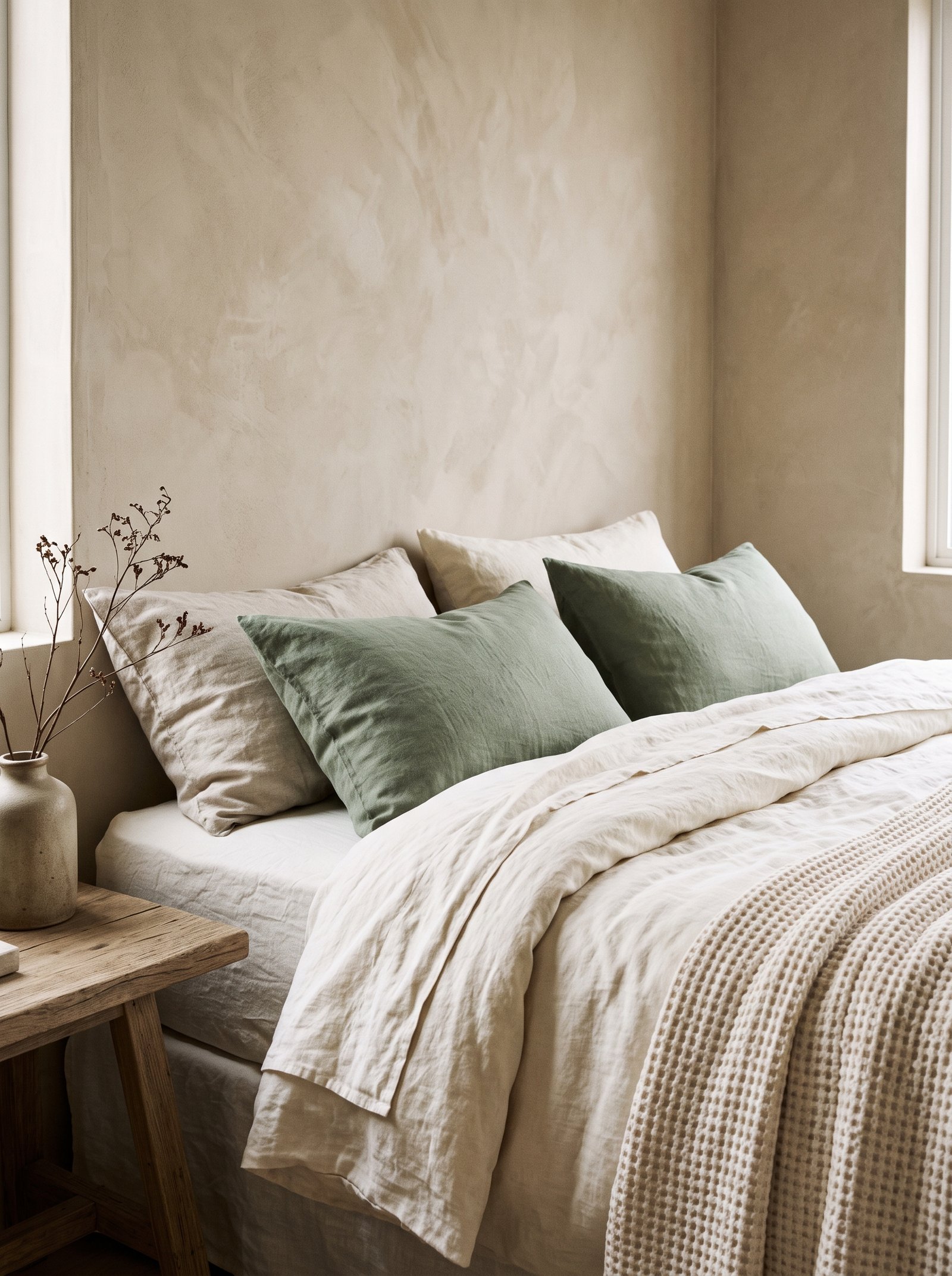
Soft black — matte, slightly warm — grounds beige walls and gives them modern edge. Without black, beige rooms can drift toward sleepy; with one or two carefully placed black elements (picture frames, a floor lamp, a bookshelf, matte black hardware), the room becomes sharp and intentional.
Keep black restrained. One substantial black piece per room is usually enough — a floor lamp, a dining table, a set of framed black-and-white photographs. Over-blacked rooms against beige walls read heavy; under-blacked rooms read too soft.
Matte black outperforms glossy black against beige. The matte finish shares the understated quality of beige walls; gloss introduces reflections that fight the warm neutral.
Combine black with warm wood tones and cream textiles for the designer-approved beige-black-cream palette that works in almost any room style from modern farmhouse to contemporary minimalist.
4. Warm Caramel
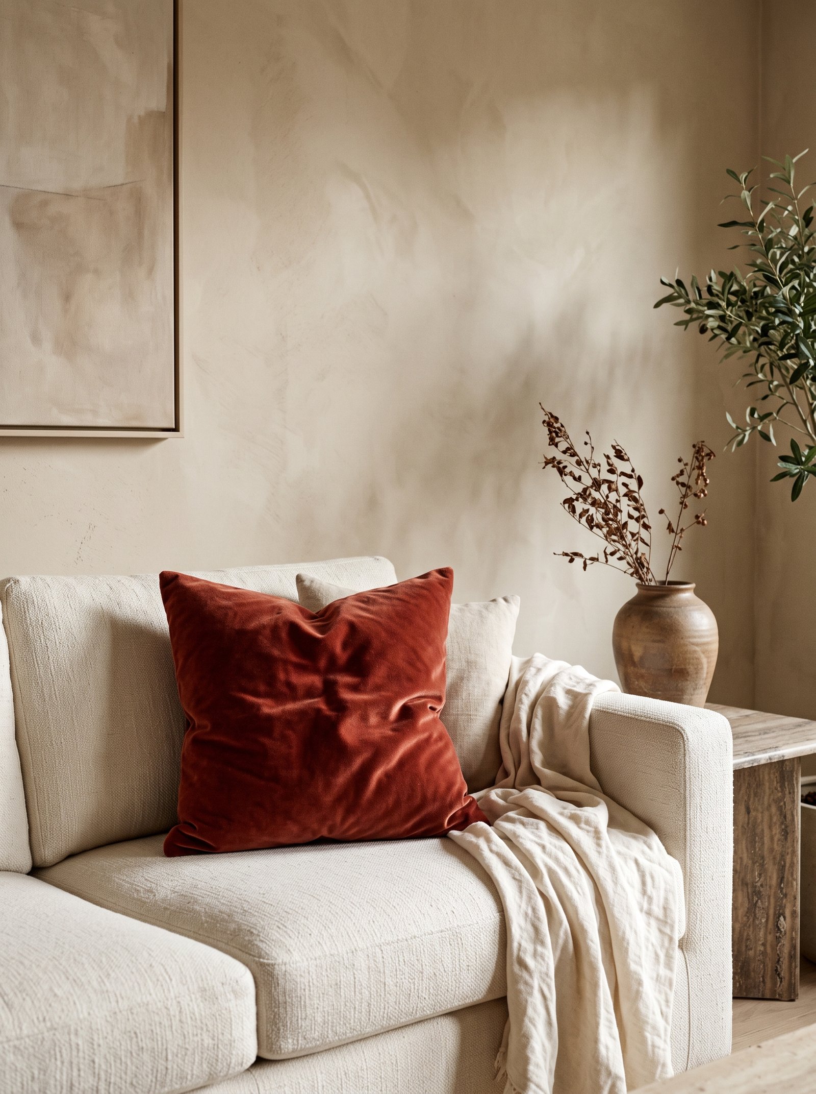
Caramel — the color of warm cognac leather, aged brass, honey wood — is a natural extension of modern beige. The two colors sit comfortably on the same warm-neutral spectrum, which means caramel accents never fight beige walls; they amplify the warmth.
The classic application is leather. A caramel leather armchair, a caramel leather ottoman, or a caramel leather chesterfield sofa against beige walls creates a palette that feels pulled from a traditional library or a vintage boutique hotel bar. The leather also develops better patina against beige than against cool backgrounds.
Introduce smaller caramel moments through brass hardware, warm brown bookshelf spines, and amber glassware. Each adds to the honey warmth of the overall palette.
Pair caramel with cream, olive green, soft black, and warm wood. The combination is almost indestructible — hard to style wrong, consistently photographs well.
5. Dusty Sage
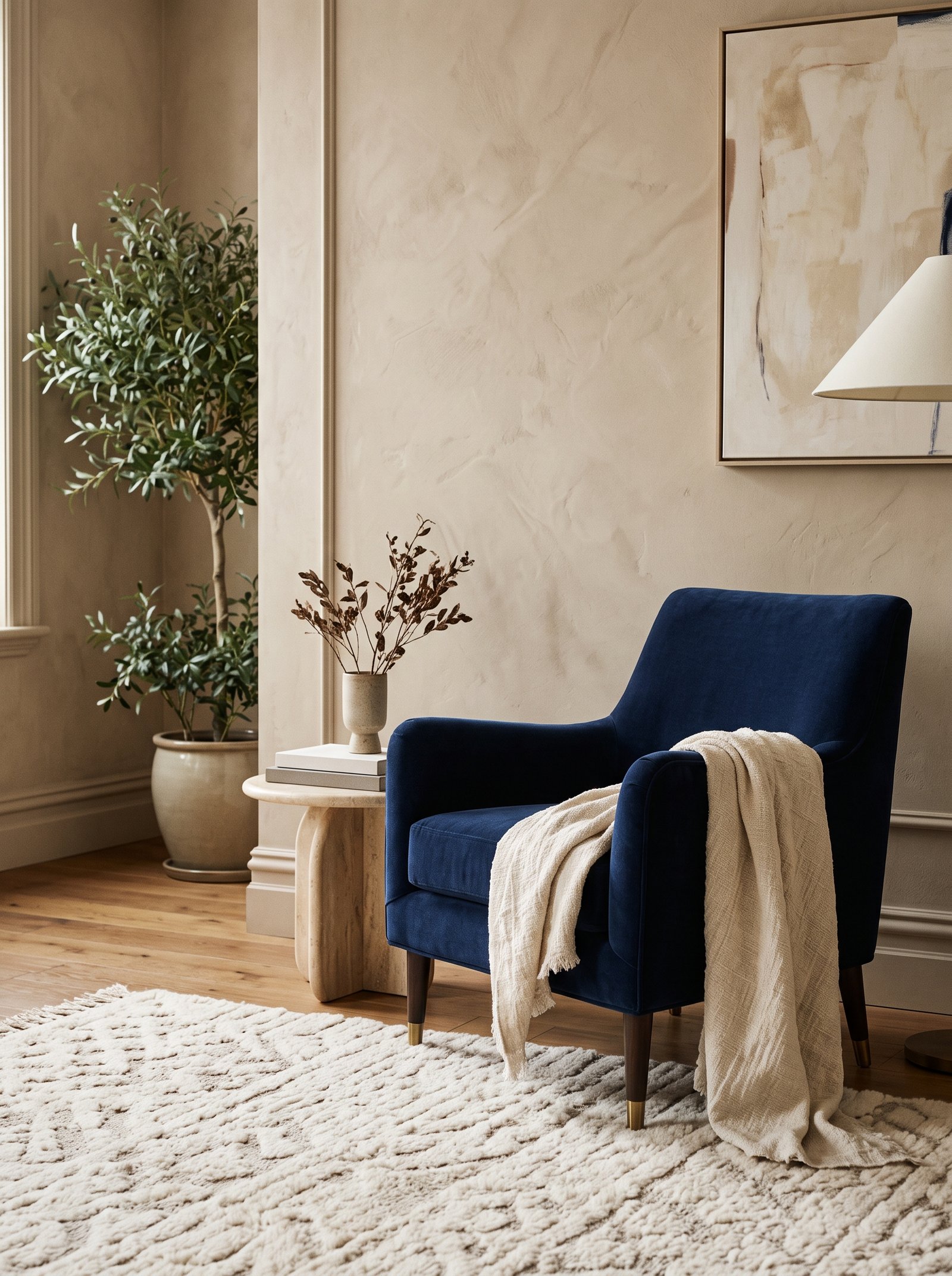
Dusty sage — a soft, muted sage green with grey undertones — is the lighter sister of deep olive and works beautifully against beige walls when a room needs something fresher and less saturated. The color reads calm and botanical without the depth of olive, which makes it perfect for bedrooms, bathrooms, and spaces where quiet is the priority.
Sage pairs beautifully with the warm undertones of beige, especially when introduced through natural fibers — a sage linen duvet, sage velvet pillows, a sage painted accent chair. The texture softens the color and keeps it from reading flat.
Avoid pairing sage with pink or coral against beige walls — the combination gets too candy-colored. Stick with cream, oatmeal, warm wood, and small amounts of brass for the balanced sophisticated feel.
For a paint commitment, consider Farrow & Ball Mizzle, Clare Current Mood, or Backdrop Breakers for a sage that reads calm against warm beige walls.
6. Cream and Warm White
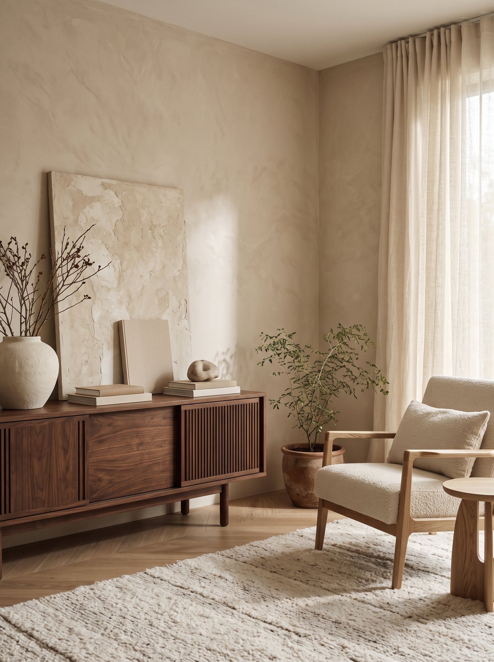
The quietest but most sophisticated pairing with beige walls is more beige — specifically layered creams and warm whites in different textures and tones. The monochromatic palette reads expensive and considered because the eye flows uninterrupted across the whole room.
The trick is varying the undertones and textures within the beige-cream-oatmeal family. A boucle sofa in cream, a linen throw in warm white, oatmeal curtains, a jute rug, and the beige walls become a layered neutral story rather than one flat color.
Add texture to prevent flatness — nubbly boucle, smooth linen, chunky wool, soft velvet, polished brass, honed stone. The texture variety provides visual interest while the color stays unified.
One small accent color — a single olive branch, a soft terracotta pillow, a muted sage pot — becomes the exception that proves the rule and keeps the palette from feeling monastic.
7. Deep Burgundy

Deep burgundy — the color of aged wine, antique leather books, oxblood paint — brings a traditional-boutique richness to beige walls. The warm red tones of burgundy harmonize with beige’s underlying warmth, creating a palette that feels like a well-curated gentleman’s library or a wine-country villa.
Introduce burgundy through substantial pieces — a velvet sofa, a leather chair, a large area rug with burgundy tones, or a painted built-in cabinet. The color has visual weight and reads best in larger applications rather than small accessories.
Pair burgundy with cream, warm wood, aged brass, and small touches of soft black. Avoid pairing with cool blues or bright corals; the color temperatures fight.
For a less-is-more approach, limit burgundy to one piece per room — a single large piece of upholstery, art, or textile — and let the rest of the room support in neutrals.
8. Camel
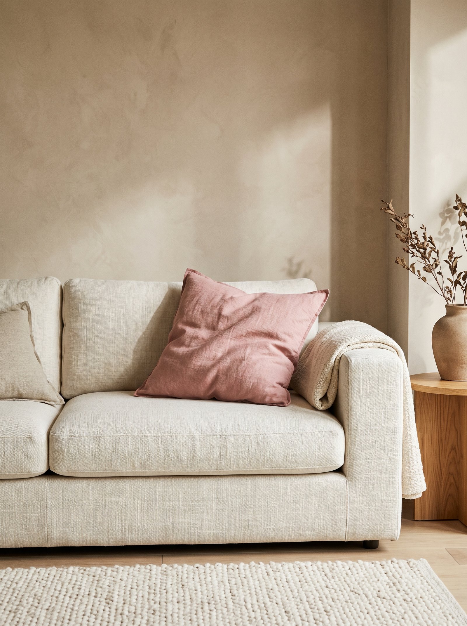
Camel — the warm tan that bridges beige and caramel — reads timeless against beige walls. The color has quiet confidence; it doesn’t demand attention but it anchors a room in warm neutral sophistication the way a well-tailored camel coat anchors an outfit.
Camel upholstery is where this pairing shines. A camel boucle armchair, a camel linen sofa, or camel velvet dining chairs against beige walls creates a palette that reads European and expensive without any single piece being especially bold.
The color also works beautifully in wool rugs, cashmere throws, and leather accessories. Any application that showcases the natural texture of warm wool or soft leather amplifies the camel’s richness.
Pair camel with cream, deep olive, chocolate brown, and warm brass. The palette is reliable across years and styles — the kind of foundation palette interior designers return to for timeless rooms.
9. Dusty Rose

Dusty rose — the muted pink that reads sophisticated rather than girly — works surprisingly well against warm beige walls. The pink’s warmth harmonizes with beige’s underlying tones, creating a palette that feels soft and romantic without tipping into juvenile territory.
Keep dusty rose to one piece per room — a single velvet armchair, a bedroom bench, a pair of pillows, or a small area rug. Over-pinked rooms against beige walls read sweet; one well-placed pink moment reads intentional and modern.
Pair with cream, warm wood, soft black, and small amounts of brass. Avoid pairing dusty rose with bright coral or hot pink — those shades read dated. The restraint of dusty is what makes the pairing work.
For a paint accent, consider Farrow & Ball Pink Ground, Clare Rise & Shine, or Backdrop Last Call for an upholstery or ceiling accent against beige walls.
10. Charcoal Grey
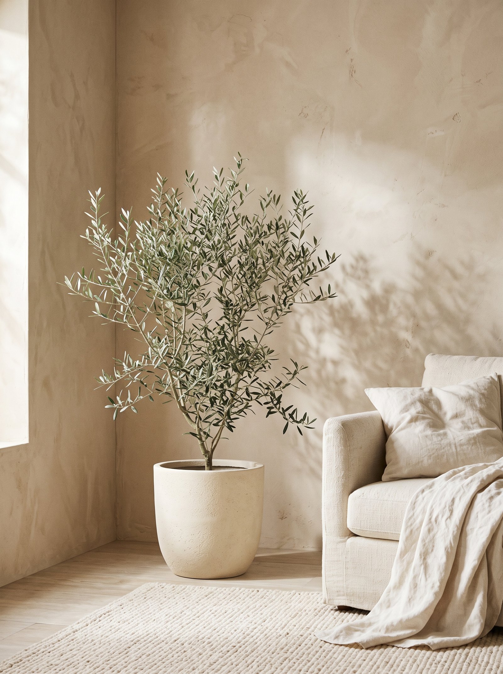
Charcoal grey against warm beige walls creates a modern-sophisticated palette that reads urban and considered. The warm beige softens the cool charcoal, preventing the room from feeling cold the way grey-on-grey rooms often do.
Choose charcoal with slight warm undertones (soft charcoal, not blue-grey) to maintain temperature harmony. A warm charcoal sofa, charcoal painted cabinetry, or charcoal area rug against beige walls holds the modern-neutral palette together without clashing.
Pair with cream, warm wood, soft brass, and natural fibers. The combination feels pulled from a modern Scandinavian apartment or a well-designed New York loft.
Avoid introducing bright primary colors into a charcoal-beige palette; the sophistication depends on the restrained neutrality. Any accent should stay in the warm-neutral family — cream, olive, caramel, soft black.
11. Navy Blue
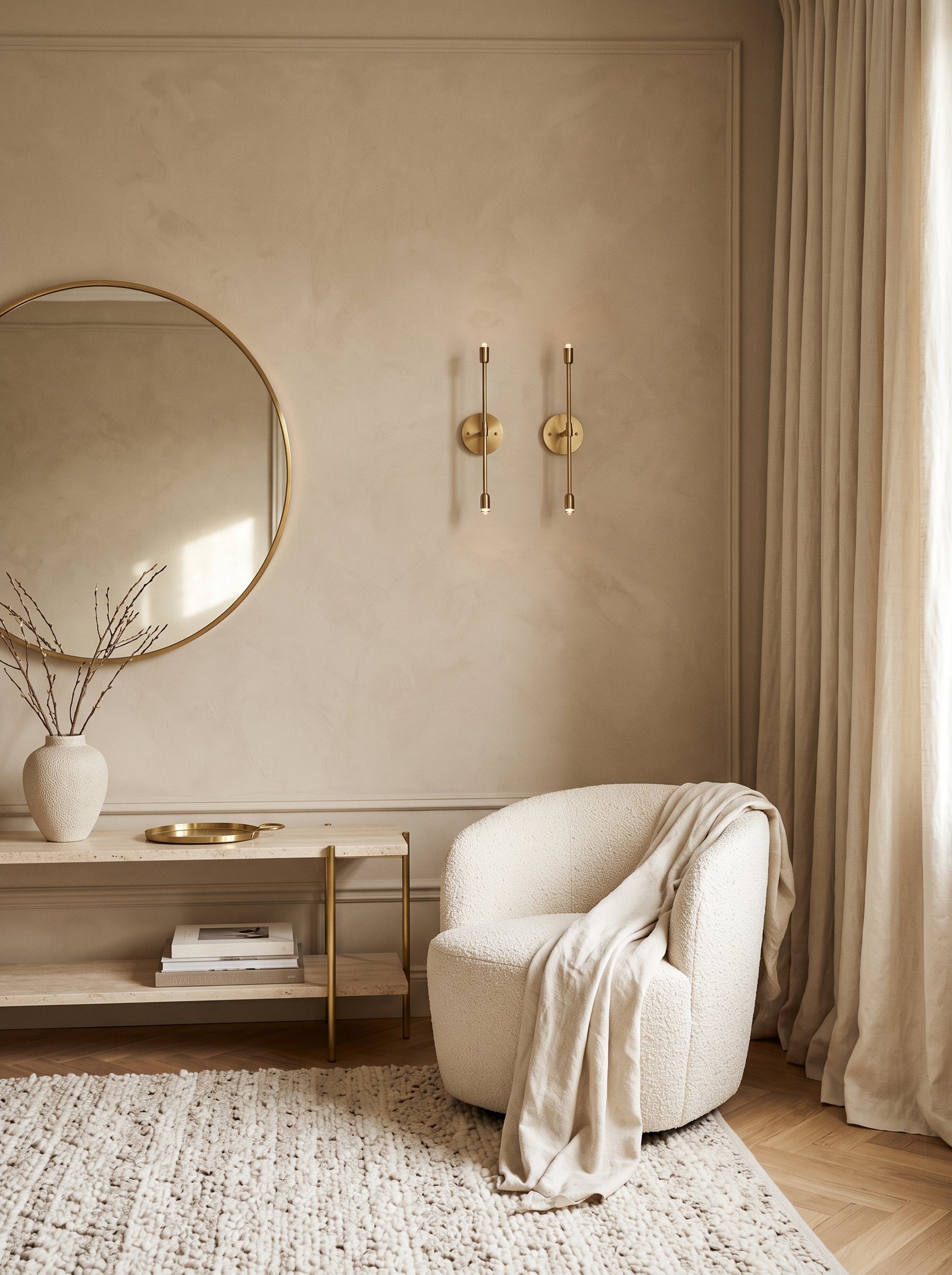
Navy blue brings traditional confidence to beige walls. The deep blue creates sharp contrast against the warm neutral, which gives rooms with navy accents a crisp, polished feel. The combination is a classic for home offices, libraries, and dining rooms where seriousness is welcome.
Introduce navy through substantial anchor pieces — painted built-ins, a velvet sofa, large upholstered dining chairs, or framed art with navy tones. Small navy accessories against beige walls read lost; larger navy applications anchor the space.
Pair navy with cream, warm wood, brass, and small touches of warm red (burgundy, rust). The palette feels nautical-sophisticated or English-library-classic depending on which supporting materials you choose.
For a paint commitment, Farrow & Ball Hague Blue, Clare Brooklyn Bridge, or Benjamin Moore Hale Navy all work beautifully against modern warm beige walls.
12. Chocolate Brown
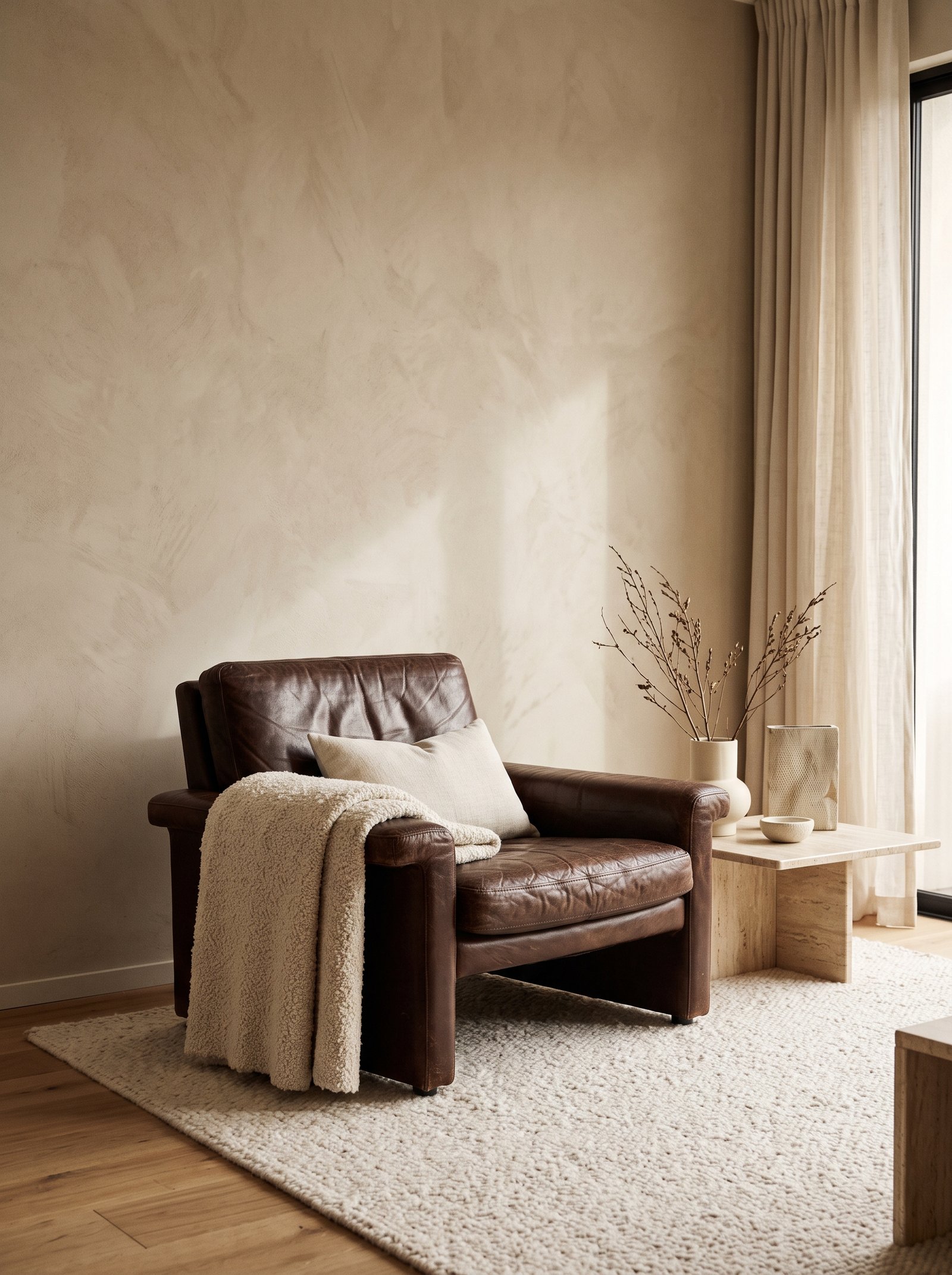
Chocolate brown — the deep, warm brown of aged leather and dark walnut wood — grounds beige walls in richness. The color brings traditional warmth without the orange of terracotta or the depth of burgundy, which makes it ideal for creating sophisticated interiors that read sophisticated across many design directions.
The classic application is leather and wood. A chocolate leather chesterfield, a walnut credenza, or a dark wood dining table all read beautifully against beige walls. The combination has the quiet confidence of English country interiors or Belgian minimalist homes.
Pair chocolate with cream, caramel, soft black, and warm brass. Natural fibers like jute, sisal, and wool amplify the earthy warmth of the chocolate-beige combination.
Avoid pairing chocolate with cool colors against beige walls. The temperature clash flattens both the brown and the beige, and the room loses its warmth.
13. Mustard Yellow
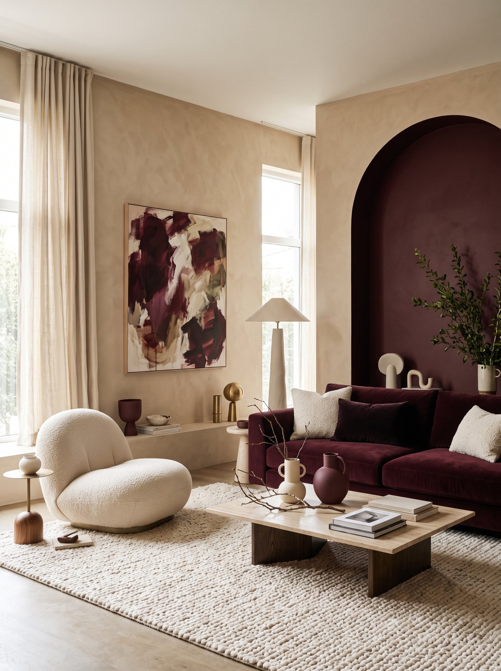
Mustard yellow — the muted warm yellow of French Provence linens and 1970s velvet — brings cheerful warmth to beige walls without tipping into primary-color territory. The muted quality of mustard harmonizes with beige’s warm undertones for a palette that feels sunny and inviting.
Introduce mustard through textiles first. A mustard velvet pillow, a mustard throw blanket, mustard linen curtains all add warmth and personality without a major commitment. The color photographs beautifully in warm light.
Pair mustard with cream, olive green, warm wood, and small amounts of chocolate brown. Avoid pairing mustard with bright orange or hot pink; the combinations get too saturated against beige walls.
For a bolder statement, paint a single accent piece in mustard — a bar cabinet, a reading chair, or a bedroom bench. The painted piece becomes the room’s warm focal point against the quieter beige walls.
14. Soft Taupe
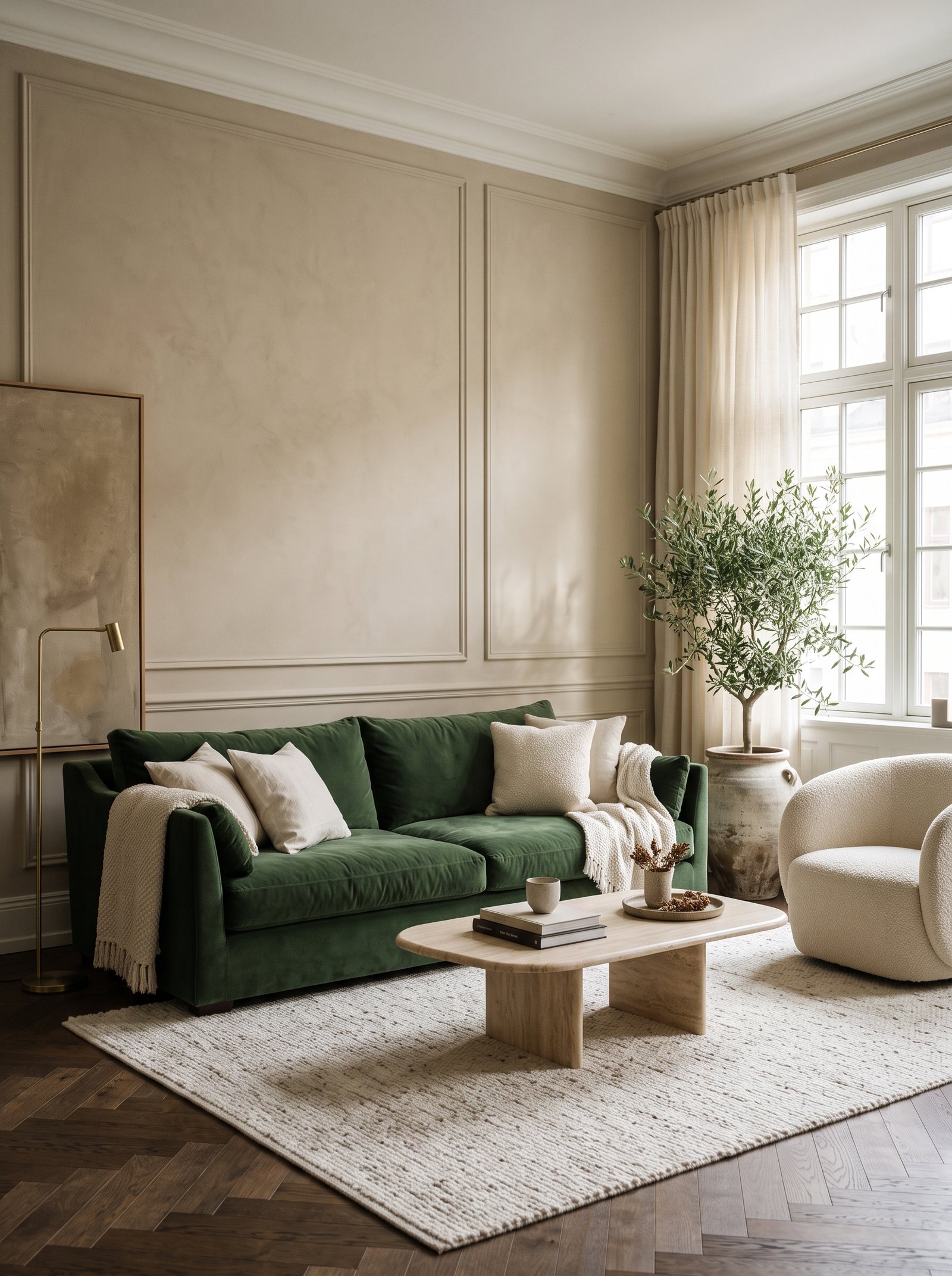
Soft taupe sits in the same warm-neutral family as beige and creates layered monochromatic rooms that read as expensive and intentional. A taupe sofa against beige walls doesn’t contrast — it layers, which is exactly the look sophisticated interiors aim for.
The success of this pairing depends on texture variation. Boucle, velvet, linen, wool, and leather in slightly different shades of taupe keep the monochromatic palette from feeling flat. The eye reads texture change as visual interest even without color change.
Add one small warmer or cooler accent — a deep olive branch in a cream vase, a terracotta pillow on the taupe sofa — to prevent the room from drifting into monotone. The accent reads intentional against the restrained neutrality.
Pair taupe with cream, oatmeal, warm wood, and small brass accents. The palette is reliable, timeless, and photographs beautifully in any light.
15. Blush Peach
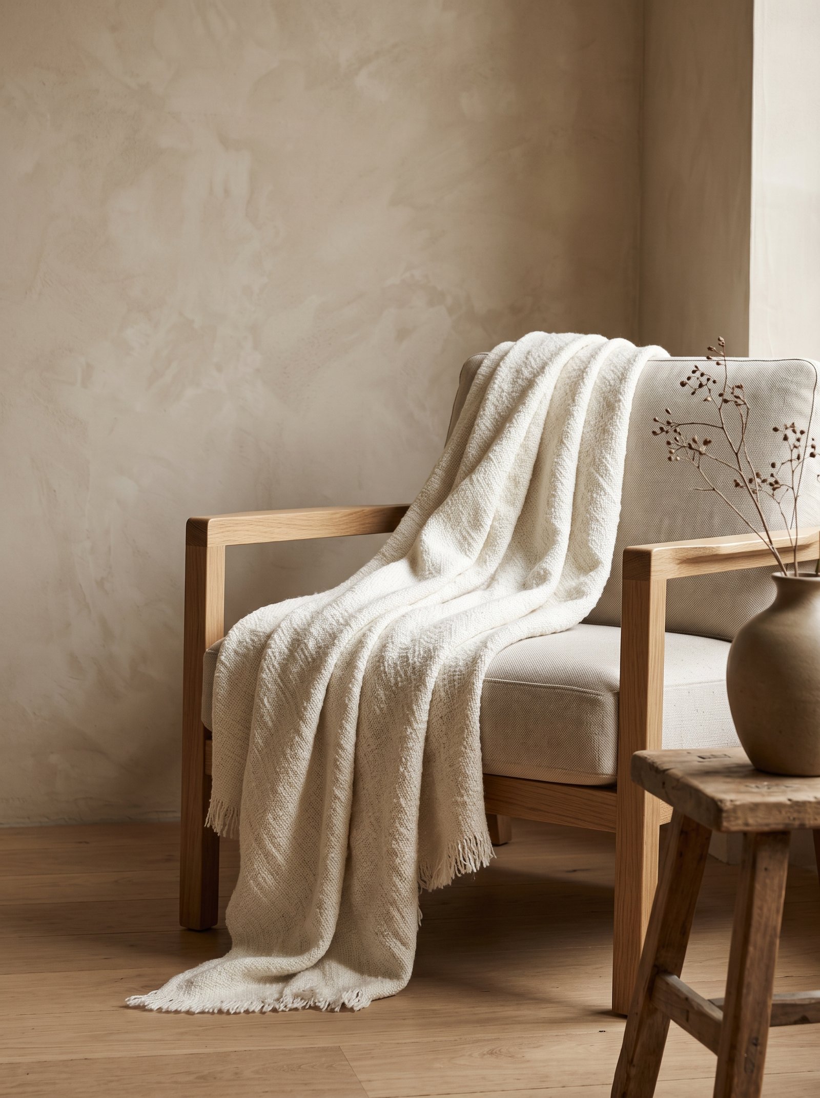
Blush peach — the soft warm pink-orange of early morning sunlight — adds romance and softness to beige walls. The color shares beige’s warm undertones, creating a palette that reads feminine and sophisticated without feeling juvenile.
Keep blush peach to small accents — a single ceramic piece, a soft throw, a set of tapered candles. The color is quiet and benefits from restraint; too much blush and the room reads as a nursery.
Pair blush with cream, warm wood, deep olive (surprisingly beautiful), and small touches of brass. The combination of blush and olive against beige is a defining palette of modern-romantic interiors.
For an unexpected application, consider blush peach in a bathroom — a painted vanity, a peach shower curtain, blush towels. The color brings warmth to typically cool bathroom spaces, especially against beige walls.
16. Forest Green
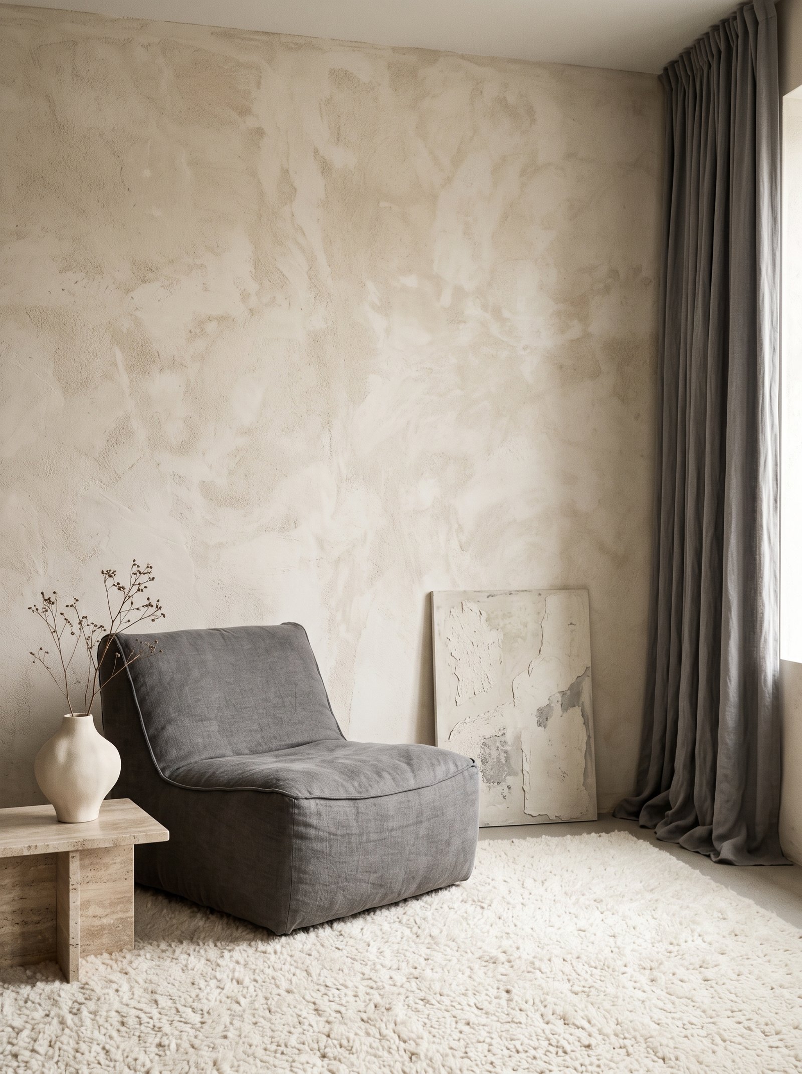
Forest green — deeper and darker than olive — creates dramatic contrast against beige walls. The combination feels pulled from British country houses, old libraries, and sophisticated European interiors. The depth of forest green makes the beige walls read warmer and more inviting by comparison.
Use forest green in substantial applications — a painted built-in bookcase, a feature wall behind a bed, a velvet sofa, or a large area rug. Small forest green accents get lost against beige walls; large applications create the drama the color deserves.
Pair forest green with cream, warm wood, brass, and small touches of burgundy or rust. The palette feels traditional-sophisticated and works especially well in home offices, dining rooms, and libraries.
For paint, Farrow & Ball Studio Green, Benjamin Moore Essex Green, and Clare Blackwatch all create the right depth of forest green against modern warm beige walls.
17. Soft Lilac
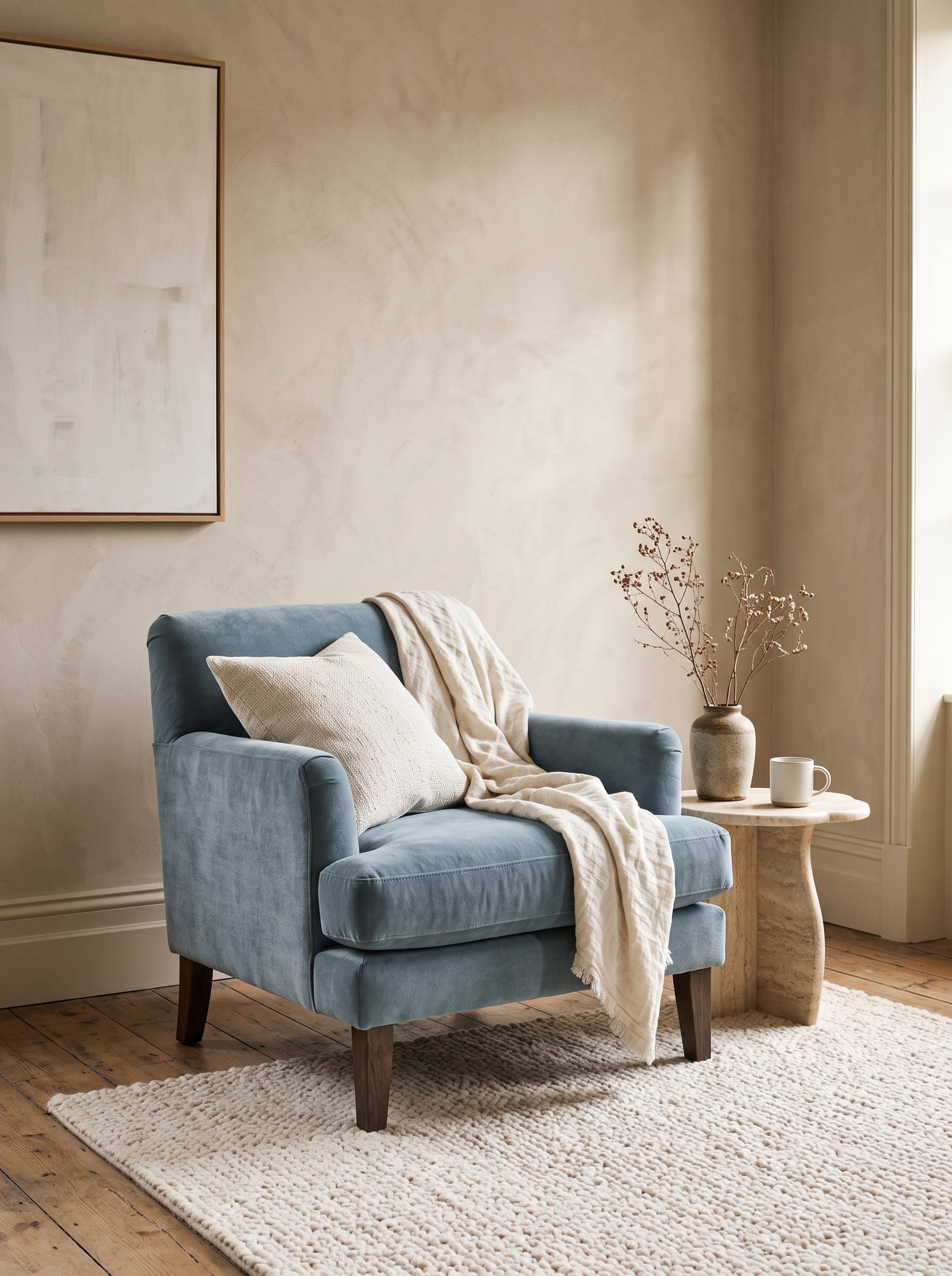
Soft lilac — muted and dusty, not saturated — creates a delicate romantic palette against beige walls. The color is unexpected enough to feel modern, soft enough to work with the warm beige, and sophisticated enough to escape the lavender-fields-of-Provence cliché.
Keep lilac restrained. A single accent piece — a bedroom bench, a velvet pillow, a ceramic vase — is enough. Over-lilaced rooms against beige walls read sweet and dated; one well-placed lilac moment reads modern.
Pair lilac with cream, warm wood, soft black, and small amounts of brass. Avoid pairing with mint green or bright pinks; the palette becomes too candy-shop.
For a bolder commitment, paint a small bedroom in a muted lilac for a soft romantic sanctuary. Farrow & Ball Pale Lilac or Clare Deep Dive work beautifully against adjoining beige walls in connected rooms.
18. Dusty Blue

Dusty blue — a soft muted blue with grey undertones — creates a quietly sophisticated contrast against beige walls. The cool blue cools the warm beige just enough to prevent the room from feeling overheated, while remaining soft enough to maintain the neutral palette.
The combination works best in bedrooms and bathrooms where calm is the goal. A dusty blue upholstered headboard, dusty blue bedding, or a dusty blue painted vanity against beige walls creates a palette that reads as a boutique coastal hotel without any explicit nautical theme.
Pair dusty blue with cream, warm wood, soft black, and brass. Avoid pairing with bright navy or stark white against beige walls; the sophistication depends on the muted quality of the dusty blue.
For paint, Farrow & Ball Light Blue, Benjamin Moore Van Deusen Blue, or Clare Lazy Sunday deliver the right muted quality that complements beige walls.
19. Rich Rust
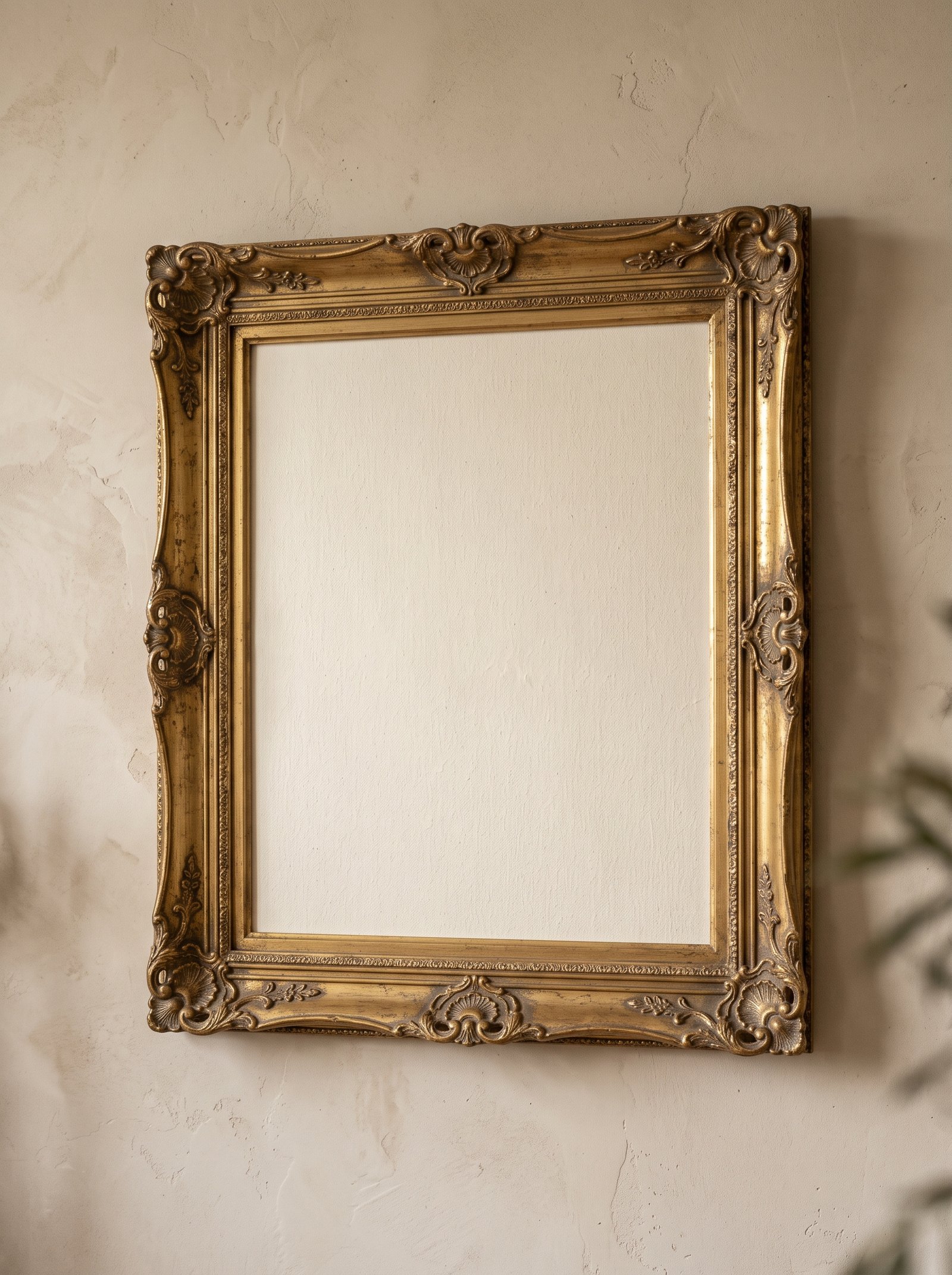
Rich rust — deeper and more saturated than terracotta — brings autumnal warmth and depth to beige walls. The color has the earthy pedigree of fall leaves, aged copper, and desert rock, which makes it inherently harmonious with beige’s warm neutrality.
Introduce rust through substantial applications — a velvet armchair, a wool area rug with rust tones, a painted small cabinet, or a large piece of textile art. The color has weight and benefits from being used generously enough to anchor the space.
Pair rust with cream, olive green, warm wood, and small touches of chocolate brown. Avoid pairing with bright corals or pastels; rust works with other grounded earth tones.
For a bolder statement, consider rust on a feature wall or in large-scale wallpaper. Against surrounding beige walls, the single rust statement reads as a confident design decision.
20. Warm Mushroom
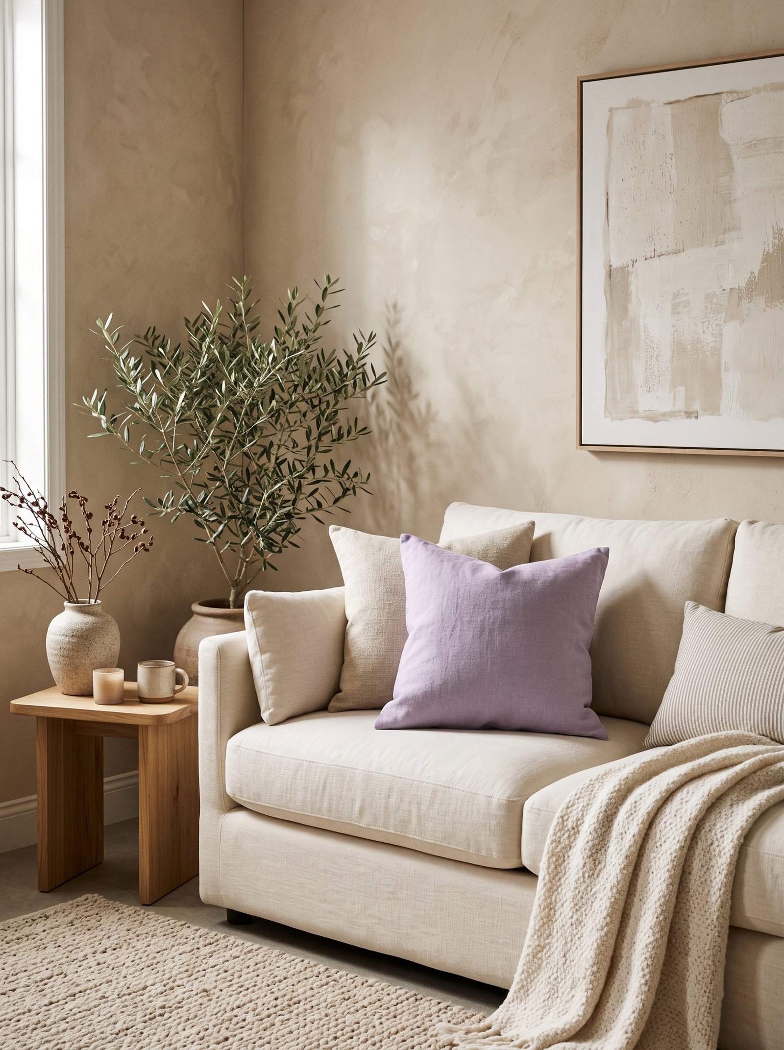
Warm mushroom — the dusty neutral between taupe and sage with hints of pink and green — is a modern designer favorite that works beautifully against beige walls. The color is a chameleon that reads slightly different in different lights, which keeps the palette feeling alive.
Mushroom works beautifully in upholstery, bedding, and painted furniture. A mushroom boucle sofa, mushroom velvet pillows, or a painted mushroom accent piece against beige walls creates subtle sophisticated layering.
Pair mushroom with cream, warm wood, soft brass, and small amounts of olive or terracotta. The palette feels pulled from a Belgian country house or a quiet Japanese-inspired interior.
For paint, Farrow & Ball Mole’s Breath, Clare Elephant in the Room, or Benjamin Moore Revere Pewter all deliver the right dusty quality that complements modern warm beige walls.
21. Deep Teal
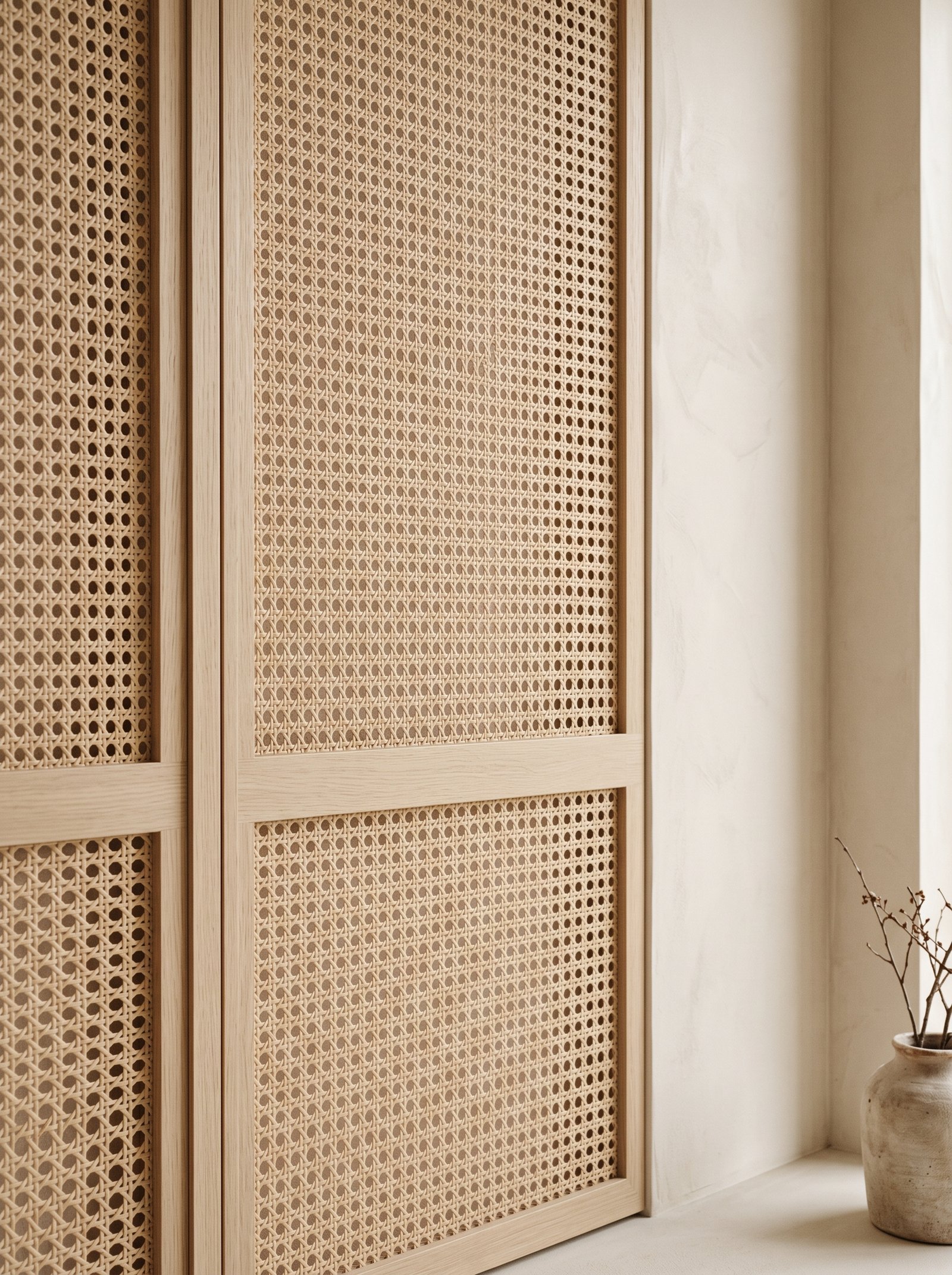
Deep teal — the saturated blue-green of peacock feathers and deep ocean — brings unexpected drama to beige walls. The color is bold enough to make a statement while sitting within the broader blue-green family that still harmonizes with beige’s warm undertones.
Use teal in a single significant application — a painted bookshelf, a velvet sofa, a large piece of wall art, or a feature wall in an adjacent room visible from the beige-walled room. The impact depends on commitment; small teal accents against beige walls read tentative.
Pair teal with cream, warm wood, brass, and small touches of coral or terracotta. The combinations feel sophisticated-boho and work especially well in creative spaces, dining rooms, and home offices.
For paint, Farrow & Ball Hague Blue, Benjamin Moore Narragansett Green, or Clare Sea the Day all deliver the right depth for a dramatic accent against warm beige walls.
22. Soft Cognac
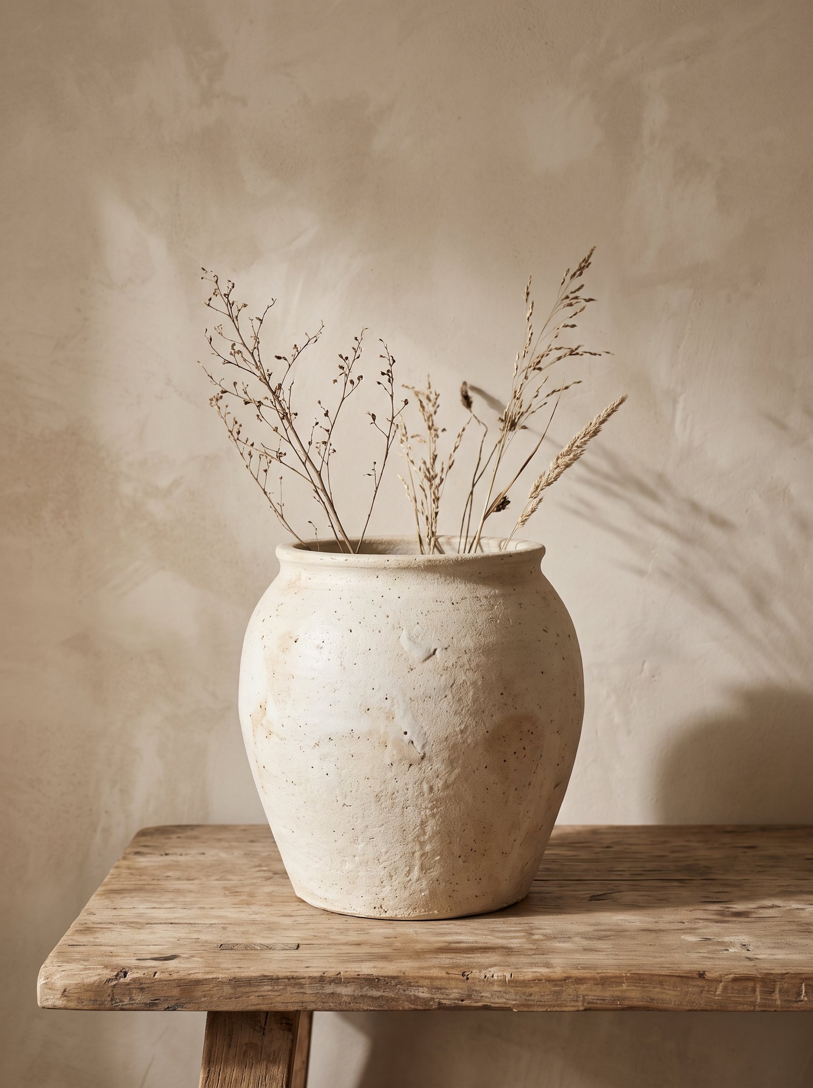
Soft cognac — the warm brown-orange of aged whiskey — reads as timeless luxury against beige walls. The color is slightly lighter than caramel and warmer than tan, giving it a specific sophistication that works especially beautifully in leather and velvet.
Cognac leather is the signature application. A cognac leather sofa, armchair, or ottoman against beige walls creates a palette that feels pulled from a vintage boutique hotel bar or a mid-century modern apartment. The leather develops beautiful patina against the warm beige backdrop.
Pair cognac with cream, olive green, dark wood, and brass. The combination is quietly expensive and reliably stylish across many design directions from mid-century modern to traditional.
For small-scale introductions, cognac leather accessories (a small side table, a leather tray, a bookshelf accent) bring the color into the room before committing to larger upholstery pieces.
23. Dusty Plum
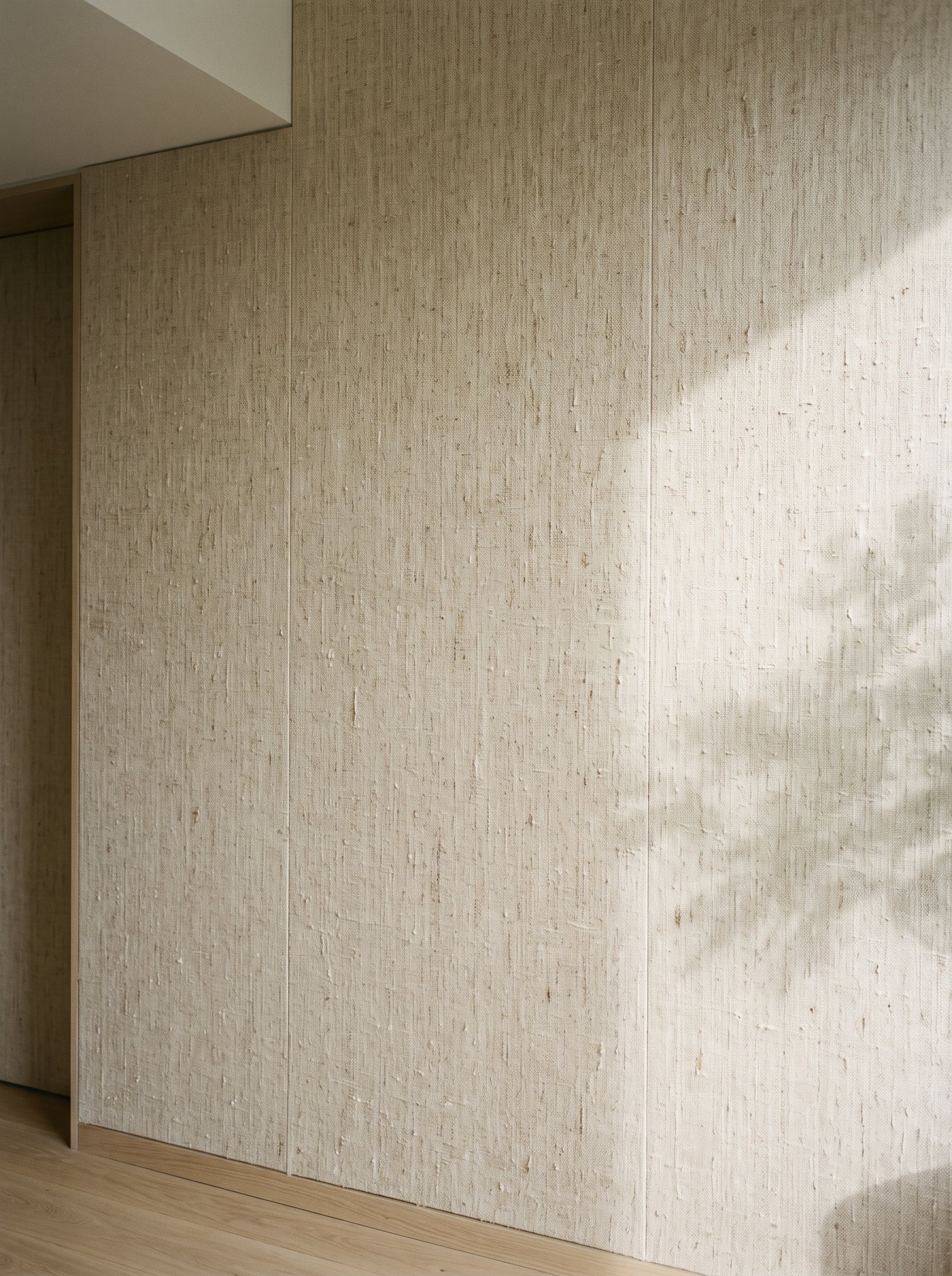
Dusty plum — a muted warm purple between burgundy and lavender — creates sophisticated depth against beige walls. The color is unexpected enough to feel modern, warm enough to harmonize with beige’s undertones, and dark enough to anchor a room without feeling oppressive.
Introduce plum through velvet upholstery — pillows, throws, a small armchair, or a bedroom bench. The velvet texture amplifies the color’s richness and keeps it from reading flat.
Pair plum with cream, warm wood, soft black, and small touches of brass or gold. Avoid pairing with cool blues or bright pinks; the sophistication depends on keeping the palette within warm earth tones.
For paint, Farrow & Ball Brinjal, Clare Night Shift, or Benjamin Moore Shadow all create the right depth for a dusty plum accent against modern beige walls.
24. Golden Ochre
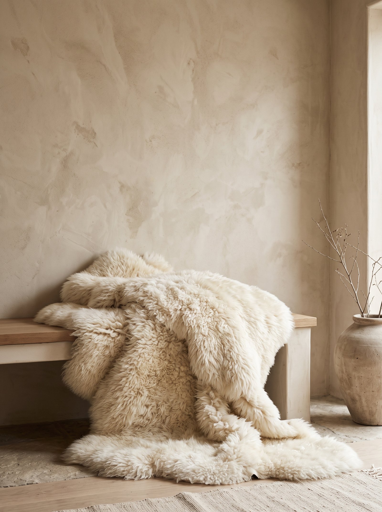
Golden ochre — the warm yellow-brown of sunflowers, saffron, and aged brass — brings radiant warmth to beige walls. The color has the energy of mustard without the saturation, which makes it easier to live with across years and seasons.
Ochre works beautifully in art, textiles, and painted accents. A large piece of textile art with ochre tones, ochre linen pillows, or an ochre painted accent chair all read as warm sophisticated highlights against beige walls.
Pair ochre with cream, deep olive, warm wood, and brass. The combination feels pulled from a Mediterranean villa or a sun-drenched Moroccan interior.
For an unexpected statement, consider ochre curtains or an ochre area rug. The color glows in afternoon light and transforms a beige-walled room from quiet to warm and alive.
25. Pure Cream
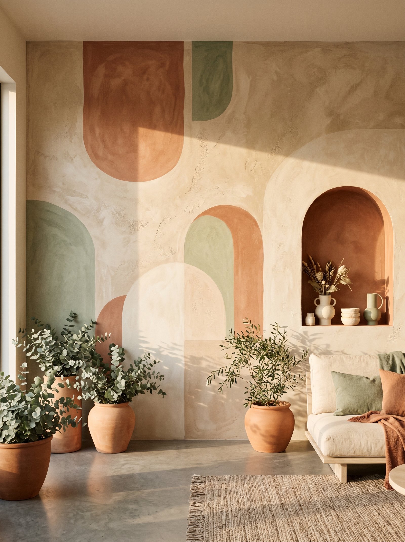
Pure cream — slightly warmer and softer than white, slightly lighter than oatmeal — is the perfect quiet partner to beige walls. The two colors sit on the same warm-neutral spectrum, creating tonal harmony that reads expensive and considered without any strong contrast.
Use cream throughout the room for the monochromatic sophisticated look. Cream boucle sofa, cream linen bedding, cream wool rug, cream velvet pillows against beige walls creates a palette that feels pulled from a Belgian country house or a Parisian apartment.
The success depends on texture variation and small warm wood accents. Without texture change, the monochrome reads flat; with layered textures (boucle, linen, velvet, wool, leather) the same palette reads rich.
Add one small accent in a slightly deeper warm tone — a terracotta vase, an olive branch, a cognac leather tray — to prevent the room from drifting into pure monochrome. The small accent reads intentional against the restrained neutrality.
Common Mistakes to Avoid With Beige Walls
Even the best accent colors can look wrong against beige walls if the pairing is executed poorly. The most frequent mistake is matching the beige’s exact tone with surrounding furniture — a beige sofa against beige walls creates a flat room with no definition, no matter how beautiful either piece is on its own. The solution is to vary the shade (lighter cream, deeper taupe) or add texture contrast (boucle against smooth plaster) to prevent the beige-on-beige flatness.
The second mistake is pairing beige walls with pure stark white trim or stark white textiles. White against warm beige makes the beige look yellow and dingy by comparison. Use warm cream or soft off-white for trim, baseboards, ceilings, and bedding, and the beige walls return to reading as the warm neutral they actually are.
Third mistake: introducing too many cool colors against warm beige. A single dusty blue accent can work beautifully; three or four cool-toned pieces together (grey sofa, blue curtains, cool silver hardware) fight the warm walls and create a palette that feels confused and tension-filled. Keep cool accents to one piece per room when working against beige walls.
Fourth: using the wrong lighting. Beige walls under cool-white LED bulbs look flat and institutional. The same beige walls under warm 2700K bulbs glow and feel inviting. Lighting is 30% of how any wall color reads, and beige is especially sensitive to light temperature. Always use warm bulbs with beige walls.
How to Choose Which Color Is Right for Your Room
The question of which accent color to pair with beige walls depends on three factors: the room’s function, the room’s natural light, and the mood you want to create. Living rooms and dining rooms where energy and gathering matter benefit from richer accents (olive, burgundy, forest green, teal). Bedrooms and bathrooms where calm is the goal benefit from softer accents (dusty sage, dusty blue, blush, soft taupe).
Rooms with abundant natural light can carry darker and more saturated accent colors without feeling heavy. The sunlight compensates for the color’s visual weight. Rooms with limited natural light are better served by lighter accents (cream, blush, soft caramel, dusty rose) that don’t absorb the already-limited light.
For mood, cool-toned accents (dusty blue, soft lilac, dusty sage) create calming, restful spaces. Warm-toned accents (terracotta, mustard, cognac, burgundy) create energetic, enveloping spaces. The beige walls amplify whichever mood you choose by providing a quiet, warm background that lets the accent carry the emotional weight.
Start with a 72-hour test. Introduce the color you’re considering through a small piece — a pillow, a vase, a throw — and live with it for three days in your actual room with your actual light. The right color will feel like it belongs; the wrong color will feel like something you’re trying too hard to make work. Trust the three-day verdict and build out from there.
Three Complete Whole-Room Palettes to Copy
The Belgian Country Palette: beige walls, cream boucle sofa, deep olive velvet armchair, warm walnut coffee table, aged brass hardware, jute area rug, one terracotta ceramic vessel, dried eucalyptus branches, soft black picture frames. This palette reads timeless, European, and quietly expensive. It works in living rooms, dining rooms, and open-plan spaces where sophistication is the goal.
The Modern Minimalist Palette: beige walls, oatmeal linen sofa, dusty sage accent pillows, oak coffee table on tapered legs, matte black floor lamp, cream wool rug, one large black-and-white framed photograph, trailing pothos plant in a cream ceramic pot. This palette reads calm, modern, and uncluttered. It suits bedrooms, home offices, and primary living spaces where restraint is the design philosophy.
The Warm Mediterranean Palette: beige walls, warm cream linen bedding, terracotta velvet headboard, warm oak nightstands, aged brass sconces, golden ochre throw blanket, dried pampas grass in a hand-thrown clay vessel, a single piece of textile art with ochre and olive tones. This palette reads warm, inviting, and sun-drenched regardless of actual light conditions. It works beautifully in bedrooms, reading nooks, and dining rooms.
Each of these palettes uses the color pairings described above but assembles them into complete rooms. Copy any one directly or borrow elements from each to build the version that fits your home. The underlying principle is the same across all three: warm beige walls, one or two dominant accent colors from the warm or warm-neutral family, texture layering to prevent flatness, and warm lighting to make the whole palette glow.
Testing Colors Before You Commit
Before investing in a sofa, a rug, or paint for an accent piece, test the color against your actual beige walls. The color on the swatch, in the showroom, or on your laptop screen will not look the same in your home. Your specific beige tone, your room’s light, and your existing furniture all affect how an accent color behaves.
For textiles, order fabric swatches from upholstery sites — most offer them for free or a nominal fee. Pin the swatches to the wall at different heights and in different light conditions for at least 48 hours before ordering. The color that looked perfect in morning light may read completely differently in the evening.
For paint, buy sample pots of two or three candidate colors. Paint 12×12 inch squares on multiple walls in the room, including walls that face different directions. Let the paint dry fully, then observe for three to five days before deciding. Lighting changes throughout the day and across seasons will reveal which color actually belongs in your room.
For furniture, use a cardboard mockup or a smaller version of the piece in the color you’re considering. A small accent chair in your target color placed in the space tells you more than any digital rendering ever could. The 72-hour live-with test prevents expensive mistakes.
Pulling the Beige-Wall Palette Together
Beige walls are not the problem that outdated opinions make them out to be. Modern warm beige is one of the most sophisticated wall colors in current interior design — the issue is only ever the colors you pair with it. Choose colors with warm undertones (olive, terracotta, caramel, cream, mushroom) and the beige becomes an asset. Choose colors with cool undertones (bright blue, cool grey, stark white) and the room feels confused and dated.
The rule for success: pick one or two primary accent colors from the list above and build your room around them. Don’t try to use five accent colors in one beige-walled room — the result reads cluttered and loses the sophistication beige is capable of carrying. Restraint is the secret.
Start with the easiest wins. Add olive green through pillows and a plant or two. Introduce warm brass hardware or candlesticks. Layer in cream textiles for softness. Three small changes against beige walls transform the whole room without any paint commitment.
For specific room approaches that pair beautifully with beige walls, see our guides on warm neutral living rooms, sage green bedroom ideas, modern terracotta home decor, master bedroom boutique hotel decor, and styling rental living rooms with beige walls. Each pairs with the color combinations above to help you build a whole-home palette that works with — rather than against — your existing wall color.
Take our 2-minute Decor Style Quiz
Answer 10 quick questions and discover whether you’re Modern Boho, Scandinavian Minimalist, Modern Farmhouse, Mediterranean, Japandi, or Classic Traditional — plus your color palette and 3 articles made for you.
Start the Quiz →Beige Walls Color FAQs
What colors go best with beige walls?
Deep olive green, warm terracotta, soft black, warm caramel, dusty sage, cream (not stark white), navy blue, and dusty rose all work beautifully. The key is matching the beige undertone — warm beige wants warm accents, cool beige wants cooler accents.
Is beige out of style?
No. Modern warm beige (not pink-peach 1990s beige) is one of the most sophisticated wall colors in current interior design. The issue is never the beige itself — it is the colors paired with it. The right accents make beige read as a warm neutral; the wrong accents make it look dated.
Should I paint over my beige walls?
Not unless the beige has strong pink-peach undertones that read 1990s. Modern warm beige is a sophisticated backdrop that works with many design directions. Change the accent colors (sofa, art, pillows) rather than the walls — far cheaper and often enough to transform the whole room.
What accent color makes beige walls look modern?
Soft matte black. One substantial black element — floor lamp, picture frames, bookshelf, or hardware — grounds beige walls and gives them modern edge. Deep olive green is a close second.
Our interactive tools can help
Take the style quiz, generate a beige wall color palette, or calculate the perfect pillow stack for your bed — all free, all in under 2 minutes.
Explore Tools →