
25 Bookshelf Styling Ideas With Layered Looks Anyone Can Copy
A beautifully styled bookshelf is one of the quietly powerful things in a home. It signals who lives here, what they value, and how carefully the room has been considered — all without a single word of design-speak. Done poorly, it reads cluttered or sterile; done well, it looks like a layered painting you’d stop and study. The difference almost never comes down to the shelves themselves or the budget. It comes down to a short, repeatable set of styling rules that editorial stylists and designers use project after project.
These 25 bookshelf styling ideas pull from the layered looks you keep screenshotting on Pinterest — the shelves in editorial shoots, the ones designers build for client homes, and the ones that show up on the cover of every magazine. Each idea is a copy-and-paste move you can try with the books, objects, and small art you already own. Start with the first three, then layer in whichever ones match your room, your palette, and the shelves you already have.
1. Mix Vertical and Horizontal Book Stacks

If every book on your shelf stands upright, you have built a library. If every book lies flat, you have built a storage unit. The layered editorial look that defines modern bookshelf styling comes from mixing both on the same shelf — a run of vertical books, then a short horizontal stack of three or four, then more vertical, in no fixed pattern that follows the eye naturally rather than mechanically.
The horizontal stacks are what designers use to create visual “resting places” for the eye and little pedestals to prop decorative objects on. Each horizontal stack doubles as a platform — place a small ceramic, a brass object, or a single tall vase on top of it, and the stack becomes an architectural element rather than a pile of books. Keep each horizontal stack to three to five books maximum so it reads as deliberate styling rather than lazy flattening.
Vary the ratio across shelves. One shelf might be mostly vertical with one horizontal stack; the next might reverse the proportion. The deliberate variation is what reads as collected over time rather than organized in one Sunday-afternoon purge.
2. Pull Books Forward to the Edge
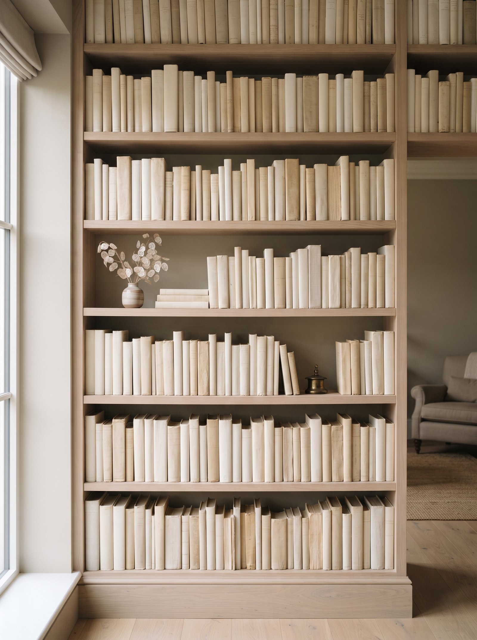
Push every book forward until the spines sit flush with the front edge of the shelf. It is a tiny move with an outsized effect — the spines line up as one clean plane, and the depth behind them becomes a shadow box that makes any object you place in front look intentional. The whole shelf reads as considered joinery rather than as functional storage holding books.
This is the single most underused trick in bookshelf styling, and it is completely free. A $150 big-box bookshelf styled this way reads as a $2,000 custom built-in from across the room because the eye registers the tight front plane as architecture rather than furniture.
For bookshelves without adjustable depth, use small plastic shelf risers or wooden blocks at the back to push the books forward uniformly. The invisible blocks hold the alignment permanently without you having to re-level everything after each dust.
3. Group Books by Spine Color, Not Topic
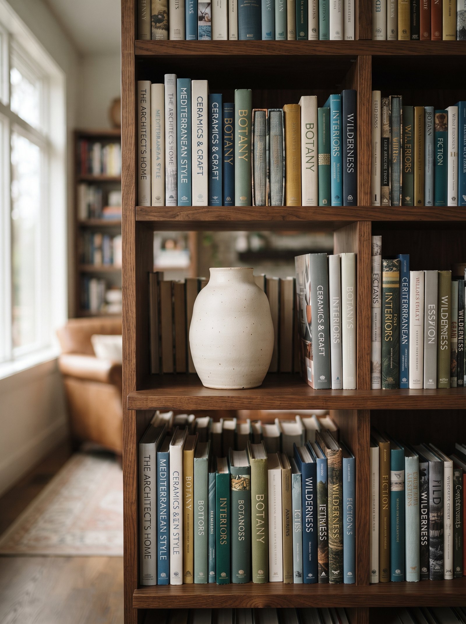
You do not need a full rainbow shelf — that trend read fresh in 2016 and reads dated now. But grouping books in loose color families — all your creams together, your blacks together, your warm earth tones together, your deeper reds together — makes any shelf read as styled instead of random. Topic organization is for a working library you reference daily; color grouping is for a styled bookcase in a living room where the shelves are seen more than searched.
Start with the loudest, most saturated spines and tuck them lower on the bookcase where they anchor the composition. Push the muted creams and warm whites up top where they recede and let the ceiling line read lighter. The gradient from heavy at the bottom to light at the top mirrors how the eye naturally reads any composition.
The color groups do not need to be rigid. A few spines of complementary tones mixed into a dominant color group reads more collected than perfect sorting. The slight imperfection is what prevents the shelves from reading as a store display.
4. Flip Books Backward for a Neutral Palette
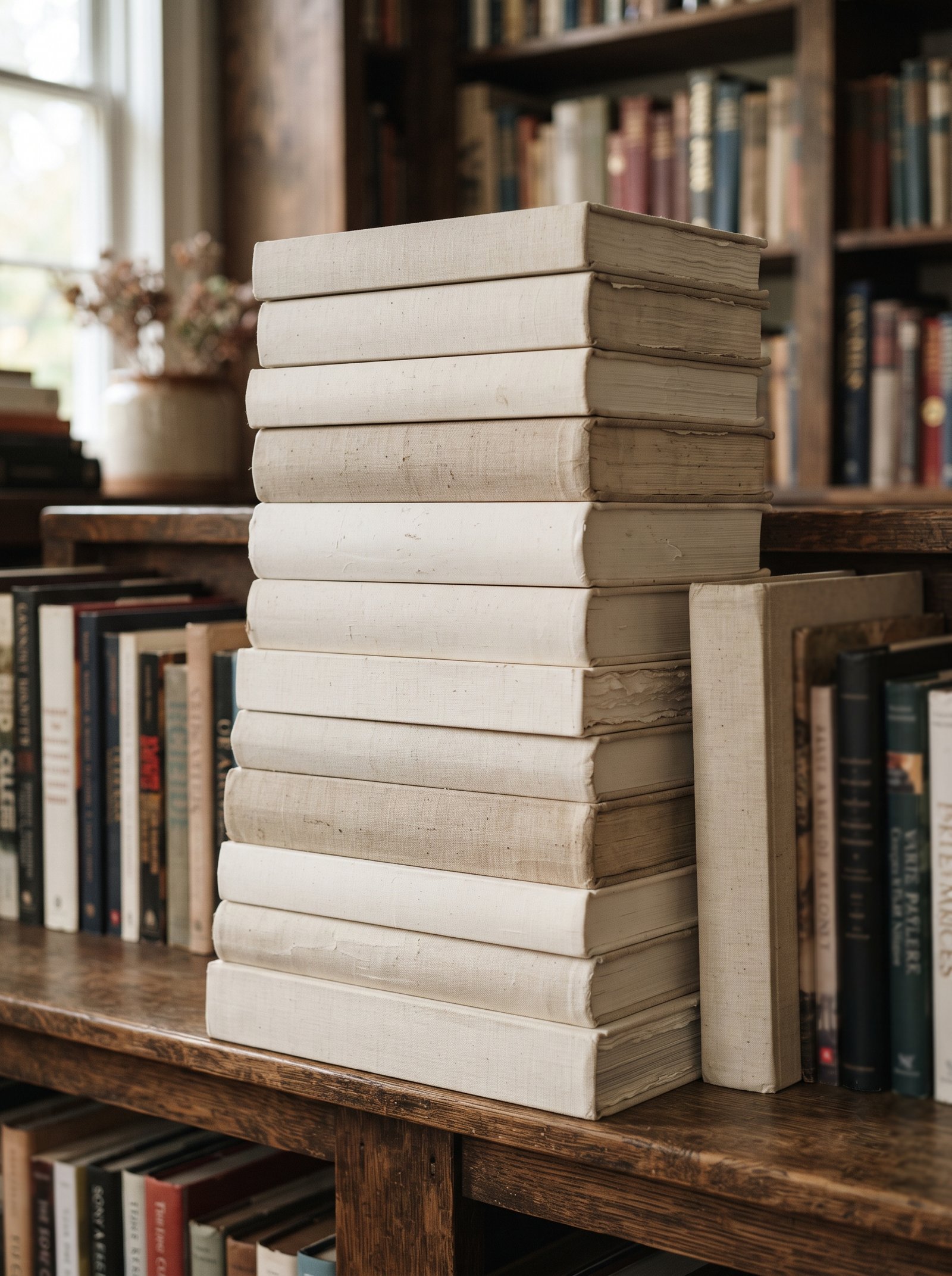
Loud publisher spines are the main reason bookshelves look chaotic. Turning a selection of books backward — pages facing out instead of spines — gives you a block of soft cream color that calms the whole shelf without donating or hiding anything you want to keep. It is free, reversible, and shockingly effective at quieting a busy bookcase.
Do not flip everything — the effect gets precious and reads like you’re hiding the books rather than styling them. One section per shelf, mixed with normal spines, is the sweet spot. The warm cream page edges serve as a neutral palette-cleanser between runs of colored spines, giving the eye a moment to rest.
Flip the books whose spines you dislike aesthetically but whose content you want to keep — the design textbook from college, the paperback with the embarrassing cover, the business book with the loud orange typography. The content is preserved; the visual noise disappears.
5. Add a Piece of Leaning Art

A small piece of art leaned against the back of a shelf behind a stack of books creates layering that a flat gallery wall never can. The leaned frame introduces depth, blocks a portion of the empty back panel, and gives you an easy way to swap seasonal art — a new print, a postcard in a cheap frame, a page torn from a magazine and matted, a photograph from your last trip.
Scale the frame so it covers roughly half the shelf height. Anything smaller gets lost against the surrounding books and objects; anything larger starts to crowd the shelf and fight the composition for attention.
Choose simple frames in warm wood, matte black, or soft brass that complement the books and objects without competing. Ornate carved frames belong on walls where they can command space; shelf art benefits from quiet frames that let the art itself be the focus.
6. Use the Rule of Three for Every Shelf
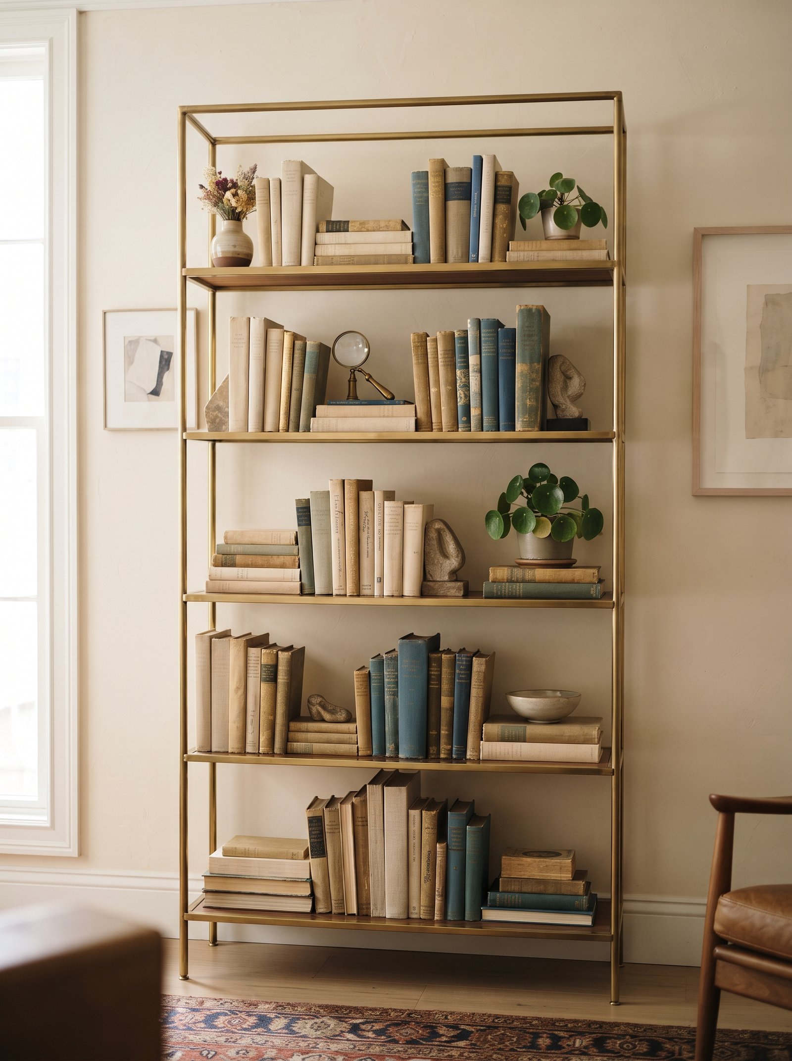
On each shelf, aim for three decorative objects at three different heights — tall, medium, short — grouped near one end with books taking the rest of the space. Three is the number that reads composed to the human eye without feeling cluttered. The triangular composition formed by the three objects creates visual stability that no straight-line arrangement can replicate.
If you have more than three decorative objects, split them across multiple shelves rather than piling them all on one. Nothing kills a bookshelf faster than one shelf trying to carry everything decorative while the other shelves hold only books. The composition reads as unbalanced and crowded.
The three-object rule applies to every shelf, which means a six-shelf bookcase holds roughly 18 decorative pieces maximum. If you own more than that, rotate them seasonally rather than displaying them all at once. The restraint reads as intentional curation.
7. Introduce One Sculptural Object

One sculptural piece per shelf gives the arrangement a visual anchor and a conversation starter. A hand-thrown ceramic vessel, a carved wooden form, a soft plaster bust, a chunky brass object, an abstract stone — something whose shape stops the eye for a beat and asks it to study the piece. Without a sculptural anchor, shelves read as object collections; with one, they read as composed vignettes.
These are the pieces to spend a little more on. One beautiful handmade ceramic from a working potter outperforms a dozen big-box tchotchkes forever, both in daily enjoyment and in how the shelves photograph. Hunt estate sales, small-shop ceramicists on Instagram, and local craft fairs for pieces with real character.
Vary the material and finish of sculptural pieces across shelves. All-ceramic sculpture reads monotonous; a mix of ceramic, wood, metal, and stone across different shelves reads collected over time from multiple sources.
8. Add Trailing Greenery From Above

A trailing plant on the top shelf — pothos, string of pearls, ivy, tradescantia, trailing philodendron — softens the hard rectangle of a bookshelf and introduces movement that nothing else can replicate. The vines break up the straight edges of the shelves and give the whole piece a sense of being lived with and attended to rather than installed and forgotten.
Position the plant so the vines cascade down over at least two shelves. A plant that trails only slightly creates minimal visual impact; one that drapes dramatically across multiple shelves reads as architectural element rather than small accent.
If natural light near the bookcase is limited, choose a plant that genuinely tolerates low light (pothos, snake plant, zz plant) rather than fighting an impossible battle. Alternatively, a quality faux vine from a better-than-expected brand does the same visual job indefinitely without maintenance. Choose matte, non-reflective leaves — glossy fake leaves give the plastic away.
9. Repeat an Accent Color Three Times
Pick one accent color — rust, deep green, mustard, inky blue, soft terracotta — and place it on exactly three shelves. A book spine on one, a vase on another, a small object on a third. The repetition pulls the whole bookshelf together as a composition rather than letting each shelf float independently with no visual relationship to the others.
Three is the magic number for color repetition. Two feels accidental, four starts to feel like a theme being hammered home. Three reads as intentional punctuation that connects the shelves without dominating them.
Choose the accent color to echo something else in the room — the throw on the sofa, the rug underneath, a piece of art on an adjacent wall. The repetition across the bookshelf plus the room’s main textiles creates whole-room cohesion that elevates the entire space.
10. Lean a Framed Photo Alongside Books
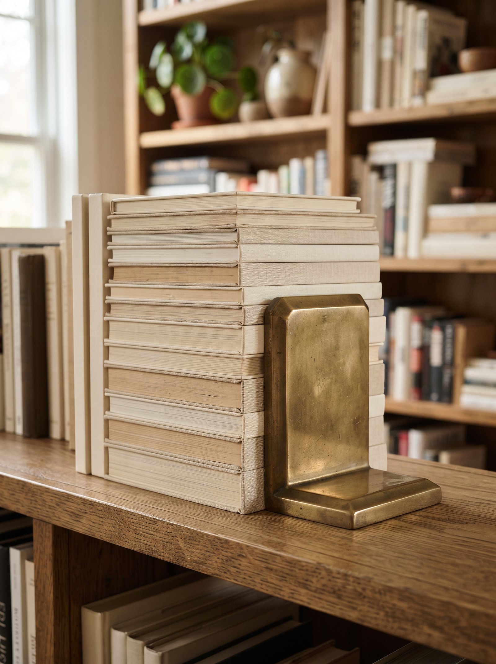
A single leaned photograph — black and white, warmly matted, something personal — gives the shelf a human touch without filling it with the kind of family-portrait wall that makes a room feel like a museum of your relatives. One photo per bookcase is plenty; the restraint makes the one you choose feel considered rather than compulsory.
Keep the frame neutral: wood, soft brass, matte black. Ornate frames fight the books; simple frames step back and let the image do the work. If the photo itself is colorful, a quiet frame balances the composition; if the photo is black and white, you can afford a slightly more interesting frame.
Position the photo at eye level when standing — usually one of the middle shelves. Photos tucked up top or down low get missed; photos at eye level invite guests to pick them up and ask about them.
11. Vary the Spine Heights Deliberately
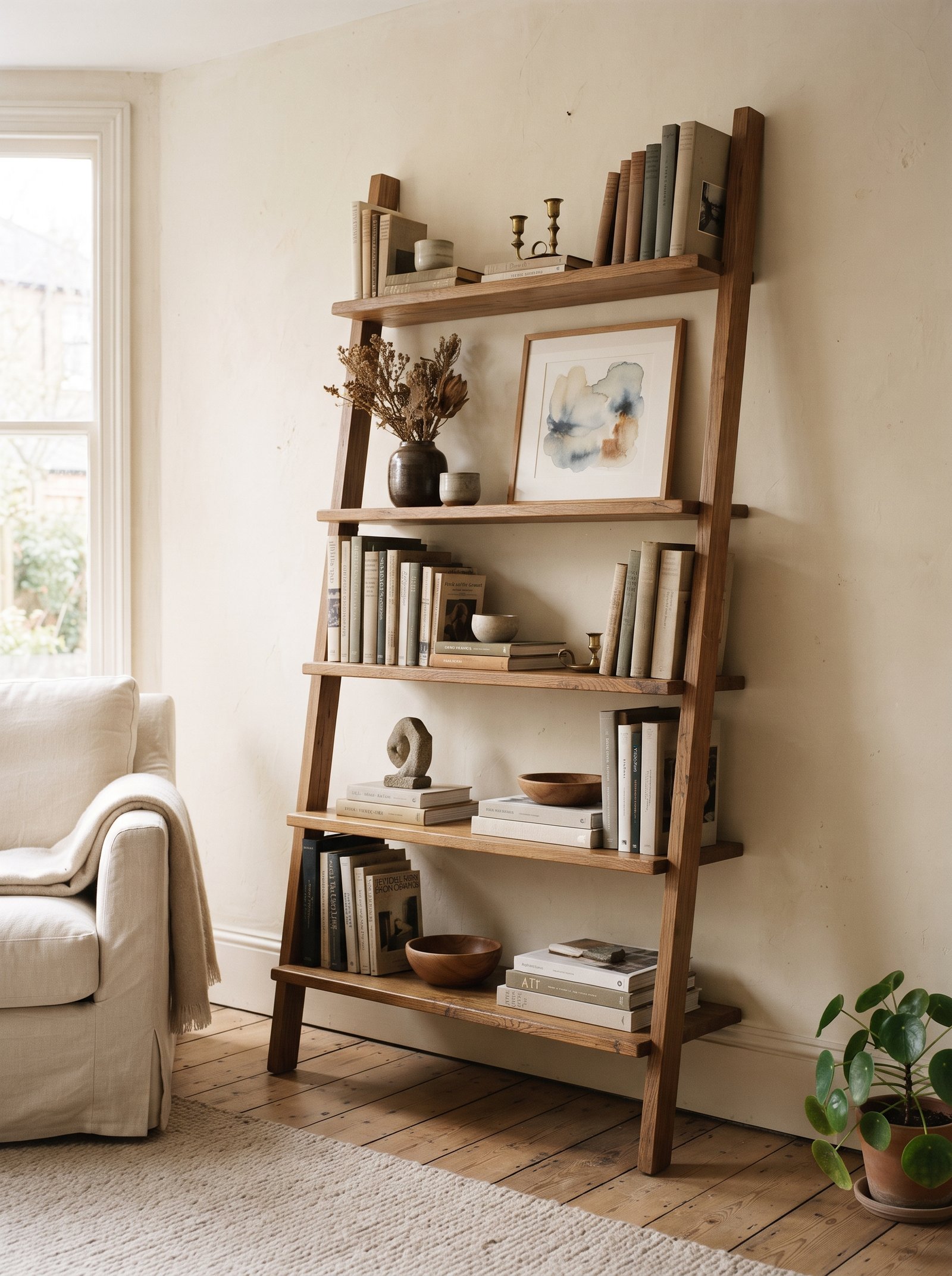
Sort your vertical books so the heights wave gently — tall, short, medium, tall, short — instead of marching from tallest to shortest. The varied skyline reads as collected over time rather than organized in one Sunday-afternoon purge where you obsessively graded every book by height. The slight imperfection is the whole point.
If you have a run of same-height paperbacks that would otherwise read as a monotonous block, break them up with a bookend or a short horizontal stack mid-shelf. The interruption gives the eye a visual rest and prevents the paperbacks from reading as a flat wall of identical rectangles.
The height variation should look organic rather than schematic. Avoid perfectly alternating tall-short-tall-short patterns; aim for a loose rhythm with occasional runs of similar heights interrupted by deliberate contrasts.
12. Hide a Little Storage in Plain Sight

A lidded box in rattan, leather, or linen on one shelf hides chargers, cables, small supplies, extra remote controls, the kids’ art materials, or any of the small daily items that otherwise create visual chaos. The box reads as styling; secretly it is storage. This is how adult-looking rooms stay functional without turning into visible junk drawers.
Keep the box in the same material family as other textures already on the shelf so it integrates rather than announces itself as “the storage box.” A woven rattan box reads as decor if the shelf also has woven elements; a leather box reads as styled if the shelf has leather-bound books; a ceramic lidded jar reads as sculpture if the shelf has other ceramics.
One lidded box per bookcase is usually enough. Multiple hidden-storage boxes start to read as “where I shove things” rather than as styled vignettes with secret storage.
13. Repeat a Shape Across Shelves
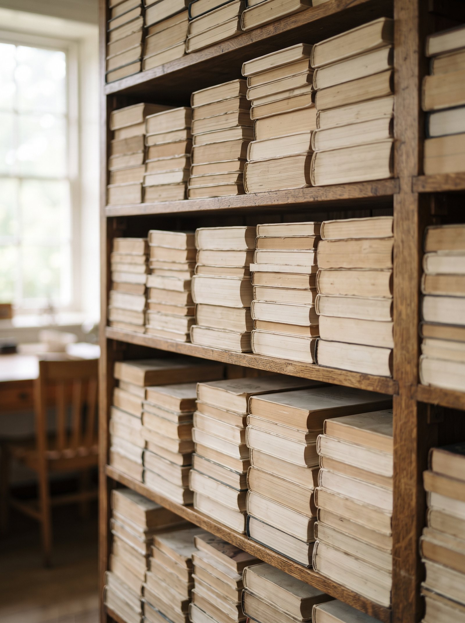
Choose a shape — round, oval, cylindrical — and repeat it on different shelves in different materials. Three round things across three shelves (a bowl, a vase, a small dome) feel composed in a way that random objects of varying shapes rarely do. The shape rhyme creates subliminal visual coherence that the brain registers as “well-styled” even without being able to name why.
The shape repetition works best when the materials and sizes vary. Three identical round brass bowls reads as a store display; one round brass bowl, one round ceramic vase, one small round wooden dome reads as collected taste.
Apply the same principle to angular shapes if your overall aesthetic leans more modern. Three square or rectangular pieces across different shelves creates the same compositional coherence as three round ones — just in a different visual register.
14. Add One Reflective Surface
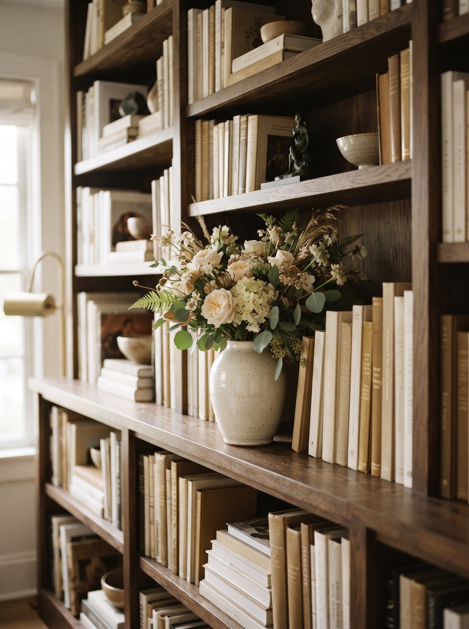
One reflective piece on a shelf — a small mirror, a glossy ceramic, a glass vessel, a brass tray leaned on its side — bounces light into the depth of the bookcase and keeps the shelves from reading as a dark cave. This is especially useful for bookshelves positioned against a windowless wall where ambient light does not reach the interior shelves naturally.
Keep the reflective surface small; large mirrors on open shelves start to feel like a bathroom moment or a department-store display. One modest mirror or glossy piece is enough to activate the light bouncing without dominating the shelf.
Position the reflective piece where it catches light from a window or lamp. The reflection becomes the point — if the piece just sits there in shadow, the reflective quality is wasted and the piece reads as any other object rather than as the light-bouncer it is meant to be.
15. Let the Top Shelf Breathe
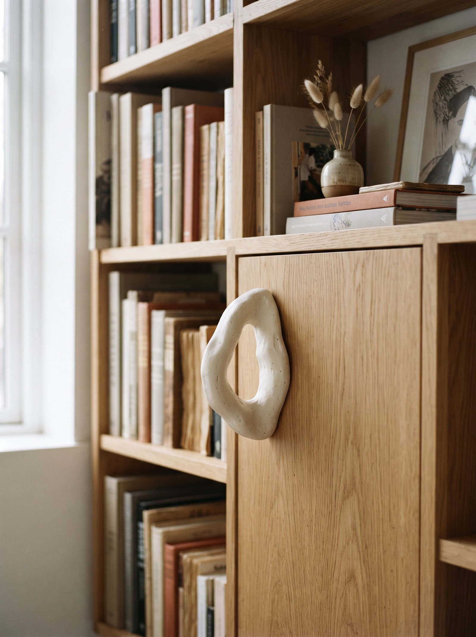
The top shelf is almost always over-styled in amateur bookshelf arrangements. Try the opposite — one tall vase or sculptural piece, and the rest empty. The negative space pulls the eye up and gives the whole bookcase a sense of lift that a crowded top shelf immediately kills. The empty space becomes an architectural choice rather than an oversight.
Empty space is the design equivalent of a well-placed silence. It reads as expensive, confident, and intentional. Rooms that fill every surface read as insecure, trying too hard to prove they have content. Rooms that leave the top shelf mostly empty read as curated by someone who understands restraint.
The one object on the top shelf should be substantial — a tall vase with a few branches, a large ceramic form, a single piece of sculptural art propped against the back panel. Small objects floating alone on a top shelf read as lost; one substantial piece reads as the entire styling of that shelf.
16. Mix Hardcovers With Softcovers in a Smart Way

Weight-heavy hardcovers belong on lower shelves — they anchor the eye and ground the bookcase. Lighter paperbacks and softcovers migrate up toward the top where their lighter visual weight matches the airier top of the composition. This is not a rigid rule, but following it instinctively keeps the whole bookcase feeling balanced from top to bottom.
Give paperbacks a little dignity by lining them up neatly and tucking the saggiest or most beat-up ones behind a horizontal stack or a decorative object. Paperbacks are honest objects — they do not need to be hidden — but they do read better when the ones showing fronts are the ones in better condition.
The vertical weight gradient (heavy at bottom, light at top) is the same principle designers use in rooms generally — dark colors low, light colors high, substantial materials low, delicate materials high. The bookshelf is a miniature of the whole-room approach.
17. Use Bookends That Are Objects, Not Just Supports

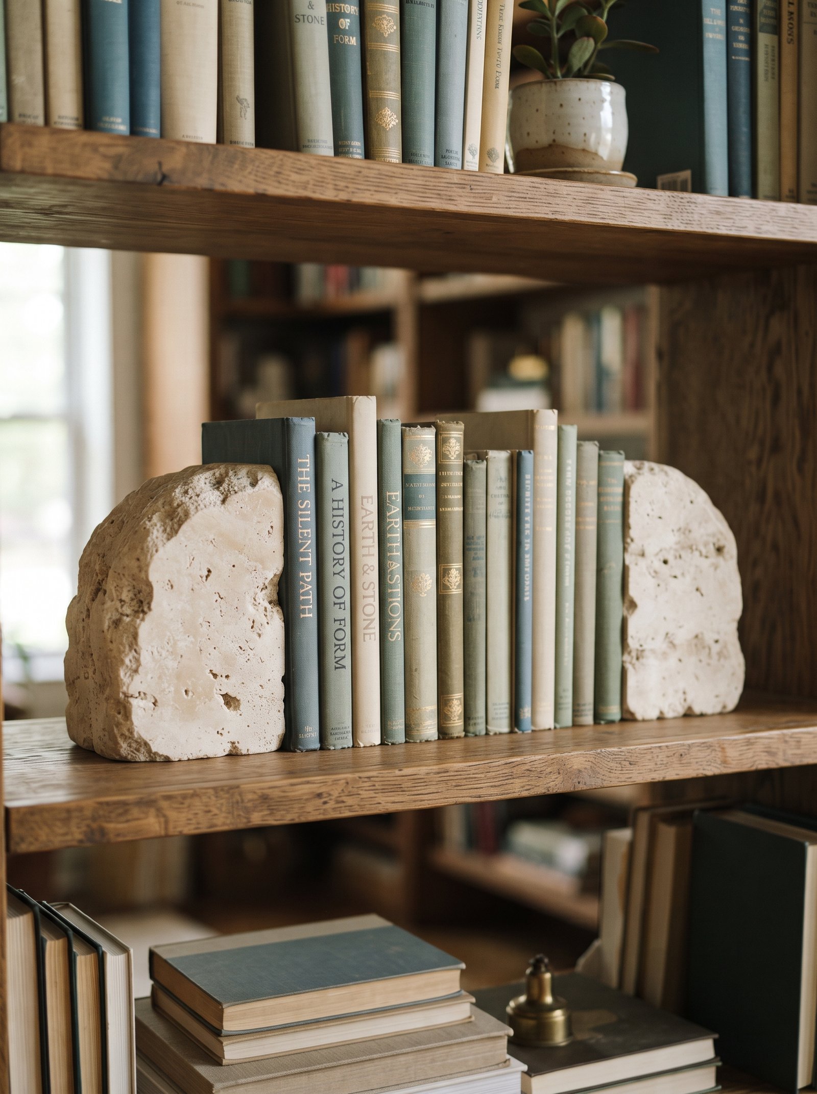
Skip wire bookends. Use something that reads as styling first and functional second — a chunky stone, a brass figure, a short carved wooden block, a vintage object with weight, a pair of beautiful ceramics. The bookend becomes part of the vignette rather than disappearing as pure utility. Every object on a styled bookshelf should earn its place as both functional and decorative; bookends that read as pure wire or plastic utility fail that test.
Mismatched bookends on opposite ends of a shelf often work better than a matching pair, because they feel collected rather than ordered from the same catalog page. Two different carved stone pieces, or a brass object on one end and a ceramic form on the other, read as curated taste rather than coordinated purchase.
Weight the bookends properly for their job. A beautiful bookend that cannot actually hold up a row of books becomes a frustrating object every time you add or remove a book. Function and form both matter.
18. Add One Unexpected Natural Element
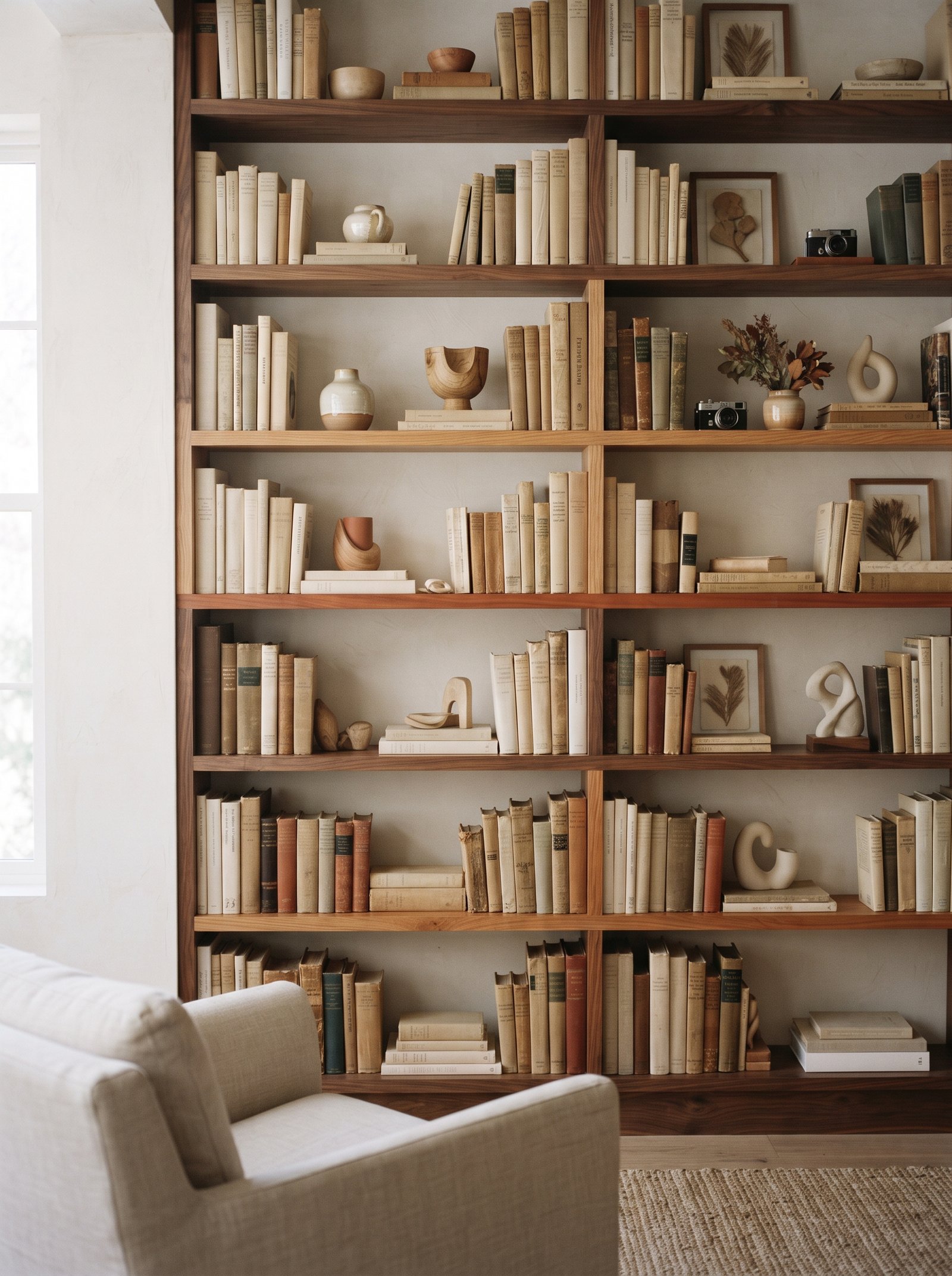
A small piece of coral, a smooth river rock, a weathered chunk of driftwood, a dried gourd, a single beautiful seashell — one natural element on a shelf gives the arrangement a sense of time and place that no manufactured object can touch. It also costs nothing if you pick it up on a walk, which makes it the most sustainable styling element in your entire bookshelf.
Keep it to one per bookcase. More and it tips into cabinet-of-curiosities territory, which is a specific aesthetic choice that works for some rooms and dates most. One natural piece reads as a quiet nod to the outside world; multiple pieces read as a collection that requires more commitment than most casual stylers want to make.
The natural piece should have real visual interest — unusual shape, interesting texture, striking color. A plain rock reads as a rock; a weathered rock with an interesting silhouette and warm color reads as sculpture.
19. Let One Shelf Stay Mostly Books
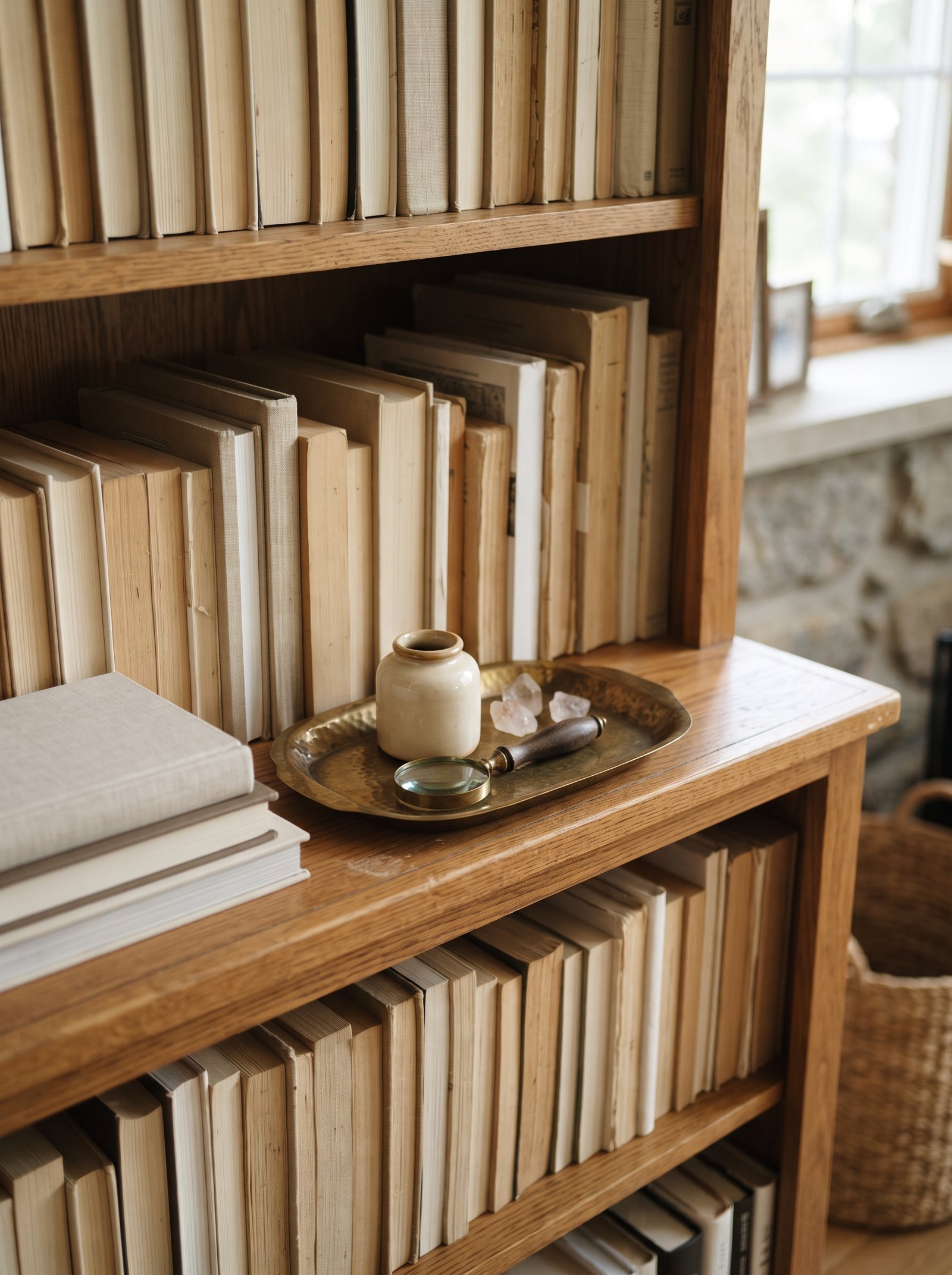
Not every shelf needs vignettes. One shelf dedicated almost entirely to books — tightly packed, mostly vertical, little to no decorative styling — reminds the eye that this is a bookcase, not a styling display. It also gives the busier shelves above and below somewhere restful to resolve to, which is a compositional principle that applies at every scale in interior design.
Treat this shelf as the honest working library and the rest of the bookcase as the styled commentary around it. The contrast between the dense book-only shelf and the vignetted shelves is what creates the overall sense of considered design across the whole piece.
Choose the shelf you reach for most often (usually at waist or eye level) as the book-only shelf. The working books live where they are most accessible; the decorative styling lives on the shelves that get seen more than touched.
20. Introduce a Pop of Pattern

One book spine with a stripe, a small block-printed textile folded on a shelf, a painted ceramic with a graphic motif — one piece of pattern on an otherwise quiet bookcase gives the eye a place to pause and keeps the whole thing from reading as monastic. The restraint of a single patterned element against solids is what reads as sophisticated; multiple competing patterns read as busy.
Keep the pattern small-scale and the palette in your existing color story. Loud graphic patterns on open shelves fight everything around them and win, which is not what you want. Small-scale ticking stripes, muted block prints, and quiet checked textiles all work; bold geometrics and large florals rarely do.
The patterned piece belongs at eye level where it registers. Pattern tucked onto a bottom shelf or hidden up top loses most of its impact.
21. Weight the Bottom, Lighten the Top

Dense books, dark objects, and heavy ceramics on the lower shelves. Lighter paperbacks, smaller objects, airy vases and plants on top. The visual weight distribution follows how we read the world — heavy things sit, light things float — and the bookcase settles into itself in a way that balanced styling always does.
Reverse this and the whole piece feels top-heavy and unstable, even if nothing is physically going to fall. The eye registers visual weight as actual weight, which means a bookcase styled heavy-at-top reads as about to tip over whether or not it would.
This principle also applies to color. Darker-toned books and objects on the bottom; lighter cream, white, and pastel objects at the top. The gradient from dark to light vertically mirrors how we read light itself from sky to ground.
22. Add a Small Light Source
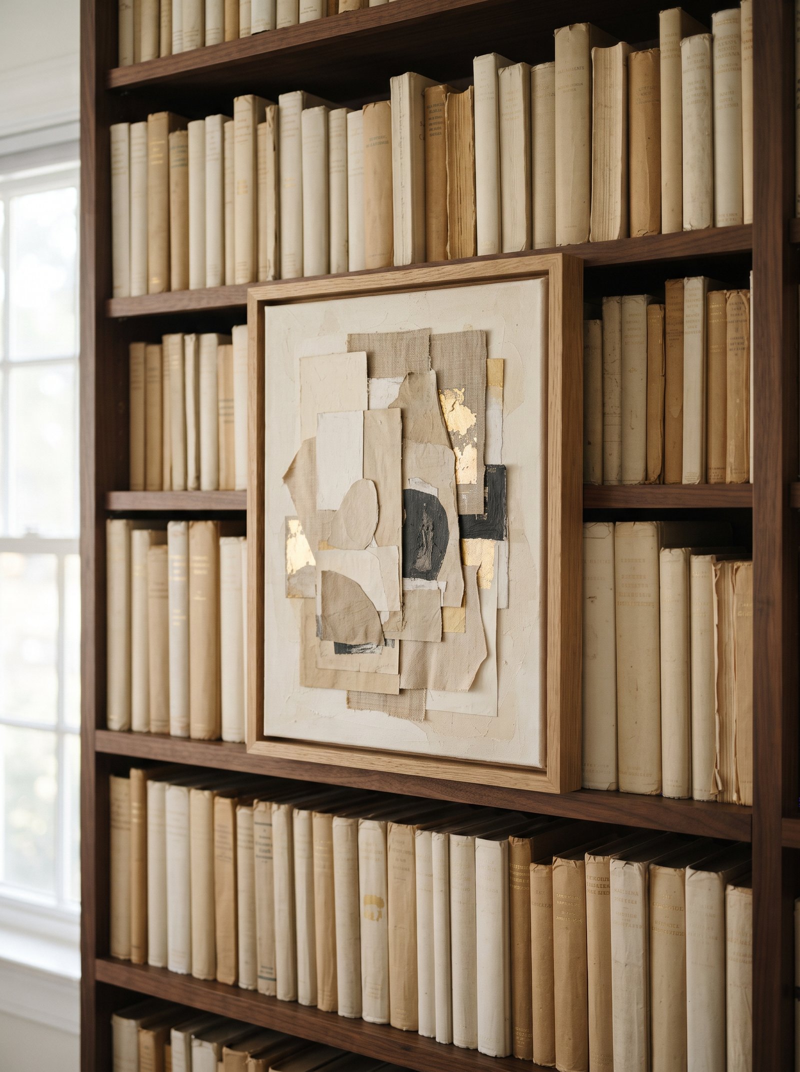
A small cordless lamp, a battery-powered puck light tucked behind a book, or a plug-in picture light mounted at the top transforms a bookshelf from functional furniture into a feature. The warm light pools in the depth of the shelves and makes the whole piece glow in the evening — which is when most of us actually spend time in the room.
Rechargeable mini lamps are the easiest route — no wiring, no permanent installation, and they can migrate wherever the room needs light when styling priorities change. Pair with 2700K bulbs for the warm candle-adjacent glow that flatters wood, ceramic, brass, and book spines alike.
Picture lights mounted above the top shelf give the whole bookcase a gallery feel. The small installation effort pays off every evening when the bookshelf becomes a glowing feature rather than disappearing into the dark corner it occupied in daylight.
23. Keep a Tray on One Shelf
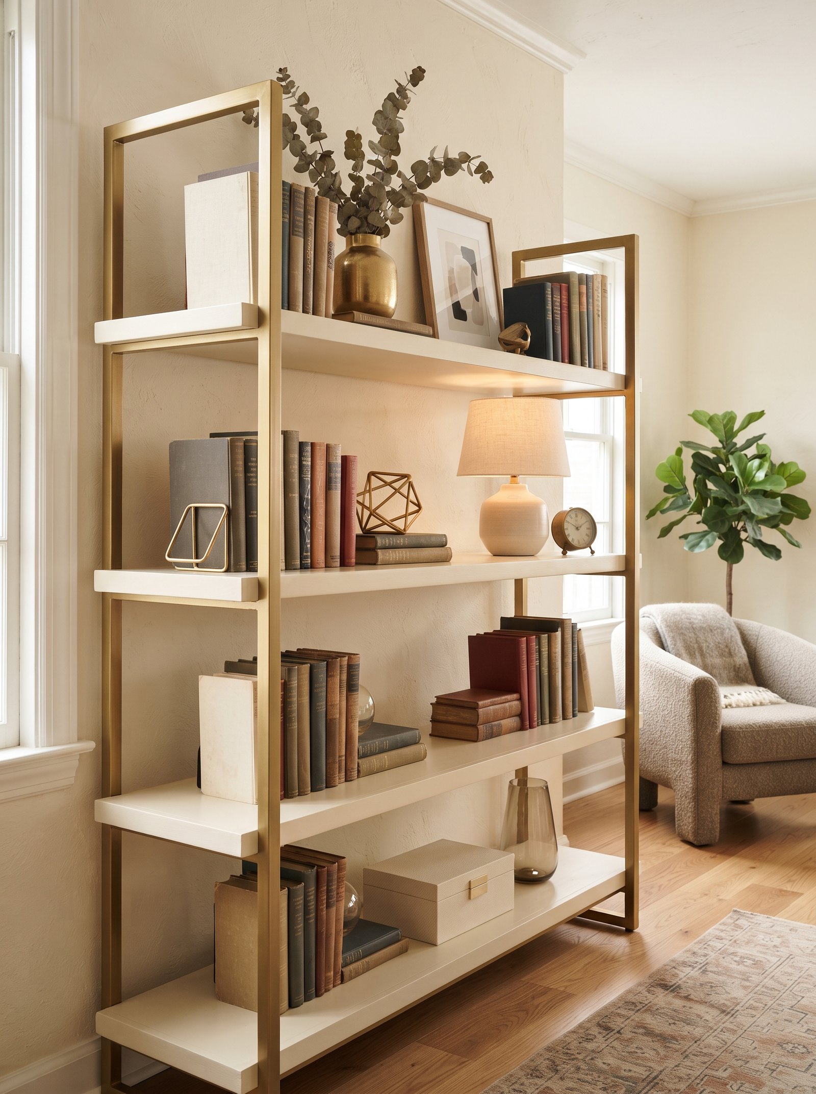
A small tray on one shelf creates a mini vignette — three objects grouped on it read as a composition instead of as scattered things. The tray provides the same framing effect it does on a coffee table, miniaturized to shelf scale. The vignette reads intentionally bordered rather than randomly placed.
Match the tray material to something else on the bookcase (brass if there are brass objects elsewhere, wood if the shelves themselves are wood, ceramic if there are hand-thrown pieces) so the tray reads as part of the family rather than as an alien addition.
The tray-based vignette is a particularly useful move for shelves where the back panel is a boring color or finish you want to visually interrupt. The tray plus its contents hides the back panel in that spot and provides a focused composition in front of it.
24. Edit Down by a Third
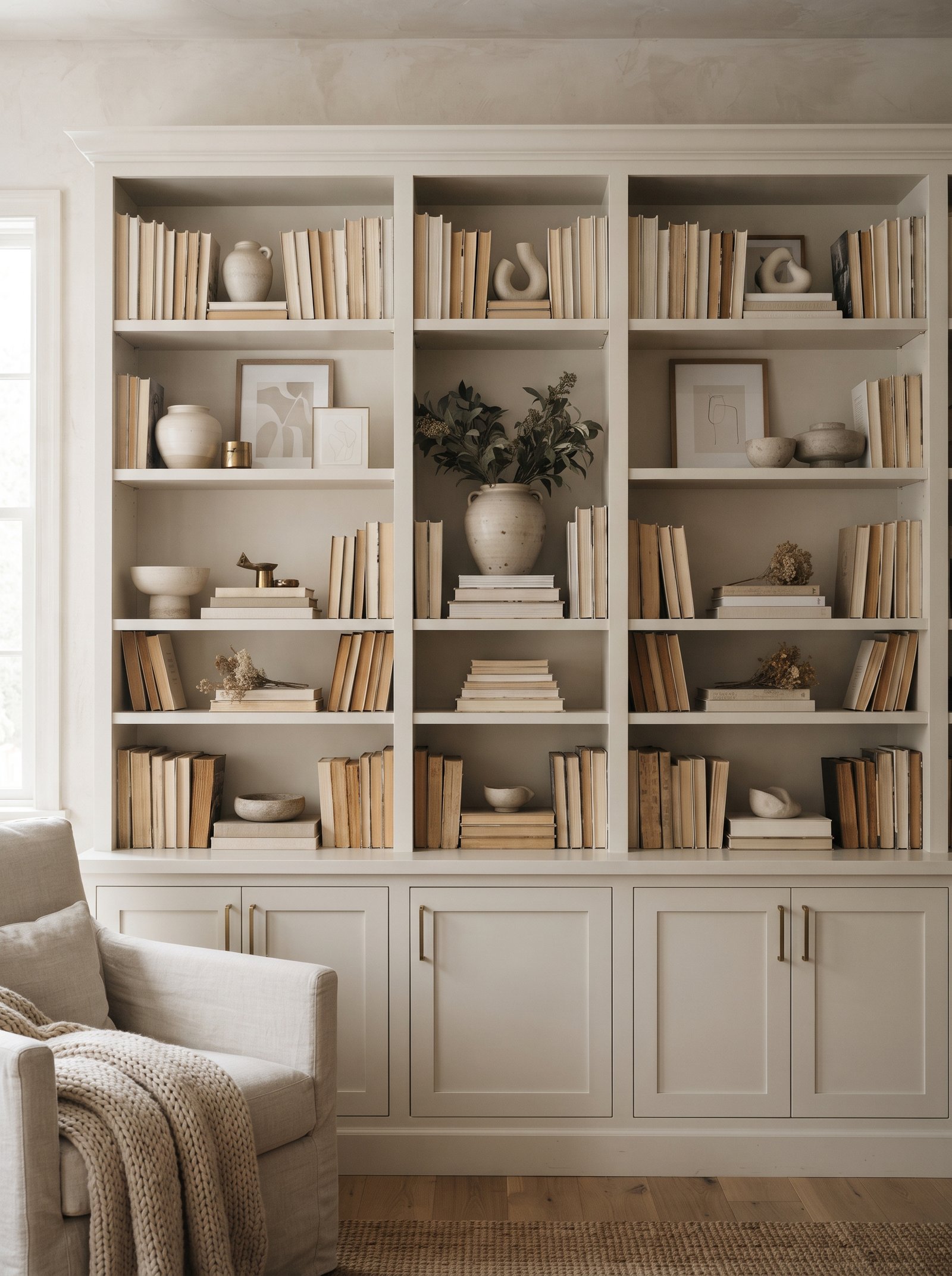
Finish styling your bookcase, then remove one-third of what you added. The urge to add is the enemy of a composed shelf. Live with the pared-back version for a day; nine times out of ten you will leave it that way permanently. The restraint reveals itself as the right answer only after you let it exist for a while.
Store the removed objects in a drawer or basket somewhere accessible — they become the seasonal rotation when you want to refresh without buying anything new. The reserve of objects is almost as valuable as the ones currently displayed; it gives you creative inventory to work with as taste evolves.
The editing move should happen at least once a season. Over time, the natural tendency to accumulate objects on surfaces erodes even the best initial styling; proactive editing fights that drift and keeps the shelves looking as sharp as they did when first styled.
25. Make the Whole Thing Photograph Well
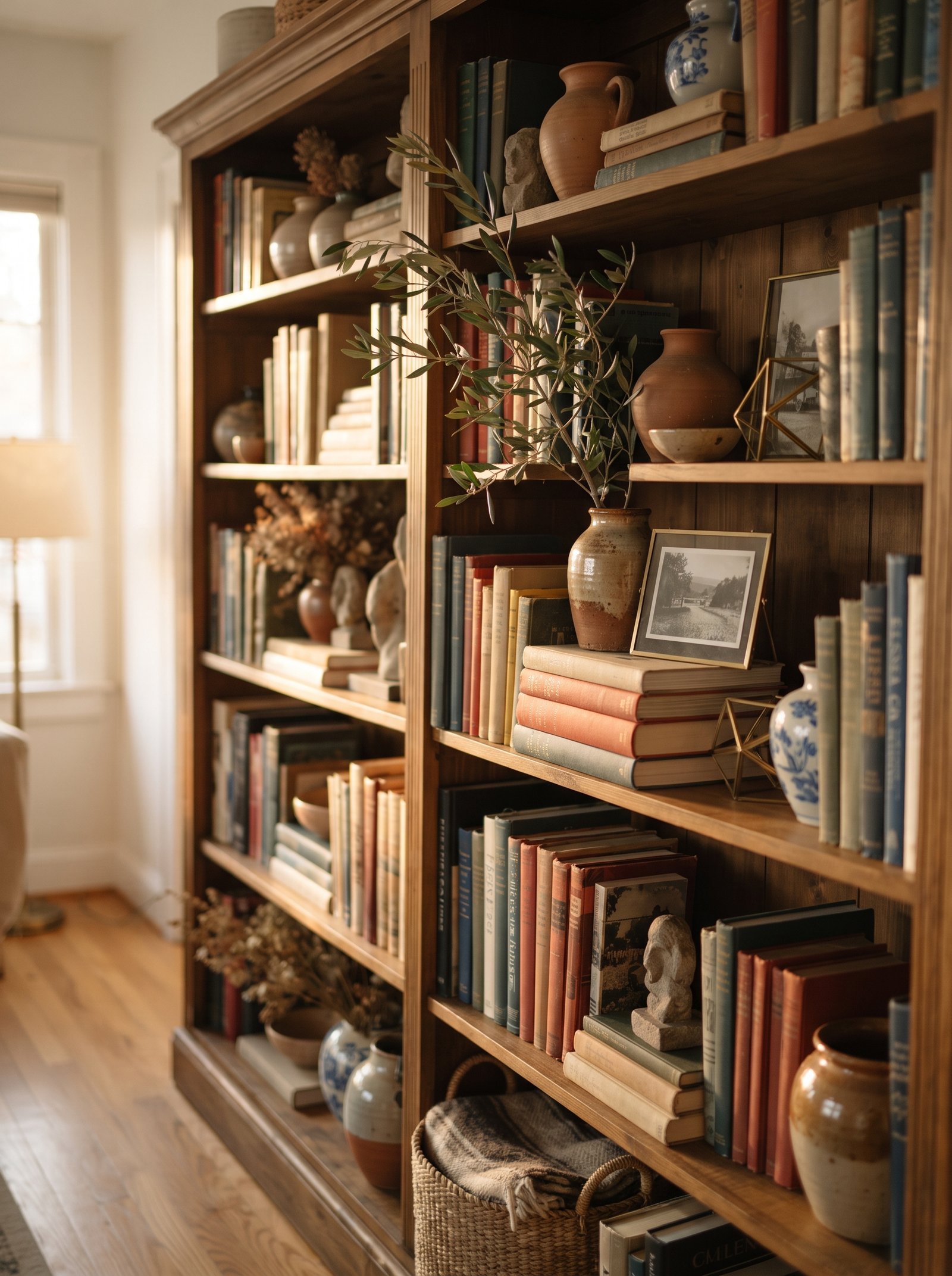
Take a photo on your phone from across the room when you think the styling is done. The camera is a brutal editor — it flattens the shelves and shows exactly what is not working. Spots that look fine in person look chaotic in the frame; empty shelves that felt wrong in person often read calm on camera. Trust the camera’s judgment.
If the shelves photograph well, they look well. If they do not, trust the camera and keep editing until the composition reads cleanly in the frame. The camera is a free second opinion that interior designers use constantly on their own work; amateurs skip this step and wonder why their shelves never quite look like Pinterest.
Photograph the shelves in different lighting conditions — morning daylight, evening lamp light — because styling that works at one time of day sometimes fails at another. The best-styled shelves work across all lighting conditions, which is a higher bar than it initially sounds.
Common Bookshelf Styling Mistakes to Avoid
Even the best styling techniques can go sideways if you fall into the most common bookshelf traps. The first mistake is overcrowding — the instinct to fill every inch of every shelf because empty space feels wasteful. Overcrowded shelves read as busy and visually exhausting; well-spaced shelves read as expensive and considered. If you cannot tell where one vignette ends and the next begins, you have overcrowded.
The second mistake is placing all your most interesting objects on one shelf while leaving the others as plain book rows. The visual weight becomes imbalanced, and the “styled” shelf starts to feel like a lonely island surrounded by functional storage. Distribute decorative pieces evenly across shelves so the whole bookcase reads as considered rather than as a single showcase surrounded by storage.
The third mistake is matching too perfectly. Three identical ceramic vases in different sizes read as a store display, not as personal taste. Three different ceramics in a shared color family read as collected and curated. The slight imperfection and variation is what separates styled from staged.
Finally, avoid treating the bookshelf as static. Styling that worked in winter may feel wrong by summer; a vignette that looked right in the first apartment may need rework in the new house. Rotate seasonally, edit regularly, and let the shelves evolve with your taste. The best bookcases are works in progress across years, not permanent installations frozen on move-in day.
Bookshelf Styling by Room Type
The same bookshelf styles slightly differently depending on which room it is in. In a living room, bookshelves tend toward layered decorative styling — more objects, more color accents, more personality. The books are secondary to the overall visual composition because the living room is the room most seen by guests. Push the decorative moves harder in the living room than you would anywhere else.
In a bedroom, bookshelves benefit from a quieter palette — more neutrals, fewer sharp color accents, more restrained styling. The bedroom is a room for calm; busy shelves fight the restfulness. Mostly books with occasional sculptural pieces, trailing plants, and soft linen-covered boxes creates the right bedroom balance.
In a home office, bookshelves can lean more functional — more books, more reference materials, fewer decorative vignettes. The office is a working room; shelves full of actually-used books read as productive rather than cluttered. Still apply the composition rules (vertical and horizontal mix, color grouping, one or two decorative pieces per shelf), but prioritize access to the books over styling.
In an entryway or hallway, bookshelves become narrower and taller — focused on display rather than storage. Fewer books, more sculptural pieces, more negative space. The entryway bookshelf is a first impression; make it count with careful editing rather than dense styling.
Keeping the Styled Look Over Time
Styled bookshelves need light ongoing maintenance to stay looking their best. Dust the shelves and objects monthly — dust accumulates faster on styled shelves than on book-only ones because of the varied object surfaces. A soft microfiber cloth and a small natural-bristle brush for carved pieces does the job in under fifteen minutes.
Rotate pieces seasonally so no single object sits in exactly the same position for years. The rotation keeps the shelves feeling fresh and also gives you an excuse to re-evaluate what deserves display space. Objects you have not touched or appreciated in a year probably belong in storage or donated rather than on display.
Replace trailing plants when they stop looking vigorous. A once-beautiful pothos that has gone leggy or dropped most of its leaves pulls the whole shelf down visually. Fresh plant material (even if it is a new cutting from the same original plant) resets the whole composition.
Pulling the Layered Bookshelf Look Together
A beautifully styled bookshelf is not about having more objects — it is about editing the ones you have into a composition that holds together. Mix vertical and horizontal books, pull everything forward to the front edge, repeat colors across shelves, let one shelf breathe, add a trailing plant and one sculptural piece, and photograph the whole thing to find the weak spots. The shelf will look like you spent a week on it. It will actually take an afternoon.
The underlying principle across all 25 ideas is the same: a bookshelf should feel composed and personal rather than crowded or sterile. Each of the moves above exists to create composition (rule of three, repeating colors, varied heights), add depth (leaning art, trailing plants, sculptural objects), or add restraint (editing by a third, letting the top shelf breathe, book-only shelves). The combination of composition, depth, and restraint is what reads as considered styling versus random accumulation.
Start with the first three ideas and build out from there. Mix vertical and horizontal books. Pull the spines forward. Group by color. Those three moves alone will transform almost any bookcase in under thirty minutes with zero shopping. The remaining 22 ideas are the layering that turns a transformed bookcase into a magazine-worthy one over the following weeks and months of thoughtful refinement.
For more layered, lived-in styling moves across the whole living room, see our guides on coffee table styling, cozy reading nooks, no-damage wall decor, bed styling tricks, and warm neutral living rooms. Each pairs beautifully with the bookshelf styling principles here to build a whole-home palette that reads as considered rather than catalog-ordered.